How to Create a Simple Sales Page in Minutes


A sales page does not have to be complicated to be effective. Many creators and small businesses assume they need complex funnels, heavy design, or expensive tools before they can sell anything online.
In reality, a simple, well-structured sales page often outperforms bloated ones. What matters most is clarity, flow, and relevance to the audience. When the message is sharp and the path is obvious, even a lightweight page can convert surprisingly well.
The process below focuses on building a clean, fast, no-nonsense sales page that is practical to create and easy for visitors to act on.
Step 1: Define the One Thing You Are Selling
Before opening any builder or choosing colors, the most important decision is focus. A simple sales page works best when it sells one clear offer to one clear audience.
Start by answering three questions:
● What exactly is being sold
● Who it is for
● What problem it solves
If the page tries to sell multiple unrelated things, the message weakens quickly. Strong pages feel obvious, almost boringly clear. That is usually a good sign.
Quick check: If a visitor cannot understand the offer within five seconds, the positioning likely needs tightening.
Step 2: Write a Clear, Outcome-Focused Headline
The headline carries most of the weight on a simple sales page. Its job is not to sound clever. Its job is to make the right person stop scrolling.
Effective headlines usually:
● State the core benefit
● Target a specific audience
● Avoid vague hype language
For example, compare:
● “Transform Your Life Today” (vague)
● “Edit Short Videos 3x Faster Without Advanced Software” (clear outcome)
A strong headline reduces bounce rate before design even enters the conversation.
Step 3: Add a Short Supporting Subheadline
Once the headline captures attention, the subheadline adds context and credibility. This is where you briefly explain how the promise is delivered.
Keep it tight. One or two sentences are enough.
A good subheadline often clarifies:
● What the product is
● Who it helps
● How it works at a high level
Think of it as removing the visitor’s first layer of skepticism.
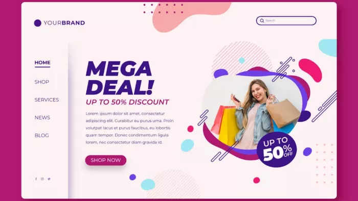
Step 4: Show the Offer Visually
Even simple sales pages benefit from a visual anchor. This could be:
● Product mockup
● Dashboard screenshot
● Course preview
● Before-and-after example
● Short demo video
The goal is to make the offer feel real and tangible.
Visitors process visuals faster than text. When the visual clearly supports the promise, comprehension improves immediately. Just avoid decorative images that add noise without adding understanding.
Step 5: Highlight the Core Benefits (Not Just Features)
This is where many simple sales pages quietly fail. They list features instead of explaining why those features matter.
A stronger approach is benefit-first communication.
Instead of:
● “Includes 50 templates”
Frame it as:
● “Launch polished content faster using 50 ready-to-use templates”
Focus areas that usually resonate:
● Time saved
● Effort reduced
● Revenue potential
● Stress removed
● Speed improved
Three to five well-written benefit blocks are usually enough for a simple page.
Step 6: Add Light Proof or Credibility Signals
Trust friction is real, even on simple pages. Visitors want reassurance that the offer is legitimate and useful.
You do not need heavy case studies at the beginning. Even lightweight proof helps, such as:
● Short testimonials
● User count
● Creator credentials
● Client logos
● Before-and-after results
Place proof after the benefits so it reinforces the claims rather than interrupting the flow.
Important: Keep proof believable. Overly dramatic claims tend to reduce trust rather than build it.
Step 7: Present the Offer Clearly
Now comes the practical part. The offer section should remove any confusion about what the visitor gets.
A clean offer block usually includes:
● What is included
● Pricing
● Payment type (one-time or subscription)
● Any guarantee or refund policy
● Primary call-to-action button
Clarity beats clever formatting here. If someone has to hunt for the price, conversions usually drop.
Step 8: Handle Common Objections Briefly
Even fast-moving buyers carry quiet doubts. A short objection-handling section can significantly improve conversions.
Address practical concerns such as:
● Is this beginner friendly
● How long results typically take
● Whether support is available
● Compatibility questions
● Refund or cancellation clarity
This section does not need to be long. It simply needs to remove the most predictable hesitation points.
Step 9: Add a Focused Call to Action
A simple sales page should guide visitors toward one obvious next step. The call to action should be:
● Visually clear
● Action-oriented
● Repeated at logical points
Common effective CTA styles include:
● Get Instant Access
● Start Now
● Try It Today
● Download the Guide
Avoid vague buttons like “Submit” or “Learn More” when the goal is conversion.
Step 10: Keep the Page Clean and Fast
Simplicity is not just about fewer sections. It is also about visual breathing room and performance.
Before publishing, quickly check:
● Page loads fast on mobile
● Text is easy to scan
● Buttons are thumb-friendly
● No visual clutter
● Sections flow logically
Many sales pages do not fail because of weak offers. They fail because the experience feels slightly heavy or confusing.
A Simple Sales Page Structure That Works
If building from scratch, this basic flow performs reliably well:
1. Headline
2. Subheadline
3. Visual proof
4. Core benefits
5. Light social proof
6. Offer block
7. Objection handling
8. Final call to action
This structure keeps momentum moving forward without overwhelming the visitor.
Final Thoughts
Creating a simple sales page quickly is less about design tricks and more about disciplined clarity. When the offer is specific, the message is focused, and the path is obvious, even a minimal page can convert effectively.
The biggest advantage of a simple sales page is speed. It allows creators and teams to test ideas quickly, validate demand, and refine messaging without getting stuck in endless design cycles.
In most cases, the best next step is not to make the page more complex. It is to make it more obvious.

Comments