Link in Bio Strategy for Business Growth


A link in bio page looks small, but it plays a much bigger role than most businesses realize. It is often the first bridge between social attention and actual business outcomes. When someone discovers your brand on Instagram, TikTok, X, YouTube, or LinkedIn, they usually do not want your homepage. They want the next right action. That might be booking, buying, reading, subscribing, messaging, or comparing. A strong link in bio strategy turns scattered social traffic into a structured path toward revenue, trust, and retention.
For businesses, this is not just a design choice. It is a conversion system. A weak link in bio page creates friction, sends people to the wrong place, and wastes attention you already paid for with content, ads, or time. A strong one acts like a mini landing page built for high-intent visitors who are already curious and ready to move.
Why link in bio strategy matters for business growth
Most brands treat their bio link as a simple directory. That is the first mistake. A business-focused link in bio should not just collect links. It should prioritize business goals.
Social platforms are discovery engines. People scroll quickly, click selectively, and make judgments in seconds. When they tap your bio link, they are signaling intent. That intent is valuable because it often comes after they have already seen your content, understood part of your message, and become interested enough to leave the platform. In other words, they are warmer than a random website visitor.
That is why the link in bio page should be built less like a menu and more like a guided decision page. It should help visitors answer one question immediately: what should I do next with this brand?
Businesses that do this well create smoother journeys from content to conversion. They align their bio page with campaigns, offers, seasons, new products, lead magnets, and customer support. They do not ask users to figure things out. They reduce thinking effort.
What a strong link in bio strategy actually does
● It shortens the gap between social interest and action
● It gives each content channel a clearer conversion path
● It helps businesses promote multiple offers without confusing users
● It creates measurable click behavior and campaign data
● It supports sales, lead generation, content distribution, and retention at the same time
The real job of a link in bio page
The real job of a link in bio page is not to be pretty. It is to organize demand.
That demand can take different forms depending on the business. An ecommerce brand may want product sales, bundles, and email signups. A service business may want discovery calls, quote requests, WhatsApp inquiries, or testimonials. A creator-led business may want newsletter subscribers, course sales, community signups, and brand partnership inquiries. The page has to reflect those priorities clearly.
A lot of businesses fail here because they try to serve every audience equally. They add too many buttons, too many categories, and too many unrelated destinations. The result is clutter. People do not choose. They leave.
A better strategy starts by deciding which business outcomes matter most.
Start with the business objective, not the tool
Before choosing a tool or layout, define what growth means for this page. Growth is not always direct sales. Sometimes it is qualified leads. Sometimes it is list building. Sometimes it is trial signups. Sometimes it is getting people into a stronger owned channel like email or SMS.
The page should be designed around primary and secondary outcomes.
| Business Type | Primary Goal | Secondary Goal | Best Link in Bio Focus |
| Ecommerce brand | Product sales | Email capture | Featured products, bundles, reviews, discount entry |
| Service business | Lead generation | Trust building | Book a call, case studies, testimonials, service pages |
| Creator-led business | Newsletter or product sales | Community growth | Lead magnet, latest content, digital products |
| SaaS company | Free trial or demo | Education | Demo booking, product explainer, use cases, blog |
| Local business | Contact or booking | Directions and trust | Call, WhatsApp, map, booking link, top offers |
| Personal brand consultant | Discovery calls | Authority building | Book now, results, client proof, content hub |
This is where many businesses become more effective immediately. Once the goal is clear, almost every layout decision becomes easier.
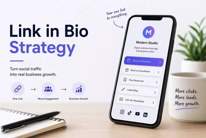
The core elements of a high-converting business bio page
A user-first page should feel instantly understandable. Within a few seconds, visitors should know who you are, what you offer, and what to do next.
1. Clear value statement
At the top, users should see a short brand description that explains what the business does and who it helps. This is especially important if someone lands there without full context from your latest post or reel.
Weak version: “Helping you grow.”
Better version: “Marketing strategy and content systems for small ecommerce brands.”
The second version is specific. It gives users a reason to continue.
2. One primary call to action
Every link in bio page should have one dominant action. This is the action most aligned with growth. It should be placed high and written clearly.
Examples:
● Shop the new collection
● Book a free strategy call
● Start your free trial
● Download the pricing guide
● Join the newsletter
When every link looks equally important, none of them feels important.
3. Secondary action paths
Not every visitor is ready for the main conversion. Some need proof, context, or education. That is where secondary links help. These might include testimonials, bestsellers, case studies, FAQs, or recent content.
4. Trust signals
Trust often determines whether a click turns into a customer action. Good trust signals include:
● Client logos
● Review count or star ratings
● Press mentions
● Bestseller labels
● User-generated content
● Short proof statements like “Trusted by 2,000+ customers”
5. Mobile-first structure
Most link in bio clicks happen on mobile. That means spacing, text length, button clarity, and scroll behavior matter more than desktop polish. Small design mistakes become conversion problems on a phone.
A practical structure businesses can use
Below is a simple structure that works for many brands.
| Section | Purpose | What to Include |
| Header | Clarify brand and value | Name, one-line positioning, profile image or logo |
| Primary CTA | Capture highest-intent users | Top business goal link |
| Secondary Links | Serve different user needs | 3 to 5 supporting links |
| Trust Layer | Reduce hesitation | Reviews, proof, client wins |
| Content/Offer Layer | Keep users engaged | Latest campaign, lead magnet, top content |
| Contact Layer | Support quick action | Email, DM, WhatsApp, booking, location |
This structure works because it follows how users think. First they orient themselves. Then they choose an action. Then they look for reassurance.
Matching your link in bio to the customer journey
A business bio page works best when it reflects different levels of intent. Not every visitor is at the same stage.
Some people are just discovering you. Others are comparing. Others are ready to act. Your page should support all three without becoming messy.
| Customer Stage | What They Need | What to Show |
| Awareness | Fast understanding | What you do, who it is for, top offer |
| Consideration | Confidence and proof | Testimonials, product benefits, case studies |
| Decision | Low-friction action | Booking link, checkout page, demo, WhatsApp |
| Retention | Ongoing relationship | Newsletter, loyalty offers, latest updates |
This is why the page should never be built as a random pile of links. It should map to real user behavior.
Content strategy and link in bio should work together
A bio page performs better when it matches the content people are clicking from. If your Instagram reel talks about one problem but your bio page pushes something unrelated, users feel a disconnect.
Strong businesses align content themes with link destinations. For example, if a week of content focuses on email marketing mistakes, the top bio link could lead to a free email audit, lead magnet, or consulting page. If the business is launching a new product line, the top link should point directly there, not to a generic homepage.
This kind of alignment matters because social traffic is context-sensitive. Users click with a specific expectation in mind.
A useful rule
Your top link should often reflect one of these:
● Your current campaign
● Your highest-value offer
● Your most likely next step for warm traffic
That focus improves conversion more than adding ten extra buttons ever will.
Common link in bio mistakes that slow growth
Many businesses underperform here not because they lack traffic, but because they create friction after the click.
The most common problems
● Too many links, which creates decision fatigue
● Generic labels like “Click here” or “Learn more”
● Sending users to a homepage instead of a focused destination
● No clear priority between links
● Outdated promotions still visible
● No proof, reviews, or credibility signals
● Design that looks polished but hides the actual action
● No tracking, so the business never learns what is working
A user-first strategy removes unnecessary choices and makes the highest-value path obvious.
How many links should a business include?
There is no universal number, but fewer and better is almost always stronger than more and weaker. Most businesses can do very well with 4 to 7 meaningful links.
The real question is not how many links you can fit. It is how many choices a user can process without losing momentum.
Here is a helpful framework:
| Number of Links | Likely Outcome |
| 1 to 3 | Very focused, strong clarity, best for campaigns |
| 4 to 7 | Balanced, ideal for most businesses |
| 8 to 12 | Can work if hierarchy is strong |
| 12+ | Often cluttered unless segmented very well |
If you need many destinations, group them by user need instead of stacking them equally.
Writing better CTA labels
Words matter on a bio page because users scan quickly. Vague labels perform worse than specific ones.
Compare these:
| Weak CTA | Better CTA |
| Learn More | See Pricing Plans |
| Click Here | Book Your Free Consultation |
| Shop Now | Shop Bestsellers |
| Get Started | Start Free 14-Day Trial |
| Our Services | Explore Branding Services |
| Newsletter | Join Weekly Growth Tips |
Specific CTA labels reduce ambiguity. They tell users what happens after the click. That lowers hesitation.
The role of trust, proof, and credibility
A social visitor may like your content and still hesitate to take the next step. That hesitation often comes from uncertainty, not lack of interest.
This is where trust-building elements make a big difference. A short testimonial, star rating, user count, or case study link can improve confidence because it shows that other people have already gone first.
For small businesses especially, proof matters because brand familiarity is often lower than for larger players. A clean bio page with no evidence can feel incomplete. A simple line like “Trusted by 500+ clients” or “Rated 4.8/5 by customers” immediately changes the emotional context.
You do not need to overdo it. One or two strong proof elements are usually enough.
Using link in bio for different business goals
For lead generation
If the business sells services, consulting, software, coaching, or B2B solutions, the page should focus on getting users into a conversation or lead pipeline. That often means:
● booking links
● lead magnets
● pricing guides
● case studies
● contact options
For ecommerce
If the business sells products, the page should reduce the path to purchase. That may include:
● new arrivals
● bestsellers
● bundles
● seasonal offers
● review-backed products
● email signup with discount
For local businesses
Local businesses benefit from speed and convenience. The best bio pages for them often include:
● call now
● WhatsApp now
● directions
● book appointment
● current offer
● customer reviews
For content-led businesses
If growth depends on audience building, the page should prioritize owned channels and monetization paths:
● newsletter
● free resource
● latest video or article
● course
● community
● sponsorship inquiry
Measuring whether your strategy is working
A link in bio strategy should be treated like a performance asset, not a static profile detail. That means tracking matters.
The most useful metrics are not just total clicks. Businesses should look deeper.
| Metric | Why It Matters |
| Total clicks | Shows overall engagement from social traffic |
| Click-through rate by link | Reveals which offers attract users |
| Conversion rate by destination | Shows whether clicks become outcomes |
| Top traffic source | Helps match content channels with intent |
| Device behavior | Confirms mobile usability issues |
| Campaign-specific performance | Measures launch or promotion effectiveness |
A high click count with low conversions may mean the page is persuasive but the destination is weak. A low click count may mean the CTA or page structure is unclear. Good strategy comes from observing both.
How often businesses should update their bio page
A business bio page should not stay static for months unless the business itself is static. It should evolve with campaigns, launches, seasons, content themes, and customer priorities.
A practical rhythm looks like this:
● Review weekly if you post actively or run frequent campaigns
● Refresh monthly for evergreen priorities
● Update immediately for launches, offers, or important announcements
● Remove expired promotions as soon as they end
The strongest businesses treat the page like a live storefront, not a forgotten settings field.
What a good link in bio strategy feels like to the user
This is an important test. A strong page feels easy. It feels like the business understands what the visitor is trying to do. It does not make them hunt, guess, or scroll through clutter.
In practical terms, the user should experience:
● fast understanding
● obvious next steps
● minimal confusion
● enough proof to feel comfortable
● a short path from interest to action
That is the difference between a page that simply exists and one that drives growth.
A simple blueprint businesses can follow
If you want a practical starting point, use this order:
1. Write a one-line value statement
2. Choose one primary growth action
3. Add 3 to 5 secondary links based on customer intent
4. Include one trust signal near the top
5. Match the top link to your current content or campaign
6. Track clicks and conversions
7. Review and improve regularly
That process is simple, but it solves most of the real problems businesses face with their bio link.
Final thoughts
A link in bio strategy is often underestimated because it looks small. In reality, it sits at a critical point between attention and action. It is one of the clearest places where brand clarity, offer strategy, user psychology, and conversion design meet.
For business growth, the goal is not to create the most stylish page or the one with the most links. The goal is to create the clearest path for the right visitor to take the right next step. When that happens consistently, social traffic becomes more than engagement. It becomes pipeline, revenue, lead flow, and customer momentum.
A user-first link in bio page does not ask people to figure out your business. It helps them move through it. That is why it matters, and that is why businesses that treat it seriously tend to get more value from the audience they already have.

Comments