How Multilingual Access Enhances User Experience for Global Brands


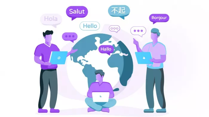
When you visit the site of a global brand and see your native language, it feels like home. Prices make sense, reviews sound familiar, and you don’t have to guess what a button does. That kind of comfort doesn’t happen by accident — it’s the result of thoughtful multilingual design. For global brands, it’s a way to build trust and lasting loyalty with their customers.
But why does it matter so much, and how do they do it?
What multilingual access really means
People trust what they understand. A CSA Research survey found that 76% of consumers prefer buying from websites that provide information in their native language. For many users, language is about confidence as well. If a Spanish-speaking visitor lands on a site that only offers English, they might hesitate to make a purchase. But if they see a clear option to switch to “Español,” they’re far more likely to stay, browse, and buy.
Multilingual access goes far beyond translating text. It’s about localization — adapting a product or website to fit each culture’s expectations. That includes currency symbols, date formats, measurements, and even humor. A French version of an app, for example, shouldn’t just swap English words for French ones; it should reflect French phrasing, etiquette, and even shopping habits. When done right, it feels like the brand was built locally, not exported.
That’s why major brands like IKEA, Netflix, and Airbnb invest heavily in multilingual user experiences. Netflix, for instance, doesn’t just translate subtitles — it adjusts show titles, descriptions, and recommendations based on local trends. The result is a more personal connection that keeps users coming back.
How adaptability affects conversion, engagement, and real results
Language impacts conversion directly. A study by Common Sense Advisory found that 40% of consumers won’t buy from websites not in their language, and more than half prefer content tailored to their region. For global e-commerce, that’s a huge insight.
Consider Booking.com, which supports over 40 languages (and currencies). By offering localized content, from the French version to Japanese and Arabic ones, it gives users a sense of home wherever they travel. The payoff is clear: higher engagement, fewer drop-offs, and better customer satisfaction. The same goes for apps and digital services — users are more likely to complete sign-ups, watch longer, or make purchases when the experience feels natural to them.
The downside? Going multilingual isn’t easy. Translation alone doesn’t guarantee accuracy or tone. Brands often face issues like inconsistent terminology, slow content updates, or awkward machine-generated phrases. That’s why many global teams now use hybrid models — combining AI translation for speed with native editors for nuance.
For example, Shopify’s localization teams use automated translation for product listings but rely on regional experts to fine-tune marketing copy. It’s a balance between efficiency and authenticity. And that’s the key: users can spot poorly translated content in seconds, and it breaks immersion instantly.
Best practices for a great multilingual UX
A few simple principles make a world of difference:
- Make switching languages easy. Always show a visible language selector — don’t hide it in the footer.
- Auto-detect, but never assume. Use browser settings to suggest a version, but let users change it manually.
- Localize everything. Not just words — think about images, idioms, examples, and even colors that suit local audiences.
- Keep consistency. All language versions should match in design and update timing.
- Test with native speakers. A small group of real users can catch tone or phrasing issues that automated QA won’t.
These details might seem small, but together they turn a global website into something that feels personal and familiar, like it was made with the user in mind from the start.
The bottom line
Multilingual access isn’t just about expanding reach — it’s about respect. When users see their language reflected on a global platform, they feel seen. It shows the brand values connection over convenience. From the French version of a site to the Japanese app store page, every localized touchpoint says: “You matter.”
The companies that get this right don’t just sell worldwide; they belong worldwide.

Comments