The New Creator Advantage Is Not Content, It’s Packaging

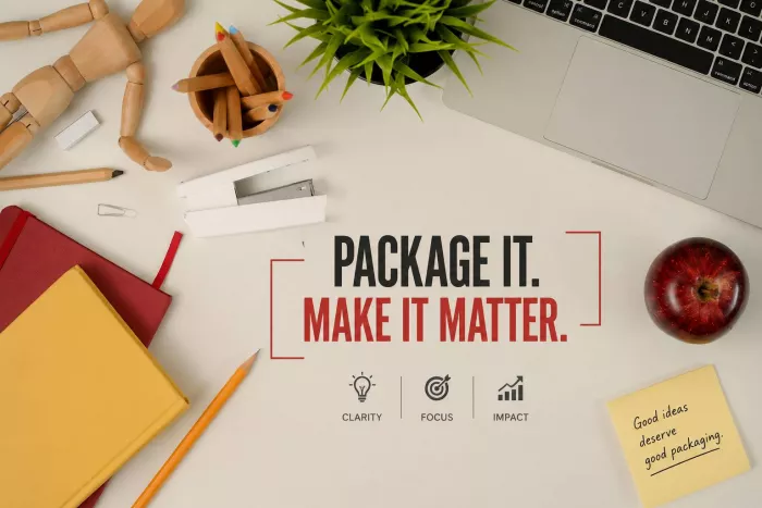
The new edge for creators is not having more to say. It is making what you say impossible to ignore. In a world where “good content” is everywhere, the real advantage now lies in how you frame, title, structure, and visually present your ideas. Two people can share the same insight; the one who wins is the one whose packaging makes it feel clearer, more relevant, and easier to act on.
Content vs Packaging: What Really Changed
Most modern creators still behave as if the internet has a content shortage. It doesn’t. There is more free, high‑quality information available than anyone can consume in a lifetime. The scarcity has shifted from information to attention and differentiation.
● Content is the substance: your ideas, knowledge, stories, data, experience.
● Packaging is the interface: the way you name, frame, structure, and design those ideas so they instantly make sense to the right people.
In a feed where thousands of posts flash past in seconds, great ideas with weak packaging vanish. Meanwhile, average ideas with sharp packaging get read, shared, and bookmarked. This is not about tricking people with clickbait. It is about respecting how people actually consume information and presenting your work in a way that matches their reality.
The Building Blocks of Modern Packaging
To use packaging as an advantage, you need to see it as a set of skills, not an aesthetic afterthought. These are the core layers that matter.
1. Positioning: Who and What Is This For?
Positioning is the foundation. It answers two questions: who exactly is this for? and what specific situation are they in? The more precise your answer, the more your content feels like a direct message instead of a broadcast.
A vague position sounds like: “For anyone who wants to grow online.”
A sharp position sounds like: “For solo creators stuck at 2k followers after posting daily for months.”
That simple shift changes everything: your examples, your language, your format, and your calls to action. Strong packaging starts with the courage to exclude.
2. Hooks and Titles: The First Gate
The hook is not a decorative sentence on top of your content. It is the first “deal” you make with the audience. A weak hook describes what the piece is. A strong hook describes what the piece does for them.
● Weak: “Copywriting tips for creators”
● Strong: “Stop sending paragraphs: use this 2‑line DM script to get replies”
Good hooks are specific, outcome‑driven, and often slightly counterintuitive. They create enough tension that the reader feels a genuine cost to ignoring your piece.
3. Format and Structure: How the Idea Travels
The same idea can appear as a short video, a carousel, a thread, a long‑form article, or a podcast. Packaging is choosing the right vehicle and then making the ride smooth.
Strong structure feels like a guided journey:
Problem → tension → insight → practical shift → next step.
When structure is weak, people feel lost, even if the information is useful. When structure is strong, they feel carried from start to finish with minimal mental effort.
4. Visual Layer: How It Feels Before It’s Read
Design is part of packaging, not decoration. Thumbnails, cover images, typography, spacing, and color choices influence how trustworthy, modern, and “worth the click” your work feels.
Clean visuals with a consistent style say “this creator is intentional.” Overcrowded graphics, inconsistent fonts, and noisy layouts say “this might waste your time.” People feel this before they read a word.
5. Context and Framing: Why It Matters Now
Framing decides whether an idea feels abstract or urgent. “Tips to write better emails” is information. “How I cut my email time by 40% without losing deals” is a result. The underlying advice might be similar, but the frame changes perceived value.
Table 1: Content vs Packaging in Action
| Aspect | Content‑First Approach | Packaging‑First Approach |
| Intent | “Share 10 copywriting tips” | “Help creators finally get replies to their DMs” |
| Hook/Title | “Copywriting Tips for Creators” | “The 2‑Line DM Script That Gets Replies in 30 Seconds” |
| Audience | “Anyone who writes online” | “Creators stuck getting 0 replies from outreach messages” |
| Format | Long, dense text article | Short thread or carousel with clear sections |
| Visuals | Plain text, generic thumbnail | Bold, readable cover with a single, clear promise |
| Perceived Outcome | “Learn some theory” | “Get your first 3 replies this week using this script” |
Why Packaging Has Become the Real Edge
The internet’s rules have shifted. The creators who understand packaging aren’t “lucky”; they’re playing the new game on purpose.
Attention Is Decided in a Second
People decide almost instantly whether to keep scrolling or lean in. That decision is based on packaging: title, thumbnail, first line, visual cues, and perceived relevance. If those fail, the depth of your ideas is irrelevant. The game is won or lost at the entry point.
Perceived Value Is Shaped by Presentation
We all rely on shortcuts. We judge whether something is worth our time based on how it looks and feels: clarity of the promise, cleanliness of the layout, simplicity of the language. A well‑packaged idea signals that the creator has already done the hard work of organising the chaos for us.
Packaging Scales Ideas Across Platforms
Once you know how to package an idea, you can reshape it for multiple platforms without reinventing the core content. One central insight can become:
● a short video hook,
● a Twitter/LinkedIn thread,
● a carousel,
● a newsletter segment,
● a podcast talking point.
The idea remains the same, but the packaging adapts to each platform’s native style and behaviour patterns.
Algorithms Don’t See Your Intent
Algorithms don’t care how long you researched, or how much you “want to help.” They see clicks, watch time, saves, comments, and shares. All of those are heavily influenced by packaging decisions. Better packaging typically leads to better signals, which leads to more reach, and eventually more opportunity.
The Elements of Strong Packaging You Can Control
Instead of vaguely trying to “make better content,” it is far more practical to identify which packaging lever you can tighten.
● Clarity of promise
If a new reader can’t tell in 3 seconds what they stand to gain, your promise is too blurry. Replace abstract benefit statements with concrete outcomes (“save one hour per script”, “turn one idea into five posts”).
● Specificity of audience
Broad messaging feels safe but forgettable. Specific messaging feels risky but magnetic. When you name the situation your audience is actually in, they feel understood before you teach them anything.
● Ease of consumption
Strong packaging respects your audience’s limited energy. Clear sub‑headings, concise paragraphs, and selective use of bullets make your work feel lighter. The goal is not to show everything you know, but to make every important idea easy to grasp.
● Visual and structural consistency
Over time, consistent formatting and visual style become a signature. Your content becomes recognisable in a crowded feed, which makes every future piece cheaper to “sell” in terms of attention.
● Transformation‑driven framing
People don’t just want information; they want change. Packaging that clearly illustrates a shift from confused to confident, from stuck to progressing feels inherently more valuable than a list of tips with no arc.
Table 2: Weak vs Strong Packaging Signals
| Dimension | Weak Signal | Strong Signal |
| Hook | “Improve your content as a creator” | “Write carousels in half the time with this 3‑step outline” |
| Audience | “For all creators” | “For busy solo creators already posting daily but not growing” |
| Structure | Long, unbroken blocks of text | Clear sections with a visible journey from problem to solution |
| Visuals | Inconsistent fonts, cluttered layout | Clean layout with a simple, repeatable visual identity |
| Next Step | “Like, share, and follow” | “Apply this framework to your next post and compare saves/bookmarks” |
Flipping the Workflow: Packaging First, Content Second
Most creators still follow an old sequence: think of an idea, make the content, then quickly slap a title and cover on top. In the new environment, that order leaves a lot of potential on the table.
A packaging‑first workflow looks like this:
1. Start With the Real Scenario
You don’t begin with “I want to talk about consistency.” You begin with a specific moment in your audience’s life: “A creator has posted daily for 90 days and sees no growth.” That scenario becomes your north star. It shapes everything that follows.
2. Craft the Promise Before the Piece
Before writing the body, you define the promise:
“Why posting daily isn’t working for you and three packaging shifts that finally move the needle.”
Only once that promise is sharp do you create the content that fulfils it. This ensures every paragraph earns its place.
3. Choose the Format Deliberately
Ask: where will this idea have the highest leverage first? Some concepts are naturally visual and belong in carousels or shorts. Others need nuance and belong in newsletters or longer pieces. Format is part of packaging; it determines how much nuance you can afford and how you pace the experience.
4. Outline as a Reader Journey
Your outline is not just a list of points. It is a path. You intentionally decide where the tension builds, where relief comes in, where you give a quick win, and where you challenge assumptions. Good packaging makes the reader feel guided, not dragged.
5. Layer on Visual and Structural Cues
Once the structure works, you add the surface: sub‑headings that “sell” each section, simple diagrams or tables where they clarify, and a clean layout that makes the piece feel approachable. You’re not decorating; you’re reducing friction.
The Most Common Packaging Mistakes Creators Make
Avoiding a few recurring mistakes will already put you ahead of most creators who still undervalue packaging.
● Treating packaging as last‑minute work : When hooks, titles, and covers are rushed five minutes before publishing, they rarely match the real value of the piece. Packaging deserves its own deliberate time block in your workflow.
● Equating complexity with depth : Overly long titles, dense paragraphs, and heavy jargon are often attempts to signal intelligence. In reality, they reduce clarity. Deep ideas benefit from simple, confident packaging.
● Copy‑pasting trends instead of translating them : Using trending formats or hook templates without adapting them to your audience makes your work feel generic. Frameworks are useful, but only when you bend them around your specific message and people.
● Ignoring platform context : A headline that works on YouTube may fall flat on LinkedIn. A thread that thrives on X might need a completely different angle as an Instagram carousel. Strong packaging respects each platform’s culture and mechanics.
Table 3: Content‑Centric vs Packaging‑Centric Creators
| Dimension | Content‑Centric Creator | Packaging‑Centric Creator |
| Initial Question | “What do I want to talk about?” | “What problem is my audience wrestling with right now?” |
| Main Effort | Writing long, detailed pieces | Refining hooks, structure, and format first |
| Publish Trigger | “The content is finally finished” | “The promise and first impression are sharp enough” |
| Success Metric | Number of posts or words published | Engagement, saves, replies, and actual outcomes |
| Iteration Style | Tweaks ideas occasionally | Constantly tests and refines packaging elements |
Turning Packaging Into Your Personal Advantage
If packaging is the new creator advantage, it’s something you can build deliberately not a talent you either have or don’t.
● Study your own behaviour : Notice what makes you stop scrolling, click, or save. Deconstruct those pieces: how is the promise framed? How is the thumbnail designed? What about the opening line made you keep going?
● Write more hooks than you publish : For any key piece of content, generate multiple titles and hooks. You don’t need to use them all, but the exercise forces you to sharpen your promise instead of settling for your first idea.
● Think in experiences, not just ideas : See each article, thread, or video as a user journey. Where does confusion appear? Where does attention drop? Packaging is the art of smoothing those points and turning your content into an experience that feels effortless.
● Build a recognisable style over time : The more consistent your visual and structural packaging, the faster people recognise your work. That recognition lets you “skip the line” in a crowded feed because your audience already trusts your brand.
● Use feedback as a design tool : Watch which formats, hooks, and structures consistently perform better. You’re not just looking at vanity metrics; you’re learning how your specific audience wants ideas to be packaged.
Final Perspective: The Game Has Quietly Shifted
The creators who thrive from here won’t simply be the most knowledgeable. They’ll be the ones who repeatedly turn their knowledge into clear, irresistible, and easy‑to‑consume packages. Content is still the engine of your work, but packaging is the steering wheel, the dashboard, and the door handle.
If people can’t quickly see what your work is for, who it is for, and why it matters now, they will move on no matter how strong your ideas are. When you design from the outside in scenario, promise, format, structure, visuals you turn the same content you already have into a far more powerful asset.

Comments