How Small Brands Can Launch Online Without a Full Website

Kanishk Mehra
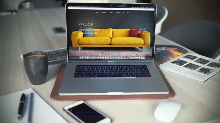
There was a time when going online meant waiting for a full website. For a small brand, that usually meant design rounds, copy edits, product photos, a few more edits, and a launch date that kept moving.
That playbook still exists, but it is not always the smartest way to start.
A smaller stack is often enough: one landing page, one link hub, one checkout or signup path, and a few strong visuals. That gives a brand enough structure to test demand, collect interest, and make the first sale without spending weeks building something that may need to be changed again later.
The goal is not to skip the website forever. It is to wait until the website has a real job.

Start with one job
The first page a customer sees should do one thing well: remove confusion.
If someone lands on it, they should know:
- what you sell
- who it is for
- why it matters
- what to do next
That is usually more useful than a polished homepage with six tabs and three slogans that all sound nice but say very little.
For an early brand, clarity beats completeness. If the offer is strong, people do not need a full tour. They need a clear next step.
Use a small hub as the first storefront
A link hub can do more than people expect. It can be the front door while the larger site is still being built.
One clean page can point to the product, the waitlist, the booking form, the latest drop, the social channels, and the contact email. That works because most early traffic does not arrive ready to browse. It arrives from a post, a DM, a mention, or a quick search.
A creator-style hub also keeps the experience simple on mobile, where most early clicks happen anyway. Instead of asking people to explore, it helps them act.
That is often enough at the beginning.
Let visuals carry the pitch
This matters even more for fashion, beauty, jewelry, food, and home goods. These categories sell visually first.
If the image works, the copy gets a chance. If the image is weak, the best headline in the world will not do much.
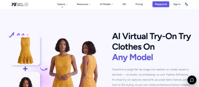
For a fashion brand, a virtual try on tool can help create fitting-room-style visuals from existing product assets before a full shoot is worth the spend. That means a small team can show fit, styling, and variation without waiting for a bigger production cycle.
The same logic applies in other categories too. A candle brand may need a lifestyle shot. A jewelry label may need close-up detail. A skincare brand may need one clean, believable product image. The job is not to make every asset perfect. It is to make the product easy to understand.
Keep the path to purchase short
A small brand can lose a sale simply by making the next step hard to find.
If a visitor has to click around to understand price, shipping, availability, or contact options, the odds of a bounce go up fast. The early launch page should make the path obvious.
A good setup usually includes:
- one button to buy
- one button to join the list
- one button to contact the brand
- one place to see what happens next
Nothing fancy. Just less friction.
The best early pages are easy to read quickly, especially on a phone, especially when the person is only half paying attention.
Add proof before you add polish
A new brand does not need to look bigger than it is. It needs to look real.
That can come from a few simple things:
- a short customer quote
- a founder note
- shipping or return details
- a clear batch size or launch window
- a few real photos instead of a full gallery
- one or two social posts that show the product in use
None of that is flashy, but it does the job.
People usually do not need more branding language. They need fewer reasons to hesitate.
Know when to build the full site
Skipping a full website is a phase, not a permanent strategy.
At some point, a bigger site becomes useful. That usually happens when:
- paid acquisition starts to matter
- search traffic becomes important
- the catalog gets larger
- support needs more structure
- the brand needs more room to tell its story
That is when a full website earns its keep.
Before that, a lighter setup can be the better move. It keeps the brand moving and gives the team real feedback instead of a long build cycle.
The common mistake
The biggest mistake is trying to look finished too early.
That usually leads to a site that takes too long to build, says too much, and still does not answer the basic question clearly enough. It feels complete, but it does not convert well because it was built to look ready instead of built to work.
A launch is not a final statement. It is a first test.
If the page helps people understand the product and take action, it is doing its job. The rest can grow from there.
A simpler way to start
For many small brands, the early stack can be surprisingly small:
- one landing page
- one link hub
- one checkout or booking flow
- one way to capture interest
- one way to reply fast
- a handful of strong visuals
That is enough to launch, learn, and improve.
By the time the full website is ready, it should be built on something real instead of a guess. And that usually makes the final site better anyway.


Comments