Personal Websites in 2026: What to Include and What to Skip


A personal website in 2026 should do one thing well: make it easy for people to understand who you are, what you do, why it matters, and what to do next. Many sites fail because they try to hold everything from old projects, extra bios, random links, and passing design trends. They may look polished, but they leave visitors unclear.
The best personal websites now work less like resumes and more like clear guides. They help recruiters see fit, clients see value, collaborators see direction, and readers see your point of view.
The job of a personal website has changed
A few years ago, many people treated personal websites as optional branding assets. They were nice to have, but not always necessary. In 2026, that is no longer the right frame. A personal website has become a filtering tool. It helps people quickly decide whether you are relevant to them.
That matters because attention is fragmented. Employers check LinkedIn, creators build on social, freelancers work through platforms, and founders often live across product pages, newsletters, and communities. People rarely arrive at your website with unlimited patience. They come with a question in mind. Who is this person? What do they actually do? Are they credible? Can they help me? Should I contact them?
A good personal website answers those questions fast. A weak one delays them behind animation, vague copy, oversized personal philosophy, or a flood of links with no hierarchy.
What a personal website is expected to do in 2026
| Visitor type | What they want quickly | What your site should do |
| Recruiter | Role fit, proof of work, clarity of experience | Show expertise, outcomes, and relevant projects |
| Client | Services, credibility, easy contact path | Explain offer, proof, and next steps |
| Collaborator | Focus area, style of work, current interests | Show what you are building and how you think |
| Reader or follower | Context behind your ideas or content | Connect your perspective to your work |
| Event organizer or media contact | Bio, topic expertise, speaker value | Provide a polished summary and contact route |
Start with the first question a visitor will ask
Most personal websites are built from the owner’s perspective. That is the problem. The owner thinks about what they want to say. The visitor thinks about what they need to know. Those are not always the same thing.
The most useful way to structure a personal website is to begin with the visitor’s first question. Usually it is not “What is your journey?” It is something much more direct:
● What do you actually do?
● Why should I trust you?
● Is this person relevant to what I need?
● Where can I see the work?
● How do I contact you?
That is why personal websites in 2026 work best when they are built around information priority, not self-expression alone. Personality matters. Voice matters. Visual identity matters. But they only work when the practical questions are answered first.
What every strong personal website should include
The best sites vary by profession, but a few elements now matter across almost every category. The difference is not whether you include them. It is how clearly and selectively you present them.
Core sections worth including
| Section | Why it matters | What it should contain |
| Clear homepage intro | Sets the context immediately | Who you are, what you do, who you help |
| Work or portfolio section | Proves capability | Selected projects with outcomes and context |
| About page | Adds depth and trust | Concise story, expertise, approach, current focus |
| Contact path | Converts interest into action | Email, form, booking link, or collaboration CTA |
| Proof layer | Builds credibility | Testimonials, metrics, clients, publications, speaking, results |
| Current activity | Shows relevance | Newsletter, recent writing, products, projects, or experiments |
These sections are not important because they look complete. They are important because together they answer the visitor’s core questions without forcing them to search.
The homepage should explain, not impress
In 2026, the homepage has one critical role: orientation. It should tell people what kind of professional or creator you are, what area you work in, and what kind of value you create.
Too many personal websites still open with theatrical copy that sounds polished but says very little. Phrases like “building at the intersection of creativity and innovation” or “helping ideas come to life” sound elegant and empty at the same time. Visitors do not need brand fog. They need clarity.
A stronger homepage usually includes:
● a sharp one-line description of what you do
● a short supporting paragraph with context
● one or two strong calls to action
● selected proof or featured work
● clear paths to deeper sections
For example, a product designer, writer, consultant, engineer, strategist, or creator should not sound interchangeable. The homepage should reduce ambiguity, not create it.
Weak homepage language vs stronger homepage language
| Weak version | Why it falls flat | Stronger direction |
| I build meaningful digital experiences | Too broad, says little | Product designer focused on B2B SaaS onboarding and retention |
| I help brands grow online | Generic and crowded phrase | Content strategist helping SaaS brands turn research into conversion-led articles |
| Passionate about storytelling and innovation | About you, not the visitor | Writer covering AI, creator tools, and digital product shifts with reported analysis |
| Creating impact through design and strategy | Abstract and overused | Freelance brand designer for early-stage startups that need sharper positioning |
Your work section should show judgment, not volume
One of the clearest shifts in personal websites is that more work no longer creates more trust by default. Better selection creates more trust.
Visitors do not want a dump of everything you have touched. They want evidence that you know what matters, what to highlight, and how to frame your contribution. That means the work section needs editing. A small number of strong projects almost always beats a long archive with weak context.
Each project should answer a few practical questions:
● What was the challenge?
● What exactly was your role?
● What changed because of the work?
● Why is this project relevant to the kind of opportunities you want now?
That last question matters most. A portfolio is not only about the past. It is also a signal about the future you want.
The About page still matters, but it must earn its space
Many people either overbuild or underbuild the About page. They either turn it into a memoir or reduce it to two lines and a headshot. Neither approach is ideal.
In 2026, a good About page should do three things at once. It should humanize you, establish credibility, and sharpen positioning. It is not there to repeat the homepage. It is there to give the visitor more confidence in how you think, what you focus on, and what kind of work you are suited for.
A strong About page usually includes a concise narrative, not a long autobiography. It may mention background, career evolution, principles, or current interests, but it should stay tied to relevance. The question is never “What is everything about me?” The question is “What helps the right person understand me more clearly?”
What a strong About page should do
| Goal | What it looks like in practice |
| Humanize | A clear voice, not corporate filler |
| Position | Specific expertise and current direction |
| Build trust | Relevant experience, results, affiliations, or proof |
| Create connection | A sense of how you work and what you care about |
| Support action | A logical next step after reading |
Proof matters more now because claims are cheaper
In 2026, almost everyone knows how to present themselves well online. AI tools, templates, polished bios, and personal branding advice have made surface-level positioning easier than ever. That means proof matters more than it used to.
If your site says you are strategic, creative, growth-focused, highly skilled, or trusted, that language alone does very little. Visitors now expect evidence.
Useful proof can take several forms:
● measurable outcomes from your work
● logos of credible clients or employers
● selected testimonials with real specificity
● publications, speaking engagements, or featured appearances
● links to shipped work, writing, products, or public contributions
Proof works best when it is placed close to the relevant claim. A testimonial about strategic clarity should sit near your consulting offer. A measurable project outcome should sit near the case study. Trust is built faster when evidence appears exactly where doubt might arise.
A personal website should have a point of view, not just a profile
One major difference between forgettable personal websites and memorable ones is point of view. A profile tells people what you have done. A point of view tells them how you see the space you work in.
This matters because the internet is full of competent people. Competence gets attention. Distinct thinking creates recall.
That does not mean everyone needs a blog with dozens of essays. But most personal websites benefit from some signal of thought. This could be writing, notes, essays, talks, product experiments, a reading page, a current ideas section, or even a short statement on how you approach your field.
The goal is not to look intellectual. The goal is to sound alive. Visitors should feel that there is a real person behind the site with a clear angle, not just a static profile trying to look polished.
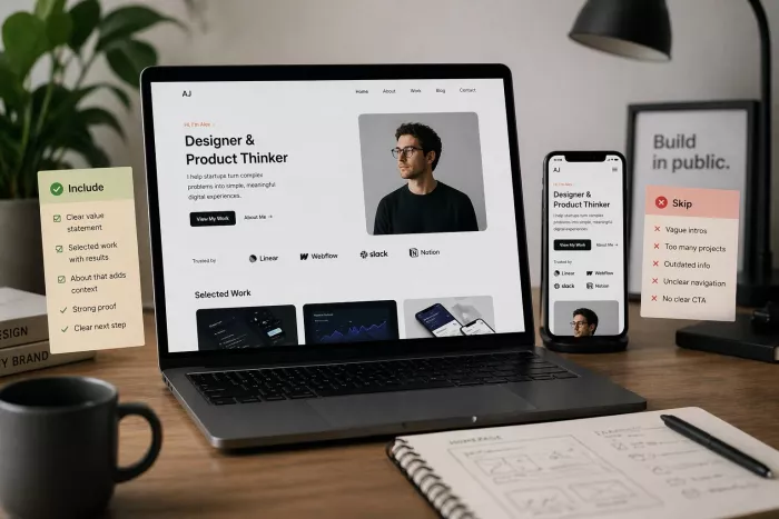
What to skip in 2026
The most common mistake on personal websites is not under-including. It is over-including. People add sections because they can, not because those sections improve understanding.
What to skip and why
| Element to skip | Why it weakens the site |
| Long inspirational intros | Delays clarity and often feels self-important |
| Massive project archives | Makes the strongest work harder to see |
| Decorative animations everywhere | Adds friction without adding meaning |
| Generic skill bars | Rarely credible and often visually dated |
| Vague mission statements | Sound polished but fail to inform |
| Too many social icons and links | Creates exits before the visitor understands you |
| Blog section with outdated posts | Signals neglect faster than silence |
| Stock phrases like passionate, innovative, visionary | Make you sound interchangeable |
| Overloaded navigation | Splits attention and weakens flow |
Skipping is not about making the site empty. It is about making it legible. Restraint is one of the clearest signs of maturity in personal website design now.
Not every personal website needs the same structure
A freelancer, job seeker, creator, founder, and independent researcher do not need identical websites. One reason many sites feel wrong is that they copy a structure from someone with a different goal.
The structure should match the outcome you want the website to create.
Different site priorities by user type
| Type of person | What the site should emphasize |
| Freelancer or consultant | Services, proof, case studies, contact path |
| Job seeker | Role fit, selected work, resume context, outcomes |
| Creator or writer | Point of view, content, audience trust, partnerships/contact |
| Founder | Vision, current product, background, media or speaking info |
| Researcher or specialist | Published work, expertise, credibility, clear bio |
This is where many people overbuild. They try to combine five identity types into one site. The result is confusion. A personal website works best when it has a primary job and a clear audience.
Design should support trust, not perform personality too hard
In 2026, visual polish is easier to achieve than ever. That is good news, but it also means visual polish is no longer a differentiator by itself. Clean templates are common. Smooth motion is common. Good typography is more accessible than before.
So design has to do something more important than look modern. It has to support trust.
That usually means:
● fast loading pages
● strong mobile readability
● typography that does not fight the content
● clear spacing and hierarchy
● restrained use of motion
● visual consistency across sections
A personal website should not feel like a design audition unless you are specifically being hired for visual experimentation. For most people, clarity outperforms novelty.
Writing quality is now a major differentiator
Because templates have improved and design systems are easier to use, writing now carries more weight. Two personal websites can look equally polished. The one with sharper language will usually feel more credible.
The writing on a personal website should be direct, specific, and grounded. It should avoid inflated claims and recycled phrases. It should sound like a real person who knows their work well, not like a machine generated brand statement.
Strong website writing does a few things consistently:
● it gets to the point quickly
● it names actual areas of expertise
● it explains work in terms of outcomes, not adjectives
● it helps the visitor move without confusion
● it removes filler that sounds nice but communicates little
If the design is clean but the writing is vague, the site still feels weak.
The best personal websites are maintained, not just launched
A strong personal website is not a one-time branding exercise. It is a live professional asset. That means it needs maintenance. Not daily updates, but regular care.
What often damages personal sites is quiet staleness. The website still exists, but the bio sounds old, the latest project is from two years ago, the blog is inactive, and the contact path is awkward. Nothing looks broken, but the site no longer signals momentum.
A better approach is to treat the website as a current representation, not a permanent monument. That means reviewing it periodically for relevance, clarity, and freshness.
Simple maintenance priorities
| Area | What to review |
| Homepage | Does the positioning still reflect what you want now? |
| Work section | Are the strongest and most relevant projects featured? |
| About page | Does the narrative still match your current focus? |
| Proof | Are results, testimonials, and affiliations still current? |
| Contact flow | Is it easy and obvious for the right person to reach you? |
| Content sections | Are inactive or outdated pieces hurting the site? |
A useful personal website in 2026 feels edited
That may be the single most important principle. A strong website does not feel stuffed. It feels chosen. The writing feels considered. The work examples feel relevant. The proof feels earned. The design feels calm. The visitor feels guided instead of overwhelmed.
That is what makes a site useful now. Not complexity. Not decoration. Not the number of pages. Not even how impressive it looks at first glance. What matters most is whether someone can arrive, understand you, trust you, and know what to do next.
Final thoughts
A personal website in 2026 should not try to be everything you have ever done online. It should be a clear, current, and selective representation of who you are professionally and what matters most right now.
Include what helps people understand your value, your credibility, your direction, and your next step. Skip what delays clarity, adds noise, or makes the site feel like a digital attic. Choose fewer projects, sharper words, better proof, and a structure that reflects your real goal.
The strongest personal websites today are not the busiest ones. They are the ones that respect the visitor’s time while making the owner easier to understand and easier to trust.

Comments