
Getting someone to tap your profile is the easy part. A good post, a sharp hook, a well-placed mention, and the visit happens almost on its own. What is harder, and far more quietly disappointing, is the moment right after: they look, they pause, and then they leave without doing a single thing you hoped they would.
That gap is where most profiles lose. Not in reach, not in views, but in the two or three seconds between landing and acting. The traffic shows up. The action does not.
This piece is about why that happens, and what is actually going on in a visitor's head during those seconds. The reasons are more specific than "your bio is weak," and once you can see them clearly, most of them are fixable.
The Click-Through Gap
Most people measure the wrong thing. They watch follower counts and view counts, because those numbers are big and they move. But a profile visit is a much more honest signal than a view. A view can be an accident of the algorithm. A visit is a decision. Someone saw you, got curious, and deliberately tapped through to learn more.
That makes the drop-off after a visit the real story. The visitor already said yes once. They raised their hand. And then, somewhere between arriving and acting, they changed their mind or simply drifted away. This is the click-through gap, the quiet distance between interested and engaged, where click-through rate helps reveal how much interest actually turns into action.
It matters because it is the cheapest traffic you will ever get. You already did the hard work of earning attention. The visitor is warm, present, and looking right at you. If they leave now, it is rarely because they were not interested. It is because something on the profile failed to carry the interest forward. Everything below is a version of that failure, broken down so you can spot which one is costing you.
What the Numbers Say
The scale of the drop-off surprises most people the first time they see it. Across link-in-bio setups, the commonly cited click-through rate sits somewhere between one and three percent of profile visitors, and a widely repeated figure is that only about one to three percent of the people who reach a profile actually tap the link. Put the other way around, that means roughly ninety-seven to ninety-nine out of every hundred visitors leave without clicking anything.
It helps to see the journey as two separate stages rather than one event. A viewer first has to decide to visit your profile at all, and only then decides whether to act once they are there. Each stage has its own leak, and they multiply.
| Stage | What happens | Rough conversion |
| View to profile visit | Someone sees your content and taps your name | around 2 to 5 percent |
| Profile visit to link click | A visitor reads the profile and taps a link | around 1 to 3 percent for most, 8 to 10 percent for the best |
The multiplying effect is the part worth sitting with. Because the two stages stack, small improvements compound hard. One analysis pointed out that lifting the profile-visit rate from three to four percent and the link-click rate from two to three percent can roughly double total clicks from the exact same number of views. You do not need more reach to get more results. You need the second stage to stop leaking.
One caution on benchmarks: treat any published average as a loose starting point, not a target. Engagement varies enormously by niche, and a figure that looks healthy in one category is weak in another. The only number that reliably guides decisions is your own trailing average, which means you have to actually measure it before you can improve it.
The First Three Seconds
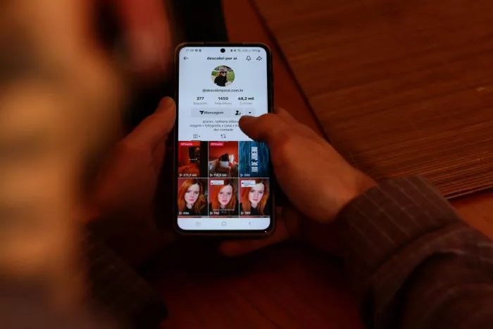
Before a visitor reads a word, they have already judged you. In the first couple of seconds on a profile, the brain is not reading, it is sorting. It takes in the picture, the layout, the overall shape of the page, and answers one blunt question: what is this, and is it for me. If the answer does not arrive fast, the visitor does not puzzle it out. They leave.
This is why a profile that is technically complete can still fail. All the information is there, but it arrives in the wrong order. The visitor needs the gist before the detail, and most profiles lead with detail. They list everything a person does before making clear who the profile is for or why anyone should care.
Three things get processed in roughly this order during those opening seconds:
● The visual impression, meaning the photo, colours, and whether the page looks deliberately made or thrown together. A page that looks cobbled together reads as untrustworthy before a single claim is tested.
● The sense of category, meaning whether the visitor can instantly slot you into a mental box: this is a fitness coach, this is a musician, this is a local bakery. Ambiguity here is expensive.
● The sense of relevance, meaning whether this appears to be for someone like them. A visitor forgives a plain design far more readily than they forgive the feeling that they are in the wrong place.
The practical takeaway is that the top of your profile is doing almost all the work, and it has to do that work pre-verbally. Clarity of impression beats completeness of information every single time in that window.
Clarity Beats Cleverness
The most common self-inflicted wound is a bio that sounds good and says nothing. Clever wordplay, a poetic tagline, an inside joke, a string of abstract nouns like "creator, dreamer, storyteller." It feels expressive to write, but to a stranger it is noise. They cannot tell what you offer, so they cannot decide to want it.
The test is simple and unforgiving. A first-time visitor should be able to finish the sentence "this is a profile for people who want ___" within a second or two of reading. If they cannot, the bio is working against you no matter how nicely it is phrased.
Here is the difference in practice:
| Clever but vague | Clear and specific |
| Helping you live your best life | Meal plans for busy parents who hate cooking |
| Lover of words and ideas | Weekly essays on personal finance for freelancers |
| Just a girl with a camera | Wedding photographer, booking 2026 dates now |
Notice what the clear versions do. They name who it is for, what they get, and often a hint of what to do next, all without a single clever flourish. Cleverness is not banned, but it has to ride on top of clarity, never replace it. The visitor who understands you in one second is the one who sticks around to be charmed by the rest.
Too Many Choices
This one runs against instinct, which is why so many people get it wrong. When you are unsure what a visitor wants, the natural move is to give them everything. Your shop, your newsletter, your latest video, your other social accounts, your podcast, your affiliate links, all stacked up so nobody misses anything. The logic feels generous. The result is paralysis.
When every option looks equally important, none of them feels urgent, and a visitor faced with a dozen equal choices often makes the easiest one available, which is to close the tab. The same problem affects a link-in-bio landing page when every button competes for attention. A page with fourteen links does not offer fourteen chances to convert. It offers one chance to feel overwhelmed.
The fix is to decide, before the visitor arrives, what the single most valuable action is for most people most of the time. That becomes the obvious priority, placed first and styled to stand out. Everything else is demoted or removed. A rough ordering that works for most profiles:
● One primary action that you genuinely want the majority of visitors to take, given clear visual weight at the top.
● Two or three secondary links for the people who want something specific, sitting below and visibly lighter.
● Everything else either folded away, grouped, or cut entirely, because a link that distracts from the primary action is costing you more than it earns.
The uncomfortable part is that focusing the page means accepting you will serve some visitors less well. That trade is almost always worth it. A profile that tries to be everything to everyone converts no one in particular.
Trust Signals Missing
Sometimes the visitor understands you perfectly and still does not act, because they do not yet trust you enough to spend a click. A click costs something small but real: attention, a moment of risk, the faint fear of landing somewhere spammy. If the profile gives no reason to believe that risk is worth taking, hesitation wins.
Trust is built from small, specific signals rather than grand claims. Saying you are the best is a claim. Showing that four thousand people subscribe, or that a recognisable brand worked with you, or that real customers left real reviews, is evidence. The brain treats evidence and claims very differently, and only one of them lowers the bar to act.
The signals that tend to matter most on a profile:
● Proof that other people already trust you, whether that is subscriber numbers, client logos, testimonials, press mentions, or visible activity that shows the account is alive and tended.
● A sense of a real person or real operation behind the page, through a genuine photo, a specific name, and a bio that sounds like it was written by someone rather than assembled from buzzwords.
● Consistency across the surfaces a visitor can see, so the profile, the links, and the destination all look like they belong to the same careful person.
The cheapest trust win most people ignore is simply looking tended. A profile that was clearly updated recently, with current links and a current offer, signals that someone is home. A stale page signals the opposite, and stale is its own quiet form of distrust.
The Friction You Cannot See

Some visitors leave for reasons that have nothing to do with your words or your offer. They were willing. The page simply made acting harder than staying, and so they stayed nowhere. This friction is easy to miss because you rarely experience it yourself. You load your own page on a fast connection, on a familiar device, already knowing where everything is.
Speed is the biggest hidden tax. Research on mobile pages has found that a majority of visits are abandoned when a page takes more than about three seconds to load, and that every extra second of delay sharply raises the odds that someone bounces. On a profile page heavy with images, embeds, and tracking scripts, those seconds add up fast, and the visitor who leaves during a loading spinner never even sees your careful bio.
The other friction points are smaller individually but they stack:
● Broken or outdated links that send a motivated visitor to a dead end, which does not just lose that click, it damages trust for every other link on the page.
● Too many steps between intent and payoff, such as a link that leads to a page that leads to another page before anything useful appears.
● Forms or logins demanded too early, asking a stranger to commit before you have given them a reason to.
● Layouts that fight the thumb on mobile, with tap targets too small or too close, so acting takes effort and effort invites second thoughts.
The discipline here is to test your own profile the way a stranger would. Open it on your phone, on a normal connection, and tap every link. Most people have never done this, and most people are quietly losing visitors to problems they could fix in an afternoon.
Weak or Absent CTAs
A surprising number of profiles never actually ask for anything. They describe, they list, they display, and then they trust the visitor to figure out the next move on their own. Most visitors will not. People do what they are told to do far more readily than what they are left to infer, and a profile without a clear instruction leaves that energy on the table.
The weakness usually shows up in the link labels. "Click here," "my link," "website," or just a bare URL tells the visitor nothing about what happens next or why it is worth it. A good call to action names the action and the payoff in the same breath. Compare the two columns below and notice how the stronger versions answer the visitor's silent question, what do I get.
| Passive and vague | Active and specific |
| Click here | Get the free meal plan |
| My shop | Shop this week's new drops |
| Latest video | Watch the 5-minute setup guide |
| Link | Book a free 15-minute call |
Three principles make a call to action land. Use a verb that names the action, so the visitor knows exactly what tapping does. Attach the benefit, so they know why it is worth the tap. And match the wording to what the visitor wants, not only to what you want, because a CTA framed around their goal converts better than one framed around your sale.
Placement matters as much as wording. The primary action should sit where the eye lands first and carry the most visual weight, not buried three links down where only the most patient visitor will reach it.
Mismatch Between Promise and Payoff
This is the leak almost nobody checks for, and it is often the largest. A visitor rarely arrives at your profile out of nowhere. They came from something specific: a video about one topic, a post that made one promise, an ad with one hook. That something set an expectation. If the profile does not continue that exact thread, the visitor feels a small, often unconscious jolt of wrongness, and they leave.
Think of it as a conversation that got interrupted. The post was the opening line. The visitor tapped through expecting the next line. If the profile instead talks about something unrelated, the conversation breaks, and a broken conversation is easy to walk away from. The classic version of this is a creator whose viral video is about one niche while the bio and link point somewhere completely different.
The problem compounds because different traffic sources carry different expectations. A visitor from a cooking video and a visitor from a business post are two different people with two different unfinished sentences, and a single static profile can only finish one of them well.
● When a particular post or campaign is driving most of your visits, make the profile and the top link speak directly to that post, even temporarily.
● When traffic comes from many directions at once, lead with the thread that matters most right now and accept that you are optimising for the majority.
● Whenever you push a specific piece of content hard, check that the profile it points to actually pays off what that content promised, rather than whatever was relevant three campaigns ago.
The principle underneath all of it is continuity. The profile should feel like the natural next step from whatever brought the visitor there, not a hard left turn into unrelated territory.
Designing for the Scanner
Everything so far points to one shift in how you think about a profile. You are not writing for a reader. You are designing a scanner. Nobody studies a link-in-bio page top to bottom. They flick their eyes down it, catch a few anchors, and decide. Your job is to make the right things catchable.
Scanning rewards structure over substance in the first pass. A page with clear visual rhythm, where the eye knows where to rest and what to tap, feels effortless, and effortless is what keeps a visitor moving toward the action. A dense, evenly weighted page feels like work, and work is where people quit.
A few design habits do most of the heavy lifting:
● Give one element clear dominance, so the eye has an obvious first place to land and an obvious first thing to do.
● Use space deliberately, letting the page breathe so each link reads as a distinct choice rather than one block of sameness.
● Order by priority, not by chronology or convenience, because whatever sits at the top will always collect the most taps regardless of what deserves them.
● Keep the labels short and scannable, since a scanner reads shapes and keywords before they read full sentences.
The quiet goal is to lower the cognitive cost of the whole visit. Every bit of confusion, every moment of "wait, which one," is a small tax that some visitors will refuse to pay. A profile designed for scanning does the deciding for them, and a visitor who does not have to think is a visitor who acts.
Small Fixes, Big Shifts
The encouraging part of all this is that the highest-leverage fixes are usually the smallest. You rarely need a redesign. You need to remove friction and sharpen a few words. Here are the changes that tend to move the number most for the least effort, roughly in order of payoff.
● Rewrite the first line of your bio so a stranger knows in one second who it is for and what they get. This single change often does more than everything below it combined.
● Cut your links down to the few that matter, and give the single most important one clear visual priority over the rest.
● Relabel every link so it names the action and the benefit instead of saying "click here" or showing a bare URL.
● Open your own profile on your phone, on a normal connection, and tap every link to catch slow loads and dead ends before your visitors do.
● Add one real trust signal near the top, whether a number, a testimonial, a recognisable name, or simply evidence that the account is active and current.
● Point your top link at whatever is actually driving your traffic right now, so the profile finishes the sentence your content started.
Resist the urge to do all six and then wait. Change one thing, watch the number for a week or two, then change the next. The point is not to guess your way to a better profile. It is to learn which specific fix mattered for your specific audience, and you only learn that by moving one variable at a time.
Final Thought
If there is one idea to carry away, it is this. A profile is not a directory of everything you do. It is a promise, made in a couple of seconds, that the visitor either believes or does not. Every click-away is that promise quietly failing to land.
Seen that way, the long list of reasons collapses into something simpler. The vague bio breaks the promise of relevance. The crowd of links breaks the promise of an easy next step. The missing trust signals break the promise that this is safe and real. The slow page, the dead link, the limp call to action, the mismatch with whatever brought the visitor there, each one is a small broken promise, and visitors leave broken promises without a second thought.
So the work is not really about clicks. It is about keeping a promise clearly enough and quickly enough that a curious stranger feels safe taking the next step. Get that right and the clicks follow on their own, because you were never short on interest. You were only ever losing people in the gap between interested and sure. Stop thinking of your profile as a place to list things. Start treating it as a promise you have two seconds to keep.


Comments