
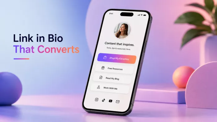
Most bio pages are a list of fourteen buttons that convert almost no one. The fix isn't a better tool, it's a sharper decision about what you're actually asking people to do.
Here's the trap almost everyone falls into: they treat the link in bio like a directory of everything they offer. Every product, every channel, every "check this out" gets its own button, and the logic feels sound, give people options, let them pick. But a list asks the visitor to choose, and choosing is work. Give someone three seconds and eight identical buttons, and the easiest decision is to close the tab.
The reframe is worth holding onto before you build anything: your bio link isn't a menu. It's a single decision you're asking a warm visitor to make. They tapped through because they already watched your video or read your post and they arrived knowing you. A page that greets them like a stranger scanning a lobby board throws that head start away. What follows is how to build one that does the opposite: points attention at one action and clears everything else out of its path.
Why most bio pages quietly fail
The fixes only make sense once you can see the mechanism underneath the failure. In almost every underperforming page, one of these four is doing the damage:
• Choice overload flattens everything. When every link is styled to look equally important, none of them is. Attention has to land somewhere, and if the page won't decide where, the visitor won't either. Every button you add quietly borrows urgency from the one that actually pays your bills.
• Context collapse. One visitor arrived from a recipe reel, another from a post about your coaching program. A single static page can't speak to both, so it drifts toward being vaguely relevant to everyone and genuinely compelling to no one.
• The warm-traffic mismatch. This is the expensive one. These aren't cold prospects you're convincing from scratch; they already trust you enough to tap. Yet the typical page opens with "Welcome to my links!" a line that carries zero information and spends the visitor's warmest moment on a wave hello.
• Fighting the phone. Nearly all of this traffic is a thumb on a small screen. If your primary action sits below three swipes of links, or the tap target is cramped, the design is quietly working against the only device it will ever really be seen on.
Decide what "converts" means first
"Converts" is an empty word until you name the one action that counts. A conversion is a specific thing you want a visitor to do: join your email list, buy one product, book a call, claim a spot on a waitlist. A click is not a conversion. Someone who taps a link and then leaves is just a more expensive bounce.
So pick one primary goal per page and rank everything else against it. That ranking is the whole game. The most useful mental model I've found is a three-tier hierarchy, where each tier gets a deliberately different amount of visual weight:
A working hierarchy for a single bio page
| Tier | What it's for | How it should look |
| Primary | The one action that defines success right now your email capture, launch, or booking link. | Impossible to miss. Full-width button, filled color, near the top, benefit-led label. |
| Secondary | Supporting paths for people not ready for the main action your latest content, shop, or portfolio. | Present but visibly demoted. Outline style or lighter weight, sitting below the primary. |
| Tertiary | Housekeeping links people seek out on purpose contact, other socials, press. | Small and quiet, near the bottom. Text links or icons, not buttons competing for the eye. |
The discipline here is subtraction. If a link doesn't clearly serve the primary goal or earn its place as a genuine secondary path, it belongs on tier three or off the page. A bio link with three well-ranked links will almost always out-convert one with twelve equal ones, because you've done the visitor's sorting for them.
The anatomy of a page that converts
Walk the page top to bottom the way a visitor's eye actually travels. Each element has a job, and each one has a lazy default that quietly kills momentum.
The identity block
Your photo, name, and one line of copy at the top. The photo and name build recognition in a fraction of a second fine. The line underneath is where most pages waste their best real estate on "Welcome to my page." That line should answer the only question a visitor is silently asking: what's in this for me?
Weak: "Content creator & coffee lover." Stronger: "I help freelancers land better clients start with the free rate guide below."
The second version does real work: it names who the page is for and points straight at the primary action. These are the same instincts that make a full-size creator page succeed, just compressed into a phone-width strip worth understanding the principles behind a great creator landing page before you shrink them down to bio scale.
The primary call to action
This is the button that earns the page. Three things decide whether it works:
• Position. Put it in the thumb zone in the lower-middle band of the screen a thumb reaches without stretching or high enough that it's visible before any scrolling. Never bury the one action you care about beneath the ones you don't.
• Contrast. It should be the most visually distinct thing on the page. If your secondary links are outlined, the primary is filled. If everything is a soft pastel, the primary gets the one saturated color you allow yourself.
• Copy. Label the button with the benefit, not the mechanic. The words describe what the visitor gets, not what the software does.
Weak: "Sign up" / "Click here" / "Learn more." Stronger: "Get the free workout plan" / "Save my seat" / "Send me the templates."
Ordering, proof, and friction
Below the primary CTA, three smaller decisions add up:
• Order by intent, not by recency. The sequence of links is a ranking, and visitors read it as one. Put the paths you most want taken nearer the top, and resist the urge to pile on today's new thing just because it's new.
• One piece of social proof beats five. A single specific line "3,200 people have downloaded this" or one short testimonial reassures without cluttering. A wall of logos and star ratings on a phone reads as noise and gets scrolled past.
• Reduce friction with expectations. Small phrases that tell people what happens next lower the cost of tapping: "takes 30 seconds," "no card needed," "one email a week, that's it." You're removing the tiny hesitations that stop a warm visitor mid-tap.
Write for people who already know you
A cold landing page has to earn belief from zero. Your bio page doesn't say the visitor already gave you a tap on the strength of your last post. That changes how you write. You can skip the throat-clearing and the credentials pitch, and go straight to the specific, useful thing.
Specificity is what carries a warm copy. "Grow your business" is the kind of phrase a stranger might need reassuring with; someone who already follows you wants the concrete version "the exact email I send to reactivate a cold client." Clever wordplay tends to slow people down because they have to decode it. Plain and precise almost always converts better than plain and clever, and clever nearly always loses to specific.
THE CORE IDEA Every link you add makes your most important one harder to find. Design the page around the one action you'd be genuinely happy to get, and treat everything else as a supporting act. |
Match the page to where the click came from
The best bio pages aren't set-and-forget they move with your content. The person tapping through today likely just saw the thing you posted today, so the top of your page should point at whatever that thing leads to. When you launch a product, the primary link becomes the launch. When the launch ends, it swaps back to your email capture.
If you post across very different topics, you can push this further by sending different audiences to different destinations, or by rewriting the primary link's copy to echo the post that's currently driving traffic. It's a small habit to edit a thirty-second edit when you publish but it closes the gap between what someone just watched and what they land on, which is exactly where context collapse does its damage.
Measure the one number that matters
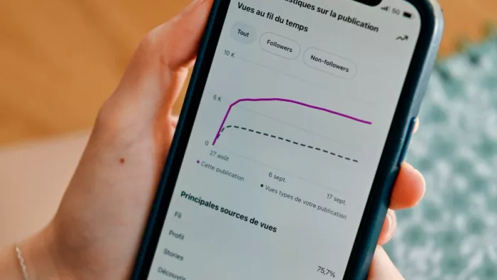
Most people track total clicks, which feels productive and tells you almost nothing. Clicks measure curiosity. The number that measures whether the page works is the conversion rate on your primary action of the people who landed, what share did the one thing you built the page to get.
Improve it by changing one element at a time so you can tell what actually moved the needle. Test the primary button's copy for a couple of weeks, then its position, then the tagline above it never all three at once, or you'll never know which one earned the lift. A light monthly review is plenty: look at the primary conversion rate, change one thing, watch, repeat.
The mistakes worth avoiding
Most underperforming pages share the same handful of missteps. Each has a clean fix once you can name it:
| The mistake | Why it fails | The fix |
| Every link styled identically | No hierarchy means no attention lands anywhere | Give the primary action visual dominance; demote the rest |
| Generic button copy ("Click here") | Describes the mechanic, not the reward | Lead the label with the benefit the visitor gets |
| Ten-plus links on one page | Choice overload; the important link gets buried | Cut to three or four; move the rest to tier three or off |
| A static page for varied content | Speaks to no single visitor's actual context | Update the top link to match what's driving traffic now |
| Designed on desktop, viewed on phone | Tap targets and layout break in the thumb zone | Build and test mobile-first, one-handed |
None of this depends on a particular platform. You can hand-build a page, use a dedicated link tool, or lean on one of the AI landing page builders to generate a clean, mobile-first starting layout you then strip down to the hierarchy above. The tool is a detail. The thinking is the work.
The verdict
A link in bio that converts isn't the one with the most options, it's the one that makes a decision on the visitor's behalf. You're catching people at their warmest, right after they chose to tap, and the page either channels that intent into a single clear action or dissipates it across a dozen equal buttons.
So the move today is subtraction, not addition. Open your page, decide the one action you'd be genuinely glad to get more of, give it the top spot and the boldest button, and demote or delete everything that competes with it. That single edit will do more for your conversion rate than any redesign because it fixes the actual problem, which was never the tool. It was asking people to choose.


Comments