
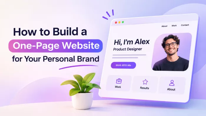
Most personal websites fail for the same reason, which is that they try to be everything at once. A row of menu links, a blog nobody updates, a portfolio buried three clicks deep, and somewhere in the middle of it all the actual person gets lost. The version that works is almost always the simplest one, a single page that says who you are, shows a little proof, and points to one clear action.
A one-page site is not a smaller version of a real website, it is a sharper one. This guide walks through how to build it properly, from the single decision that shapes everything else to the technical details people quietly get stuck on, so the result is a page that earns its place rather than one that simply sits there.
Why One Page Is Enough
For a personal brand, a focused single page almost always beats a sprawling site with a menu full of links nobody finishes reading. Visitors do not want to navigate your life, they want to understand who you are and what you can do for them in one unbroken scroll. When everything lives on one page, you control the order in which the story unfolds.
The constraint is the whole point. A single page forces you to cut the filler, choose what truly represents you, and lead the reader toward one outcome. It is also easier to build, cheaper to host, and quicker to load, so you are far more likely to actually finish it instead of leaving a half-built site live for two years.
Decide the One Job First
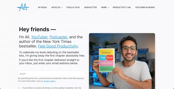
Before you touch a single design choice, settle what the page is for. A personal site can get you hired, grow a newsletter, book discovery calls, or sell a service, but it cannot do all of those at once without blurring into noise. Pick the one outcome that matters most right now, because every section, line of copy, and button you add should bend toward that single job.
This decision is the backbone of the page. Once you know the goal is, say, booking paid calls, you instantly know what the hero should say, which proof to show, and what the final button does. Skip it and you get a pretty page that leaves people impressed but unsure what you actually want from them.
Know Who You're Talking To
A page written for everyone speaks to no one. Decide on the single visitor you most want to reach, whether that is a hiring manager, a potential client, or an editor, and write every line as if that one person is reading it. A clear personal brand strategy makes it easier to identify what that audience values and which achievements deserve attention. When you picture a real reader, your language sharpens on its own, and the vague professional fluff that creeps into personal sites starts to fall away.
Knowing your reader also tells you what to leave out. A recruiter cares about outcomes and credibility, while a client cares about whether you can solve their specific problem, so the same achievements get framed differently for each. Choose the reader, then let their priorities decide what earns space on a page where space is deliberately scarce.
The Anatomy of the Page
A one-page site follows a fairly reliable structure, top to bottom, because that order matches how a stranger decides whether to trust you. You do not need every block below, but you should know what each one is for before you drop it in. The core sections break down like this:
| Section | What it does |
| Hero | States who you are and who you help in the first screen, before any scrolling |
| Proof | Shows logos, results, or testimonials that back up the claim you just made |
| About | Tells your story in a way that connects it to the reader's need |
| Work | Displays a few strong examples of what you have actually done |
| Offer | Spells out the service, role, or thing you want the visitor to take up |
| Call to action | Gives one clear, repeated next step tied to the page's single goal |
Treat this as a skeleton, not a rulebook. A freelance designer might lead with work while a consultant puts proof front and centre, but the flow from claim to evidence to action stays the same whatever you are selling.
Write a Hero That Lands
The hero is the first screen a visitor sees, and it decides whether they keep scrolling or close the tab. The job here is not to sound impressive, it is to be instantly clear. A strong hero states who you are, what you do, and who you do it for, in a single plain line a stranger could read aloud and understand without context.
The quickest way to ruin this is with empty labels. Calling yourself a "visionary creative" or a "passionate problem-solver" tells the reader nothing, because those words fit everyone and describe no one. Compare the two approaches directly:
• Weak: "Creative professional passionate about building meaningful experiences", which could belong to literally anyone in any field.
• Strong: "I design websites that turn small-business visitors into paying customers", which names the work, the audience, and the result in one breath.
Say the real thing plainly and you will already stand out, because most people never do. The hero is not the place for mystery, it is the place for the single clearest sentence on the page.
Show Proof, Not Claims
Anyone can describe themselves well, so the part of your page that builds trust is the evidence. Proof turns a nice claim into a believable one, and for a personal brand it carries more weight than any adjective. The strongest forms are specific and verifiable rather than vague and self-awarded, so lean on these:
• Recognisable logos of companies, publications, or clients you have genuinely worked with, which borrow their credibility for a moment.
• Real testimonials with a full name and, ideally, a role, since an anonymous quote reads as something you wrote yourself.
• Concrete numbers and outcomes, such as revenue moved, audience grown, or projects shipped, that show results instead of promising them.
If your brand runs on numbers, show them as a visual rather than burying them in a sentence. A clean chart of your growth reads in a second and looks more credible than a line of text, and a tool like chartgpt.co turns those figures into a presentation-ready chart you can drop straight onto the page. The rule throughout: specifics beat adjectives, every time.
Write the About Section Properly
The about section is where most personal sites quietly fall apart, usually because they turn into either a dry CV or a wall of self-congratulation. Neither works, because a reader does not care about your full career timeline, they care about the parts of your story that explain why you are right for what they need. Tell it as a short narrative, not a list of jobs and dates.
The real trick is to make your about section secretly about the reader. Rather than listing everything you have ever done, pick the experiences that connect to the outcome they are after, and write in your own voice instead of stiff corporate speak. A good about section leaves the reader feeling you understand their situation, which matters far more than them knowing every step of your path.
Design and Visual Identity
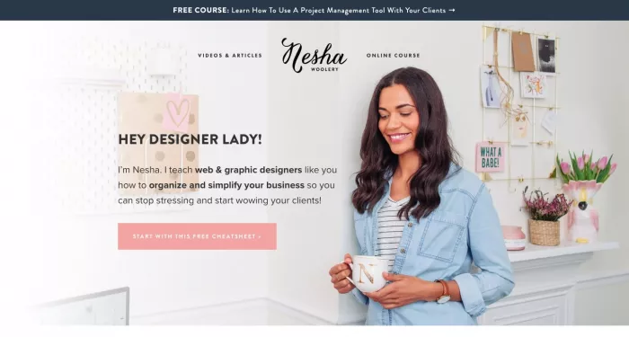
Design on a personal page is less about flair and more about signalling that you are organised and trustworthy. Consistency does that job better than any clever effect, and it is far easier to pull off. A few disciplined choices will carry the whole look, so apply them everywhere:
• Stick to one or two fonts, typically one for headings and one for body text, so the page feels composed rather than chaotic.
• Limit your colours to a small palette of two or three, used the same way throughout, which reads as deliberate instead of accidental.
• Use real, good-quality photos of yourself, because a genuine face builds a connection that a stock image or an avatar never will.
• Give the page room to breathe with generous whitespace, since crowding everything together makes even strong content feel cheap.
None of this requires design talent, only restraint. When in doubt, remove something rather than add it, since a clean page almost always looks more professional than a busy one.
Pick the Right Tool
How you build the page depends on how much control you want against how much effort you are willing to spend. The best option is the one that fits your comfort with technical work and your budget, so it helps to weigh the realistic choices side by side before committing.
| Tool | Best for |
| Carrd | The fastest, cheapest route to a clean one-page site with almost no learning curve |
| Framer | Designers who want polish and animation without writing code, at a moderate price |
| Webflow | Full visual control and room to grow, in exchange for a real learning curve |
| Hand-coded HTML | Developers who want total control and a page that loads almost instantly |
For most people building their first page, a no-code builder like Carrd or Framer is the sensible start, since it gets you live in an afternoon rather than a fortnight. You can always rebuild on something heavier later, and a simple page that exists today beats a sophisticated one you are still planning six months from now.
Domain, Hosting and Setup
A custom domain is the one spend worth making, because yourname.com signals that you take yourself seriously in a way a free builder subdomain never will. Buy it from a registrar, point it at whichever tool you chose, and you are most of the way there, since nearly every modern builder includes hosting and walks you through connecting it.
Keep the setup boringly solid rather than clever. Make sure the site loads over a secure connection, which every reputable host now provides by default, and set up a professional email on your domain if you plan to let people contact you. These are small, one-time jobs, but skipping them is exactly the detail a sharp visitor notices and quietly holds against you.
One Clear Call to Action
Everything on the page has been building toward a single moment, and this is it. Return to the one job you chose at the start and turn it into one obvious action, whether booking a call, subscribing, or sending a message. Choosing the right CTA wording helps make that next step clear without adding unnecessary options. Give the visitor a single button, repeated at a couple of natural points down the page, rather than a scattered menu of competing options.
Competing calls to action quietly cancel each other out, because a reader faced with four possible next steps often takes none. If you want people to book a call, do not also ask them to follow you, download a file, and read your blog in the same breath. One clear ask, phrased as a direct instruction, beats a buffet of choices nearly every time.
SEO and Getting Found
A one-page site can still be found, it just works within tighter limits, so the basics matter more. Your name is the most important keyword you own, so it belongs in the page title and the opening line, and the page should use a sensible heading structure with real text rather than images of text. A few essentials cover most of the ground:
• Set the page title to your name plus what you do, since that is what shows up in search results and browser tabs.
• Write a genuine meta description that reads like a human wrote it, because it is often the first impression before anyone clicks.
• Add alt text to your images and use structured data for a person, which helps search engines understand who the page is about.
Search is only half the story. For a personal brand, most of your traffic comes from people who already heard your name somewhere, so link the site from every social bio, email signature, and profile you own. The page is the hub, and your scattered presence across the internet is what points people to it.
Make It Fast and Mobile-First
Most people who open your site will do it on a phone, often right after meeting you or hearing about you. If the page is slow to load or awkward to read on a small screen, you lose the exact people you built it for, in the moment their interest is highest. Mobile is not an afterthought here, it is the default view you should design for first.
Speed is mostly discipline with images. Compress your photos before uploading them, since an oversized hero image is the usual reason a simple page crawls, and test the live site on a real phone rather than trusting the desktop preview. A page that loads fast and reads cleanly on mobile outperforms a prettier one that stutters and forces people to pinch and zoom.
Launch and Keep It Alive
Before you share the link anywhere, do a careful pass over the whole page. Click every button, follow every link, read the copy aloud to catch awkward lines, and connect a lightweight analytics tool so you can see whether people take the action you designed for. A launch is not the finish line, it is the first real test of whether the page does its job.
The part most people neglect is keeping it current. Your proof, work, and offer all change as you grow, and a site frozen two years in the past quietly undersells you to everyone who finds it. Set a reminder to revisit it every few months, because a page that stays honest about where you are now is worth far more than a polished one describing who you used to be.
Final Thoughts
The real strength of the single-page approach is ownership. Social platforms rent out an audience and can change the rules overnight, but a page on a personal domain belongs entirely to the person behind it, and it keeps doing the quiet work of representing them even while they sleep. That ownership alone makes it worth the afternoon it takes to build.
The smarter move is almost always to ship a simple version this week rather than chase a perfect one for months. Pick the one job, write the clearest hero line possible, show a little real proof, and point everything at a single action. A page can be refined forever once it is live, but a plain one that exists and does its job will always beat a brilliant one that never leaves the drawing board.


Comments