
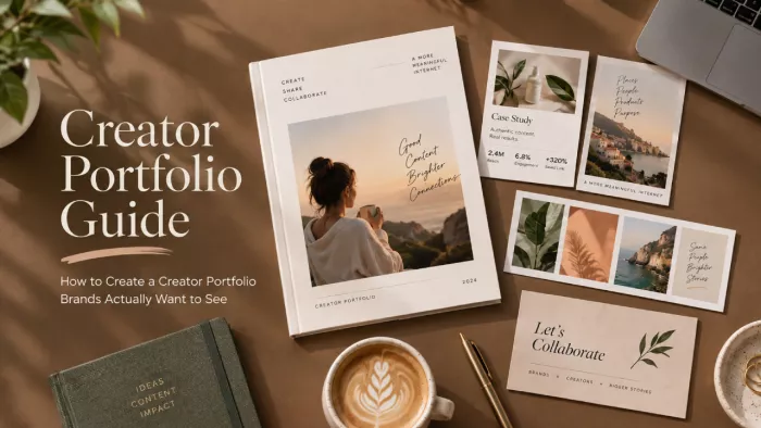
Most creators build a portfolio as proof they’ve been busy. Brands read it as proof of something narrower and far more useful: what happens when they hand you a brief.
A portfolio isn’t a highlight reel of everything you’ve ever made it’s a curated argument that you can make something worth paying for, aimed squarely at the one brand looking at it right now. The editing is the pitch. And because you’re a creator, the smartest place to host that argument is your link in bio, where a brand meets your best work the moment they tap through from your profile.
Part one : Get the premise right
What a portfolio is actually for (and how it differs from a media kit)
These two documents get blurred constantly, and mixing them up costs deals. A media kit sells your audience who follows you, how many, how engaged, and what it costs to reach them. A portfolio sells your craft, what you can make, and what that work went on to do.
One answers “is this creator’s audience my customer.” The other answers “can this person make something I’d put my brand’s name on.” A brand hunting for someone to produce Reels doesn’t want a page of demographics; they want to see three Reels you made that stopped them scrolling. Know which document does which job and you’re already ahead of most of the inbox.
The single question your portfolio has to answer
Strip away the layout and the case studies, and every strong portfolio answers one silent question forming in the viewer’s head: can I picture this person making something great for us? Not “are they talented in the abstract” talent is cheap and everywhere. The question is narrower: can the brand imagine their product, specifically, in your hands.
That reframe changes what belongs in the portfolio and what quietly doesn’t. Work that shows off but doesn’t help a brand picture the collaboration is just noise wearing a nice outfit. Everything you include should make that mental image easier to form.
Would a brand who’s never met you know exactly what to hire you for after thirty seconds? If your work says five different things, it says nothing.
Part two: Choose and present the work
Curation is the skill: why a smaller portfolio wins
Here’s the counterintuitive heart of it: eight sharp pieces beat forty decent ones, every time. A portfolio isn’t judged by your average, it's judged by its floor. The weakest thing you choose to show sets your ceiling in the viewer’s mind, because they assume it’s there because you’re proud of it.
Which means the real work is deciding what to leave out. What you cut signals taste and judgment of the exact qualities a brand is trying to hire. A bloated, everything-I’ve-made portfolio quietly announces that you can’t tell your good work from your average work, and that’s a worrying trait in someone you’re about to hand creative control to.
Curator’s cut Keep : The piece that made a brand reuse it in their own paid ads. Cut : The piece you only kept because it took you three days to make. |
How to choose your strongest work
Think of selection as a filter, not a scrapbook. A piece earns its place only if it clears all of these, not just one:
● It points toward the work you want next, not just the work you happened to do. Your portfolio is a job application for your future, so fill it with the kind of thing you want more of.
● It’s genuinely well-made, and would survive a professional in that field looking closely, not just “good for me at the time.”
● It’s tied to a result you can actually name, even a modest one, so the piece argues for itself rather than just decorating the page.
● It represents how you really work, not a lucky one-off you couldn’t reliably repeat if a brand paid you to.
And the uncomfortable rule most creators resist: your favourite piece and your most hireable piece are often not the same one. The moody passion project you love may say less to a brand than the clean, on-brief product video you find slightly boring. Choose for the client’s decision, not your ego.

The anatomy of a single portfolio entry
A portfolio piece is never just the asset, it's the asset plus its story. A gorgeous video with no context asks the viewer to do the work of imagining why it mattered, and most won’t bother. The fix is to treat every entry as a tiny case study: the brief or goal, your specific role, what you actually made, and what it achieved.
Here’s that structure filled in, so it’s concrete rather than theoretical:
Sample entry Cold-brew launch short-form video series The brief : A small-batch roaster wanted to sell out a limited summer cold brew in two weeks, with no ad budget. My role : Concept, script, filming and edit for a three-part Reels series; I also wrote the captions and hashtag set. What I made : Three 20-second Reels built around a “first cold brew of summer” hook, shot to feel handheld and unpolished on purpose. The result : 4,200 link clicks, the batch sold out in nine days, and the brand reused all three videos in their own ads. |
Notice how little of that is about the footage itself. The story is what turns “nice video” into evidence that hiring you is a good business decision and it’s the part almost everyone skips.
Showing range without looking scattered
Every creator hits the same tension: prove you’re versatile without looking like you have no identity. Show one thing and you seem narrow; show everything and you seem like a hobbyist with a phone. The way out is range within a lane variety of format or execution, held together by a consistent point of view or aesthetic that’s unmistakably yours.
Practically, that means grouping and ordering with intent. Put related pieces near each other so a theme builds instead of the viewer bouncing between unrelated styles. Done well, variety reads as depth (“they can do a lot with their thing”) rather than chaos (“they’ll try anything”).
Proving results, not just good taste
This is the line between a portfolio that impresses and one that gets funded. A beautiful piece with no outcome attached is a pleasant, forgettable. A merely decent piece with a real result behind it is a business case, and brands write cheques for the second one. Wherever you can, pin a number or an outcome to the work: views, saves, clicks, sign-ups, sales, a sold-out drop, content a brand paid to reuse.
When you don’t have hard numbers yet, be honest and specific rather than vague. “This post drove the most saves I’d had that year and filled my DMs with people asking where to buy” is soft proof, but it’s true and concrete, which beats an inflated stat a brand will instinctively distrust.
Curator’s cut Keep : The average-looking post that quietly drove real sales. Cut : The stunning shot that did nothing but sit there looking pretty. |
No clients yet? Build a portfolio anyway
The oldest trap in freelancing is needing work to get work. You break it by making the work yourself. Mock up a spec campaign for a brand you genuinely admire, build passion projects that show off craft, offer an unpaid collaboration to a small business you like, or rework a brand’s existing content to demonstrate how you’d do it better. All of it is legitimate portfolio material.
There’s a quiet advantage here most people miss: spec work can actually outperform paid work in a portfolio, because you had total creative control and no committee watering it down. The one rule is honesty label concept work as concept work, so you’re showing ambition and taste, not implying a client relationship that didn’t exist.
Show your thinking, not just your output
What separates a memorable portfolio from a merely competent one is a glimpse of the mind behind the work. A single line on why you made a choice, why the jump cut there, why the muted palette, why you opened on the mess instead of the product signals a collaborator who thinks, not just a pair of hands who executes.
This matters more than it looks, because brands aren’t only buying the finished asset in front of them. They’re buying your judgment for the next brief they can’t fully spell out. Showing your reasoning is how you prove that judgment exists before they’ve risked a budget on it.
Part three : Package it
Where your portfolio should live
Format isn’t an afterthought, it's a strategic choice that shapes how your work is received before a single piece is seen. A motion-heavy creator buried in a static PDF is underselling themselves; a designer whose work needs zooming into is badly served by a cramped grid. Match the container to the craft.

For a creator, the most natural front door is your link in bio. A portfolio page on Linktree, Beacons, or a creator platform like tieup.io sits one tap from your profile, stays current whenever you update it, and means a brand who discovers you can see your best work without emailing you for a file. Keep a heavier home for the full body of work if you like, but the link-in-bio version is the one most brands will actually open.
| Format | Shows motion | Updatable | Feels custom | Best for |
| Link-in-bio page | Yes | Yes | Medium–high | Where brands already find you |
| Dedicated site | Yes | Yes | Fully | Anyone serious about inbound work |
| Video reel / sizzle | Yes, natively | Re-edit | Yes | Video and short-form creators |
| PDF deck | No | Re-export | With effort | Agencies who want an attachment |
| Notion / Behance | Some | Yes | Medium | Fast setup with case-study depth |
Most working creators end up with two: a live link-in-bio portfolio for the brands who find them, and a lighter reel or tight PDF for pitching out. Build the main one well, then export from it rather than maintaining two from scratch.
Designing for the three-second skim
Nobody reads a portfolio top to bottom on the first pass. They skim thumbnails, stop on whatever grabs them, and decide in a few seconds whether to keep going. Design for that reality: lead with your single strongest piece, give the page a clear visual hierarchy, and write captions that reward the person who does pause instead of leaving them guessing.
The blunt version: treat the first screen of your link-in-bio portfolio like a shop window, not a filing cabinet. It’s doing most of the persuading before anyone scrolls, so whatever earns you the most “wait, who made that?” belongs right at the top.
If your best piece isn’t the first thing a brand sees, you’ve hidden your own argument on page two.
Tailoring your portfolio to the pitch
A generic portfolio blasted at everyone is a link; a tailored one is a pitch. The single highest-leverage habit is reshuffling the front of your portfolio to mirror the brand you’re approaching lead with the beauty work for the beauty brand, the food work for the restaurant, the tech explainer for the SaaS company.
You don’t rebuild anything to do this. Keep one master portfolio and a couple of quick-swap “front pages,” so ten minutes of reordering makes every pitch feel like it was assembled for that brand alone. That small effort reads, correctly, as respect for their brief.
Part four : Keep it sharp
Pruning: keep it a living, curated thing
A portfolio isn’t a monument you build once it decays if you leave it alone. Work from two years ago that felt strong then can quietly drag your perceived level down now, because a viewer assumes your current standard is whatever they’re looking at. Add new pieces as you make better ones, and actually remove the older, weaker ones instead of letting them pile up.
The discipline that keeps a portfolio sharp is a swap, not a stack: if a new piece is stronger than your current weakest one, trade them. If it isn’t, it doesn’t go in. Hosting on your link in bio makes this painless edit once, and every brand who taps through sees the current version.
Curator’s cut Keep : This year’s work that shows the level you’re at now. Cut : The old favourite that no longer clears the bar the rest set. |
Mistakes that make brands click away
Rejection is usually quiet. A brand infers something from a small slip and moves on without telling you. Here’s what each common mistake silently signals:
● Too many mediocre pieces tells a viewer you can’t judge your own work and lowers your ceiling to the weakest thing on the page.
● Work with no context or results asks the brand to do the work of imagining why it mattered, which they won’t.
● Pieces irrelevant to what you’re pitching for suggest you didn’t think about who you were sending it to.
● Inconsistent quality makes every strong piece look like it might have been a fluke.
● Slow-loading or broken links undercut every professional claim the work just made, in the least forgivable way.
● No clear “what I do” line forces the brand to guess your specialism, and confused viewers don’t hire.
● Your best piece buried on page three means most people leave before they ever reach your actual argument.
From “look what I did” to “here’s what I can do for you”
Nearly every weak portfolio is a scrapbook pointed at the past, a record of what the creator has done, arranged for their own satisfaction. Nearly every strong one is a proposal pointed at the brand’s future, a curated case, ordered and captioned around the work the viewer is about to need.
That’s the whole shift. Curate ruthlessly, give every piece its story, and make each choice with the brand’s next brief in mind rather than your own back catalogue. Do that, and the portfolio stops being a thing you dread updating and becomes the clearest, most persuasive pitch you own sitting one tap away in your link in bio, ready whenever a brand comes looking.


Comments