
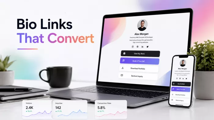
You post consistently, someone likes what they see, and they tap the one link you are allowed to put in your bio. That tap is the highest-intent moment social media gives you: a person actively looking for a reason to work with you. What most agencies and freelancers hand that person is a vertical stack of eight buttons: portfolio, blog, services, two social profiles, an about page, a booking link, and a newsletter.
That is a list of links, not a funnel. This guide treats the bio link as what it actually is for a service business: the top of your lead-generation funnel, and often the only part of that funnel a cold prospect will ever see. Set it up well and it captures qualified leads on its own. Set it up poorly and you are paying for traffic with your content and letting most of it leave without a trace.

Why this matters more for service businesses
A creator can send traffic to a scattered bio link and be fine, because creators monetise attention in aggregate a thousand casual clicks still add up. A service business does not work that way. You are not selling a low-cost impulse product where volume smooths over a weak page. You are selling trust, usually to a small number of people who are each worth a significant amount over their lifetime as a client.
That changes the calculation. When one client is worth several thousand dollars or more, a bio link that captures even a few extra qualified leads per month becomes a meaningful revenue line rather than a nice-to-have. There is also a behaviour unique to service buyers: they check you out before they contact you. Your profile is the first competence test you are given, and the link is where they go to decide whether you are worth a conversation.
The anatomy of a bio link that generates leads
The tool matters far less than the structure, and the structure is usually where things go wrong. A page built for lead generation is ordered by intent, top to bottom, with the single most valuable action sitting above everything else. In order, the elements that work are:
• A positioning line that states who you help and what changes. Not "Full-Service Marketing Agency." Something a specific reader recognises as their own problem, such as "We help B2B SaaS teams turn cold outbound into booked demos." A visitor who does not see themselves in the first line rarely stays.
• One primary call to action. This is the action you would keep if you were only allowed one book a call, request an audit, download the pricing guide. It sits first and is the most prominent element on the page. Two equally weighted CTAs force the visitor to make a decision, and that hesitation costs conversions.
• A capture option for people who are not ready to talk yet. A "book a call" link only catches the small share of visitors ready to buy this week. The larger group interested but not ready needs a lower-commitment entry point such as a free audit, a template, or a short guide. If a sales call is the only option, everyone earlier in their decision leaves empty-handed.
• Proof, placed where doubt shows up. One result-based testimonial ("cut our cost per lead by 40% in six weeks") does more than ten generic five-star quotes. A row of recognisable client logos does more than a paragraph about your values. You need just enough proof to make the CTA feel safe to click.
• Secondary links, deliberately demoted. Portfolio, full services page, and social profiles still belong on the page, but below the primary action and visually quieter, because on a lead-generation page they are supporting material.
The underlying principle is subtraction rather than addition. Every link you add divides the visitor's attention and lowers the odds of the one action that actually earns you money. A page with three well-ordered elements will usually outperform a page with twelve.
Another useful way to approach the same problem is to treat your bio link as a decision engine rather than a directory. Every element should either help the visitor understand what to do next or make that decision easier; if it does neither, it is probably competing with the conversion path.
Agencies and freelancers should not build the same page
Most advice flattens both into one checklist. That is a mistake, because an agency and a solo freelancer have different advantages, constraints, and buyers, and their bio links should reflect that.
| Dimension | Freelancer | Agency |
| What sells the click | Personality and a clear point of view buyers want you specifically | Process, team, and proof of scale buyers want reliability and capacity |
| Ideal primary CTA | A qualifying intake form or one clearly scoped offer | A strategy call or free-audit funnel with follow-up |
| Best use of the page | Filter out poor-fit inquiries before they consume your time | Feed a multi-step funnel with retargeting and nurture |
| Biggest risk to avoid | Under-pricing and attracting people who will not convert | Vague positioning that makes you look like every other agency |
For freelancers, the bio link's underrated job is filtering. Adding "projects start at $3,000" or a short intake form feels like it will scare people off, and it will mostly the wrong people. What remains is a smaller, warmer set of inquiries that waste fewer of your unpaid hours. For agencies, the page is the entrance to a system: a pixel fires, an audit request starts a sequence, and the not-ready lead gets nurtured rather than lost. Agencies also have an option freelancers usually do not: building these pages for clients as a paid deliverable, which turns the whole topic into a service line.

Lead capture mechanics that convert
"Add a lead magnet" is where most guides stop and where the real decisions begin. The magnet has one job: prove you know your craft in the time it takes to consume it. That is why a tight audit checklist or a short site teardown outperforms a 40-page ebook. The ebook signals effort, but the audit signals competence, which is what a service buyer is actually unsure about.
The second decision is how you capture the lead. Each method trades reach for commitment:
| Method | Best when | The trade-off |
| Email capture (in exchange for a magnet) | You want volume and can nurture over time | Highest reach, lowest intent many will never buy |
| Calendar booking | Your offer is clear and priced for a direct conversation | Catches only the ready-now few; everyone else leaves |
| Qualifying form (multiple fields) | High-value work where fit matters more than volume | Fewer leads, but noticeably better ones |
| DM or WhatsApp automation | Your audience prefers chat over forms | Conversational and responsive, but harder to track cleanly |
There is a real tension in that table worth stating plainly: more form fields mean fewer leads but better ones. For a low-cost, high-volume service, keep friction low. For a $20,000 engagement, add the fields a prospect who will not spend ninety seconds answering four questions was unlikely to sign a contract. Match the friction to the price.
Measurement: the step most guides skip
Most articles on this topic end at "build a good page" and never explain how to tell whether it works. That is a gap, because the bio link is one of the few marketing assets short enough to diagnose end to end. Two numbers tell you most of what you need:
• Tap rate of the people who see your profile, how many tap the link. If this is near zero, the problem is your profile and positioning, not the page. Nobody is getting far enough to judge the page.
• Conversion rate of the people who tap, how many complete the action (book, submit, or download). If many tap but none convert, the page itself is the problem: the offer, the CTA, or the gap between them.
A quick diagnostic: if 100 people tap your link and none take action, fix the page. If almost nobody taps in the first place, fix the profile. Separating those two failure points keeps you from redesigning a page that was never the issue.

Practically, tag your bio link with UTM parameters so those leads appear as their own source in analytics instead of being lumped into "direct" or "social." Add a retargeting pixel to the page so visitors who did not convert can be reached again; that warm-but-not-ready group is often your cheapest future pipeline. And do not judge the page on clicks alone. Clicks are easy to grow and mean little; a captured, qualified lead is the number that pays you.
The mistakes that quietly cost you leads
Most weak bio links are not the result of one large error but of several small, common ones stacked together:
• The link dump. Eight or more equally weighted buttons with no hierarchy, so the visitor picks the easiest option, which is usually leaving.
• No message match. Your post promised something specific, the link leads somewhere generic, and the visitor senses the disconnect even if they cannot name it. The page should continue the thought the post started.
• Sending traffic to your homepage. A homepage is built for everyone; a lead-generation page is built for one action. Bio-link traffic sent to a homepage tends to get lost and leave.
• A CTA with no reason to act now. "Contact us" with no offer and no sense of what happens next converts far worse than "Get a free 15-minute audit of your ad account."
• Set and forget. The link still points at last quarter's campaign. Your bio link should move with whatever you are actively promoting.
There is an opposite mistake too: changing the destination every time a new post goes live. A better approach is to build a bio-link system instead of updating it randomly, keeping the main conversion paths stable while changing only the campaign-specific elements. That way, older posts can continue sending visitors somewhere relevant instead of pointing them toward an offer that has disappeared.
What to build it with
Generic tool roundups assume every option fits every person. They do not. There are three tiers, and the right one depends on who you are:
| Tier | Good for | Who it fits |
| Link-in-bio tools | Fast setup, low effort, adequate for a single clear CTA | Freelancers who want it live today and will iterate later |
| Landing page builders | Real design control, forms, A/B testing, integrations | Anyone treating the page as a genuine conversion asset |
| A page on your own domain | Full ownership of data, pixels, speed, and branding | Agencies owning the pixel and data matters at scale |
A straightforward recommendation: a freelancer starting out is fine on a link-in-bio tool, and tooling should not become an excuse to delay. But once the page is doing real revenue work and certainly if you are an agency move it to a builder or your own domain. Owning the pixel and the data is worth an extra afternoon of setup, because you cannot retarget or properly attribute leads on infrastructure you are only renting.
What this looks like in practice
Consider a freelance web designer with a fairly typical setup. Her bio link had eight items: portfolio, about, three social icons, a blog, a contact form, and a newsletter. Traffic arrived from reasonably good social content and mostly went nowhere. No CTA stood out, so visitors browsed the portfolio, thought it looked nice, and left without any next step.
The rebuild changed almost nothing about her skill and everything about the structure. The page led with one line "I design fast, conversion-focused sites for wellness brands" followed by a single offer: a free five-minute video teardown of the visitor's current site in exchange for an email and a URL. One testimonial with a real number sat directly beneath it, and the portfolio was demoted to a small link near the bottom. Same designer, same traffic. The difference was that the page now asked for one specific thing and gave people a low-risk reason to raise their hand. Inquiries roughly doubled, and they arrived better prepared, because the teardown had already shown her thinking before the first call.
None of that is complicated. It is the difference between a page that displays information and a page that moves someone one step further along.
A 30-minute checklist

□ Rewrite your top line to name a specific person and a specific outcome.
□ Choose your single primary CTA, then delete or demote anything that competes with it.
□ Add one low-commitment offer for people who are not ready to book yet.
□ Place one result-based testimonial directly under the CTA.
□ Add UTM tags to the link and, where possible, a retargeting pixel to the page.
□ Check message match does the page deliver on what your posts promise?
Final Take
A bio link is not a menu and not a business card. It is the narrowest, highest-intent point in your marketing funnel, and for many of the people who will ever consider hiring you, it is the only part of that funnel they see. Built like a list, it organises links. Built like a funnel one audience, one action, one reason to act it brings in work.
The change worth watching is that this entry point is becoming more conversational: DM automation and AI-assisted intake are starting to replace the static form, qualifying leads through a short exchange rather than a fixed set of fields. The mechanics will keep evolving, but the principle holds. The businesses that get the most from their bio link are the ones who remember it has a single job and refuse to give it a second.


Comments