
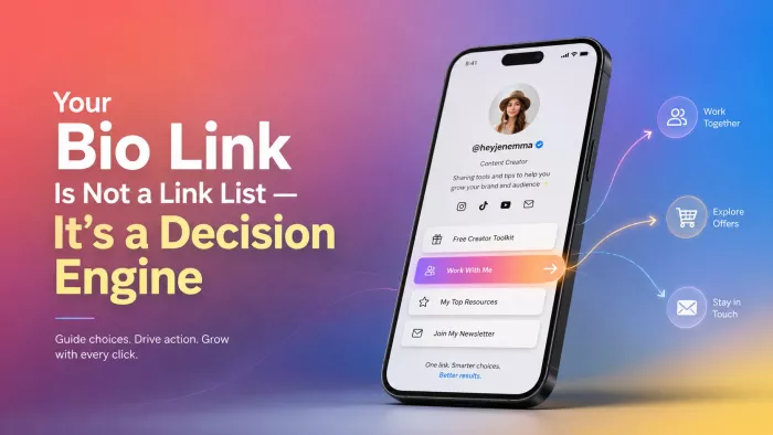
A social profile creates interest, but interest alone has little commercial or strategic value. The important moment arrives after someone taps the link in the bio. That page receives a visitor carrying a specific question, expectation or intention. It must decide what deserves attention first, which route suits the visitor and how much explanation is needed before the next click.
A bio-link page is not a digital business card. It is a handoff system between attention and action. When that handoff is poorly designed, even strong content can send traffic into a dead end.
The Handoff Moment
The journey from a social post to an external destination looks simple from the account owner’s side. A person watches a video, reads a caption, visits the profile and taps the bio link.
For the visitor, the transition is more demanding. They leave a familiar app and enter a new page with different navigation, branding and choices. The context that made the original post clear may disappear as soon as the new page loads.
A creator may remember that Tuesday’s Reel promoted a free template. The visitor sees a page containing a course, newsletter, podcast, shop, booking form and social icons. The template may be there, but the route is no longer obvious. This is where the handoff breaks.
The purpose of a bio-link page is not to prove that a person or business has many things to offer. Its first responsibility is to preserve the visitor’s momentum. The page should continue the conversation that began in the post, not force the visitor to start interpreting the brand from the beginning.
A strong handoff maintains three forms of continuity:
● The wording on the page should reflect the promise or subject that generated the visit.
● The visual identity should make the destination feel connected to the original profile.
● The most relevant next step should be visible before unrelated options compete for attention.
When continuity is missing, visitors do not necessarily assume the page is badly designed. They simply feel less certain about what to do. That uncertainty is enough to reduce action.
One Page, One Responsibility
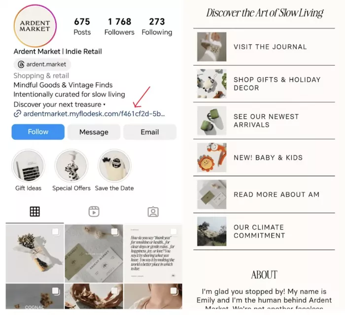
Many bio-link pages fail because they are expected to perform too many jobs at once. They become a homepage, shop, portfolio, contact directory, media kit, campaign hub and social archive compressed into one vertical screen. The page can contain several routes, but it still needs one clear responsibility.
That responsibility might be to convert interested followers into newsletter subscribers. It might be to help potential clients evaluate a service. It might be to direct product traffic during a launch. The responsibility can change, but it must be identifiable.
Without a central responsibility, every link becomes a separate request for attention. The visitor is asked to join, buy, read, watch, follow, book and contact the brand in the same session. The result is not freedom of choice. It is unfiltered choice.
A practical way to define the page’s responsibility is to complete this sentence:
After visiting this page, the most valuable next action for the right visitor is to ______.
The answer should describe a measurable behaviour rather than a broad ambition. “Understand the brand” is vague. “View the service packages” creates a clear route. “Engage with more content” is difficult to assess. “Join the weekly newsletter” can be tracked.
Once the responsibility is clear, every other link can be judged according to whether it supports, delays or distracts from that action.
Start With Promises
Most bio-link pages are built backwards. The owner collects all available URLs and begins arranging them. The page is shaped by what already exists rather than by what visitors were promised. A more reliable method begins with the content that sends people to the page.
Review recent posts, videos, captions, emails and profile copy. Identify the promises that encourage people to click. These may include access to a template, more detail about a service, product information, a full tutorial, event registration or a booking route.
Each promise creates an obligation. If the content says “full guide in bio,” the guide should be immediately recognisable. If the profile says “book a strategy session,” the page should not bury the booking option under five content links.
The gap between promise and destination is one of the most common causes of bio-link underperformance. The page may be visually polished and technically functional, yet still fail because it does not honour the reason people arrived.
A simple promise audit can expose the problem:
1. List the main posts or profile statements currently sending traffic.
2. Write down the action or resource each one promises.
3. Open the bio-link page and measure how quickly each promise can be fulfilled.
4. Remove or demote anything that blocks the most important current routes.
5. Rewrite labels that make visitors translate the promise into different wording.
A visitor who sees “Free Client Brief Template” in a post should find a button carrying the same language. Renaming it “Project Resources” may fit the owner’s internal organisation, but it increases the visitor’s search effort. The page should speak in the language that created the click.
Three Traffic Modes
A bio-link page does not operate under one permanent condition. Its structure should reflect the kind of traffic arriving at that moment.
Most pages move between three practical modes: discovery, campaign and conversion.
| Page mode | Main visitor behaviour | Page priority |
| Discovery mode | Visitors are unfamiliar with the account and want context before committing. | Explain the value of the profile, feature the strongest content and provide a low-pressure next step. |
| Campaign mode | Visitors arrive because a recent post, launch or event promised something specific. | Place the promised destination first and remove competing visual emphasis. |
| Conversion mode | Visitors already understand the offer and are evaluating whether to act. | Surface pricing, proof, process details and the clearest purchase or booking route. |
Discovery mode
Discovery traffic often arrives after a post reaches beyond the existing audience. These visitors may recognise the topic but know little about the person or brand behind it.
Sending them directly to a high-commitment offer can be premature. A better page may begin with a concise value statement, a selected piece of work and an email sign-up or free resource. The aim is not to explain everything. It is to provide enough context for the visitor to continue confidently.
Campaign mode
Campaign traffic is more focused. The visitor has usually been told exactly what is available: a guide, sale, webinar, new product, article or application form.
The page should temporarily reflect that focus. The campaign destination needs to appear first, use matching language and remain visually dominant.
Permanent links can stay below, but they should not dilute the main route. A page that gives the newsletter, shop, podcast and new launch equal weight wastes the urgency created by the campaign.
Conversion mode
Conversion traffic includes people who already understand the offer and need information that supports a decision. They may be comparing services, checking prices or looking for evidence.
This version of the page should reduce promotional language and increase practical clarity. Case studies, service packages, delivery timelines, frequently raised concerns and booking links become more important than general content. The strongest bio-link pages are not redesigned every day, but they do change modes when the audience’s reason for arriving changes.
Build a Priority Ladder
Once the page’s current mode is clear, the next task is to establish a priority ladder. A flat list forces visitors to compare every option. A priority ladder signals which action deserves attention first and which routes remain available for visitors at different stages.
The first level contains the page’s primary action. It should appear without scrolling on most mobile screens and receive the strongest visual emphasis. This may be a featured card, a larger button or a short section containing a headline and supporting sentence.
The second level contains confidence-building routes. These help visitors who are interested but not ready to act. A service page may link to a case study. A course page may offer a sample lesson. A product brand may provide a comparison guide.
The third level contains exploration. This is where visitors can find older content, broader categories, additional channels or evergreen resources. These links remain useful but should not compete with the page’s immediate purpose.
The final level contains utility. Support, account access, policies, general contact details and secondary social profiles usually belong here.
The ladder should be visible through design, not merely through order. If every button has the same size, colour treatment and amount of copy, the visitor still sees a flat list.
Visual emphasis needs restraint. A single featured destination creates direction. Five featured destinations recreate the same problem in a more decorative format.
Spend a Friction Budget
Every action contains friction. The useful question is whether the friction helps the visitor or merely consumes attention.
A page has a limited friction budget. It can ask the visitor to read a short explanation, compare two options, enter an email address or complete a form. It cannot demand all of these at once without losing people.
Some friction is valuable. A short service summary can prevent unsuitable bookings. A comparison page can help customers select the correct plan. A form can collect information that makes the next conversation more useful.
Other friction has no strategic purpose. Examples include decorative introductions, repeated links, unclear labels, unnecessary pop-ups and long scrolling distances before the main action appears.
The most common sources of wasted friction are:
● The page repeats the creator’s biography without helping the visitor choose a route.
● Several buttons use different labels but lead to the same destination.
● Important resources are hidden beneath oversized images or video backgrounds.
● Link wording depends on context that existed only in the original post.
● External pages load slowly or fail to match the promise made on the bio page.
● Visitors must dismiss a sign-up request before they understand what the page offers.
A clean page is not automatically a low-friction page. Minimal designs can still be confusing when the wording is vague. A more detailed page can feel easy when each section answers a clear question. Friction should be judged by usefulness, not by appearance.
Place Proof Before Pressure
Many bio-link pages move from introduction to commitment too quickly. They ask visitors to book, buy or subscribe before providing enough reason to trust the offer.
The missing layer is often proof. Proof does not need to become a wall of testimonials. It can appear as a selected case study, client result, product demonstration, work sample, media mention or concise explanation of what the visitor receives. The right proof depends on the action being requested.
A freelance designer may need to show three strong projects before offering an enquiry form. A consultant may need a short case study before the booking calendar. A course creator may need a lesson preview, curriculum summary or student outcome before the purchase page.
Proof should sit close to the decision it supports. Sending visitors to a separate “Testimonials” page creates another interpretation task. A short supporting line beneath the main call to action may be more useful.
For example:
Book a Content Strategy Session
A focused 60-minute session for teams that need a practical publishing plan.
Below that, a single case study or result can answer the next likely question: Has this worked for someone else? The page should not pressure visitors into commitment before giving them a rational basis for it.
Write for Destination Certainty
Button copy is not decoration. It tells the visitor what kind of commitment follows the click. Weak labels often describe a mood rather than a destination. “Explore,” “Discover More” and “Let’s Connect” sound friendly but hide the next step.
A stronger label contains enough information to create destination certainty. The visitor should know whether they are opening a guide, viewing a product, joining a list, booking a session or contacting the business.
Compare the difference:
● “Get Started” becomes “View Service Packages and Pricing.”
● “Free Resource” becomes “Download the Weekly Content Planner.”
● “See More” becomes “Read the Full Creator Income Report.”
● “Work With Me” becomes “Submit a Brand Partnership Enquiry.”
● “Join Us” becomes “Subscribe to the Friday Marketing Brief.”
The second version in each case reduces interpretation. It also filters clicks. Someone who wants general information will not accidentally open a booking form, while a ready-to-act visitor will not waste time guessing.
Supporting copy can handle qualification. A button may say “Book a Portfolio Review,” while the line beneath explains that the session is intended for junior designers preparing job applications. Specificity improves both visitor experience and downstream conversion quality.
Treat the Page as Live Inventory
Bio-link pages become cluttered for the same reason storage rooms do: new items are added, while old ones remain because removing them feels risky.
Every link occupies attention. Even a low-performing link affects the page by pushing other destinations lower, increasing scroll depth and expanding the number of choices. Links should therefore be treated as live inventory.
Each one needs a reason to remain active. That reason may be current traffic demand, strategic importance, customer utility or ongoing performance. “Someone might need it” is not enough to justify permanent priority.
Temporary links should have an expiry date. Campaign pages, event registrations and seasonal offers should be reviewed as soon as their relevance changes. Old destinations can be archived on a broader website rather than left in the primary decision path.
A monthly review is usually enough for stable accounts. Launch-heavy creators and brands may need to review the page weekly.
During the review, check:
● Whether the first link still reflects the current priority.
● Whether recent content promises a destination that is difficult to find.
● Whether any temporary campaign has expired.
● Whether two links now serve the same purpose.
● Whether the order reflects actual visitor demand rather than historical importance.
● Whether every external page still loads correctly on mobile.
The page should feel current because it is managed, not because it uses trendy design.
Measure the Route
Bio-link analytics often stop at total views and total clicks. Those numbers show activity but reveal little about decision quality.
A page can produce a high click rate by sending people toward entertaining content while failing to generate newsletter sign-ups, enquiries or sales. It can also produce a modest click rate while attracting highly qualified visitors who convert well after leaving the page.
Measurement should follow the route from arrival to outcome.
| Signal | What to examine | What it may indicate |
| Primary-link share | The percentage of all page clicks going to the main action | Whether the hierarchy is directing attention as intended |
| Downstream conversion | The percentage of visitors who complete the next meaningful step | Whether the destination fulfils the promise made on the page |
| No-click exits | Visitors who leave without selecting a link | Confusion, weak relevance, poor trust or slow loading |
| Link position performance | How a link performs before and after being moved | Whether visibility, rather than demand, is affecting results |
| Traffic-source differences | How visitors from different posts or platforms behave | Whether one page structure is trying to serve incompatible intentions |
Testing should be controlled. Changing the button order, wording, design and destination at the same time makes the result difficult to interpret.
Start with the smallest plausible change. Rewrite an unclear label. Move the campaign link to the first position. Remove a duplicated option. Add one proof element before the booking route. The goal is not to chase the highest number of clicks. It is to improve the proportion of visitors who reach a destination that matches their intention.
A Better Rebuild Method
When a bio-link page has become crowded, small edits may not be enough. Rebuilding from an empty page is often more effective than trying to reorganise years of accumulated links.
Begin by removing everything from the working draft. Do not delete the original page yet. The blank page creates a useful constraint: every element must now justify its return.
Add the current primary action first. Write a label that clearly explains the destination. Add one sentence of context only when the action needs explanation.
Next, add one supporting route for visitors who are not ready to take the primary step. This may be proof, a sample, a free resource or a lower-commitment offer.
Then add the essential utility links. Keep them visually separate from the main conversion area.
Only after these routes are working should broader exploration links return. Each additional option should serve a distinct visitor need. If two links answer the same question, combine them or choose the stronger one.
Test the page from a phone using three scenarios:
● A first-time visitor wants to understand the account.
● A returning follower wants the resource mentioned in a recent post.
● A ready customer wants to evaluate or complete the main offer.
If any scenario requires guessing, the page is not finished.
The Real Value of the Bio Link
A profile tells people who are speaking. The bio-link page determines what happens to the attention that profile creates. Its value does not come from the number of destinations it can hold. It comes from its ability to preserve context, rank choices and give each visitor a sensible next step.
The strongest page may contain fewer links, but fewer links are not the objective. The objective is better direction. A useful bio link does not ask visitors to inspect everything a creator or business has produced. It recognises why they arrived, continues the promise that brought them there and makes the next decision easier to complete.


Comments