
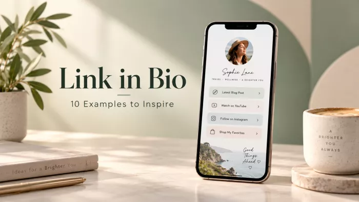
One line in a bio. On Instagram, TikTok, and most other feeds, that single link is often the busiest page a person or brand owns visited more than the website it points to. And most of them are built like a junk drawer: a dozen links stacked in the order someone happened to remember them, none actually chosen.
The ten pages below are teardowns, not trophies. Each is built around a single decision: it gets right the sort of decision that turns a warm, curious tap into the next thing that matters. First, a quick lens for judging any bio-link page.
A lens, before the list
A bio-link page is not a list of links. It is a small landing page with one visitor and one next step in mind. Five questions tend to separate the pages that convert from the pages that merely exist.
1 One obvious job. The strongest pages make a single action impossible to miss. The weakest offer a dozen equal choices and, predictably, get none of them tapped. When every link looks equally important, the page has no strategy.
2 A hierarchy that matches the goal. Whatever the eye lands on first should be the thing that matters most. Plenty of pages bury the money action beneath three social icons and a link to a two-year-old blog post.
3 It looks like the feed that sent them. A visitor arrives mid-scroll, still holding the mood of the post they tapped from. A page that looks like default, rented UI breaks that thread; one that looks like an extension of the brand keeps it.
4 The friction has been stripped out. Every extra tap, dead “coming soon” link, or moment of hesitation leaks people. The good pages remove steps between arrival and action rather than adding them.
5 There is a reason to care, not just a place to go. A bare link says where. A short line of proof, personality, or context says why and that is usually the difference between a scroll-past and a click.
The same hierarchy sits behind a link-in-bio landing page that converts, with one primary action carrying more weight than everything around it.
How the ten are grouped
Ten random pages teach nothing. Sorted by the job each is built to do, patterns start to surface. Nearly every bio-link page is really doing one of four things.
| Band | The page’s real job | Who tends to live here |
| ● Sell | Move a visitor toward a purchase or booking | DTC brands, restaurants, artists selling merch |
| ● Grow | Capture an email or a follow an owned contact | Coaches, authors, newsletter-led creators |
| ● Route | Sort mixed audiences to the right destination | Multi-hyphenates, podcasters, public figures |
| ● Tell | Build story or urgency around a single moment | Music releases, campaigns, product launches |
A quick note on what follows. These are drawn as anatomy rather than screenshots, each one stripped to the single choice it nails, the way the strongest pages in its category tend to work. The names and handles are illustrative; the strategies are not. Screenshots go stale within a season, but the reason a page works outlives its colour scheme.
01 The content creator’s hub
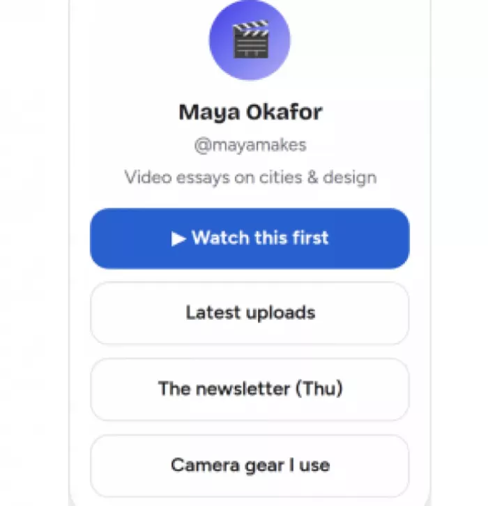
Its job: catch someone who just watched one clip and send them to the next. The clever move is the top button. Instead of a static “YouTube channel” link, it is a rotating spotlight “Watch this first” pointing at whatever recent piece is performing best that week. The block matching the visitor’s current interest sits at the top, and swapping it is a two-minute job that reliably beats a page left untouched for months. Everything below it is ordered by intent, not by platform: the best single video, then the archive, then the email list, then the low-priority gear links a fan might eventually want. Worth borrowing treat the top slot as a spotlight, not a signpost pointed at the best recent thing and rotated often. The catch: a spotlight only works if it actually moves. Left unattended, it quietly becomes the same stale link as everyone else’s. |
02 The musician around one release
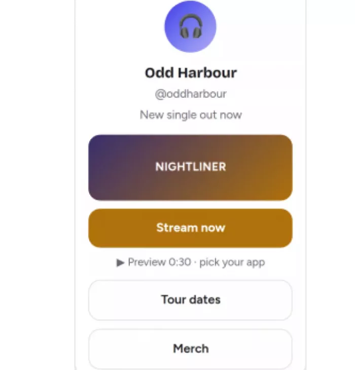
Its job: turn a curious fan into a first listen, right now. This page does one thing loudly and lets everything else wait. The release art and a single “Stream now” button dominate; a tap sends each person to their own default platform, so nobody has to hunt for the right icon. A short inline preview lets them sample the track without leaving the page sampling beats linking out, every time. Notice what is demoted, not absent: tour dates and merch still exist, but sit well below the fold, because during a release week the only number that counts is first-week streams. Worth borrowing for a moment that matters, a campaign page separate from the permanent hub that strips down to the one action. The catch: a release page has a shelf life. A “new single” banner still up six months later reads as neglect, not momentum. |
03 The DTC brand’s mini-storefront

Its job: collapse the distance between a post and a checkout. The winning decision is a match: the top button names the exact product from the post that drove the visit not a generic “Shop now,” but “Shop the serum from today’s post.” Someone who tapped through because of one item lands directly on that item, with the guesswork removed. The supporting links quietly handle objections and repeat buyers: social proof by review count, a best-sellers route for browsers, and an order-tracking link that cuts the “where’s my package” DMs a brand would otherwise field by hand. Worth borrowing match the top link to whatever the current post is about, phrased so the connection to that post is obvious. The catch: this works because the brand runs tight, frequent campaigns. Without that rhythm, a hyper-specific top link ages into a dead end. |
04 The neighbourhood restaurant
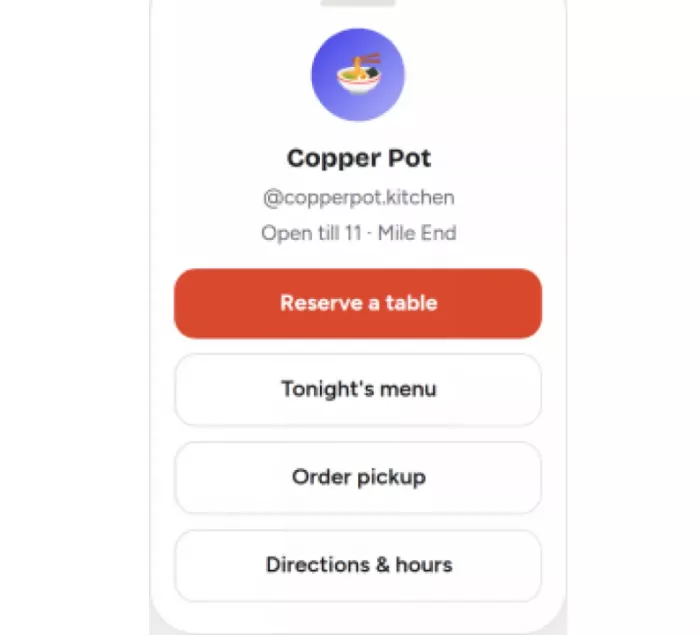
Its job: fill tables, then handle everything else. A restaurant’s bio link is often clogged with equal-weight links menu, delivery apps, reviews, socials that bury the one action worth the most money. This page refuses that. “Reserve a table” is the single filled button; menu, pickup, and directions follow as plainly secondary, in the order a hungry visitor actually needs them. The small touch that earns its place is the status line up top “Open till 11” answering the first silent question anyone taps through with, before they have scrolled at all. Worth borrowing decide which single action makes the most money, make it the only filled button, and demote the rest without deleting them. The catch: reservation-first is right for a sit-down room. A takeaway spot with no tables would lead with “Order now” the principle travels, the specific button does not. |
05 The coach who leads with value
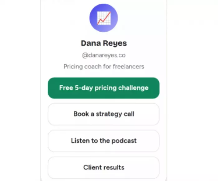
Its job: turn a cold visitor into an owned email address. Most coaching pages open with the hardest possible ask “Book a call” aimed at people who met the coach ninety seconds ago. This one inverts the order. A free five-day challenge sits on top, trading a small, genuine win for an email; the high-commitment call waits one step down, for people who have already warmed up. It is a deliberate ladder: the low-commitment yes before the high-commitment one, with proof (“Client results”) positioned to reassure anyone hovering between the two. Worth borrowing lead with the smallest valuable yes. An email captured today is a conversation still available next month; a bounced visitor is gone. The catch: the freebie has to be genuinely good. A thin lead magnet trains people to ignore the sender, which is worse than no capture at all. |
06 The author who lets you sample
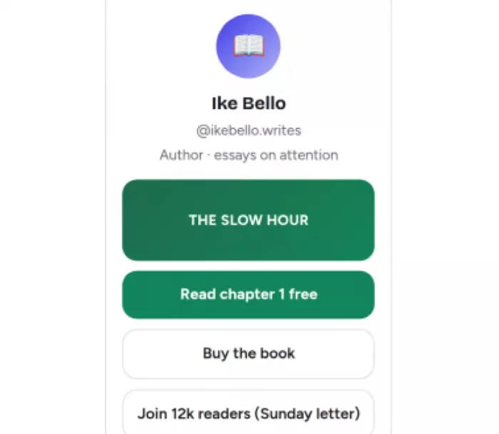
Its job: convert a stranger into a reader, then a subscriber. Buying a book from a stranger is a leap. This page shortens it by putting “Read chapter 1 free” above “Buy the book” sample first, commit second. The free chapter does the selling that a cover and a blurb cannot, and readers who are not ready to buy still have a reason to hand over an email via the Sunday letter. The subscriber count doing double duty as social proof (“Join 12k readers”) is a small, honest nudge: proof and call-to-action folded into one line. Worth borrowing let people taste the thing before the buy ask. Sampling lowers the risk of a considered purchase far more than another adjective does. The catch: sampling suits considered buys. For a cheap impulse product, a preview can add a step where a straight “Buy” would have converted faster. |
07 The podcaster who plays first
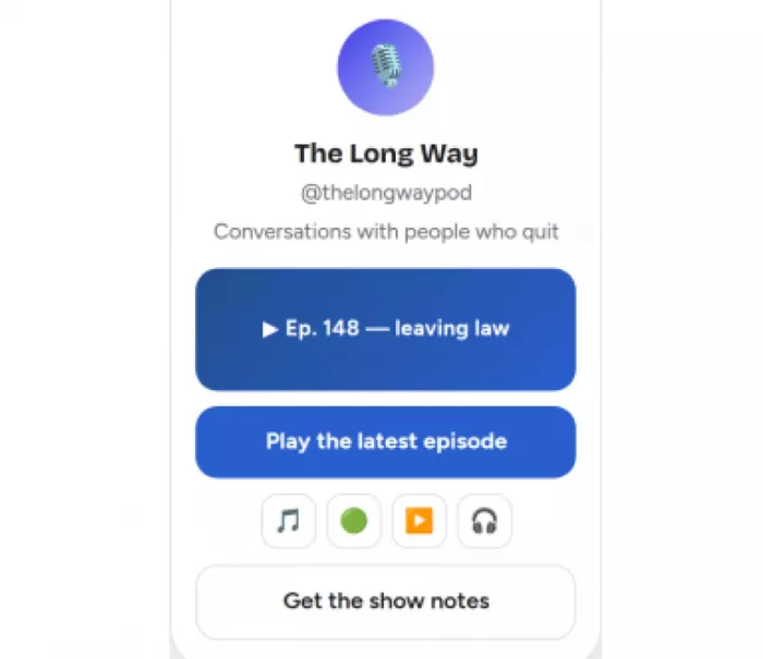
Its job: get a new listener to actually press play. Subscribing to a podcast you have never heard is a commitment nobody makes blindly. So this page samples before it asks: the latest episode plays inline, no click-away, and only then does it offer a row of app icons to follow wherever the listener already listens. Hear it, like it, then choose the platform. The follow row is a picker rather than a wall of text links, which means one tap to the right app instead of a scavenger hunt through four near-identical buttons. Worth borrowing for any audio or video, let people experience the content on the page before asking them to subscribe somewhere else. The catch: inline playback earns its space for media. A text-based creator forcing an embed onto the page is decoration, not function. |
08 The campaign that strips down
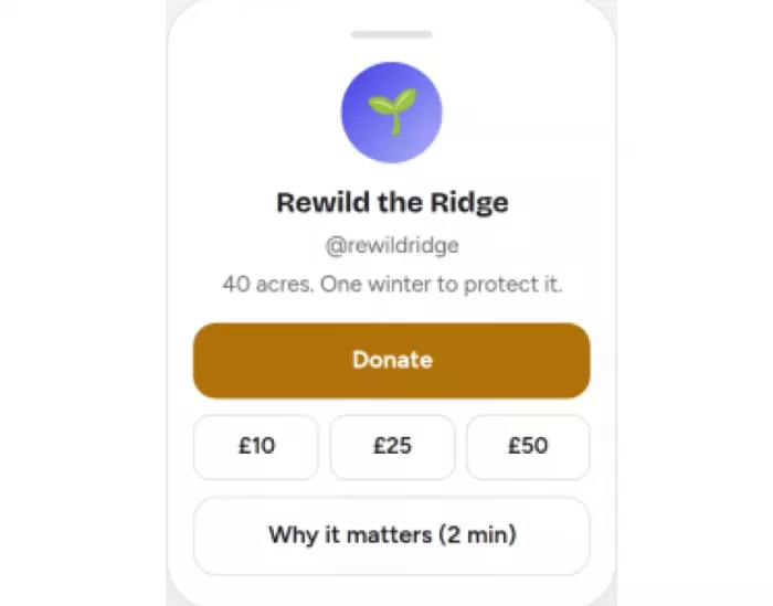
Its job: convert feeling into a single donation, this month. For a defined campaign, restraint is the whole strategy. One emotional line does the framing “40 acres. One winter to protect it.” and a single “Donate” button follows, with preset amounts that remove the friction of choosing. Everything a nonprofit might normally list (volunteer, shop, newsletter, annual report) is deliberately gone for the duration. The only secondary link is a short “Why it matters,” there to convince the undecided without competing with the ask. Worth borrowing during a campaign, cut everything that is not the campaign. Radical focus converts a moment far better than a full menu does. The catch: this is a campaign posture, not a permanent one. The organisation’s everyday page still needs the fuller set of paths once the push ends. |
09 The app that matches its stage
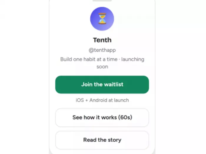
Its job: capture demand now, convert it to downloads later. A pre-launch app has no product to send people to, so the smart version does not pretend otherwise. The page’s single job is a waitlist sign-up, sized to the lifecycle stage and the plan is that the exact same slot swaps to “Get it on iOS / Android” the day the app ships. One job at a time, tied to where the product actually is. A short “See how it works” video handles the skeptics who will not join a list on faith, without cluttering the primary path. Worth borrowing let the page’s job change with the product’s stage. Pre-launch, mid-launch, and mature each want a different top button. The catch: this demands maintenance discipline. A “Join the waitlist” button still live weeks after launch is quietly leaking the users it worked so hard to gather. |
10 The multi-hyphenate who asks first
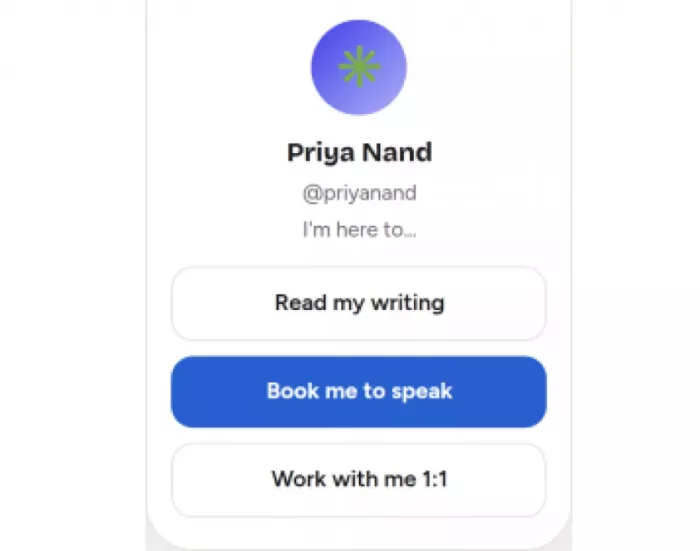
Its job: send three different audiences three different ways, cleanly. Someone who is an author and a speaker and a consultant usually ends up with fifteen flat links serving nobody well. This page starts with a question instead “I’m here to…” and offers three intent-based routes. A reader, an event organiser, and a prospective client each see their own path immediately, rather than sifting a directory built around the owner’s job titles. It sorts by what the visitor came to do, not by what the owner happens to make which is the difference between a page that routes and a page that lists. Worth borrowing when audiences genuinely diverge, segment by visitor intent up top, and keep the rest behind the route they picked. The catch: most people have one audience, not three. Splitting a single audience into invented segments just adds a pointless extra choice for when the split is real. |
The patterns worth stealing
Ten very different pages, and yet the same handful of decisions kept doing the heavy lifting regardless of industry.
◆ One dominant action, and only one. The second something competes with the primary button for attention, both lose.
◆ Order chosen, not accidental. The best block sat on top and everything else was ranked by the visitor’s intent, not by the owner’s org chart or posting history.
◆ It looked like the feed that sent people there. So arriving felt continuous rather than like landing on a stranger’s dashboard.
◆ A sample or a piece of proof near the top. A preview, a review count, a free chapter something giving a reason to care before asking for a click.
What the best pages leave out
It is tempting to read a list like this as things to add. The more useful lesson runs the other way: the good pages are defined by what they refuse to include.
A page with fifteen buttons converts worse than one with three clear priorities not slightly worse, reliably worse. Restraint is not a style choice here; it is the mechanism. Every link that is not the point is a small tax on the link that is.
◆ Dead ends. “Coming soon” buttons, links to abandoned platforms, and anything that opens to a 404 spend trust the page cannot afford.
◆ Equal-weight everything. A flat stack where the shop, the podcast, and a 2022 blog post all look identical hands the visitor a decision the page was supposed to make.
◆ Default branding. Leaving the platform’s logo and generic URL on the page announces “rented UI” and measurably dents click-through against a custom domain.
◆ Stale spotlights. A “new” release or a waitlist that shipped months ago does more damage than a plain link, because it signals nobody is home.
What a page that works has in common
Across very different industries, the pages that convert tend to share the same six traits. Together they make a fair summary of everything above.
✓ One obvious job. A stranger can name the single action the page wants within a few seconds.
✓ Ranked, not listed. The most valuable action sits on top and visibly outweighs everything below it.
✓ On-brand at a glance. It reads as an extension of the feed people tapped from, not a template.
✓ No dead weight. No “coming soon,” no broken links, no buttons that go untapped.
✓ A reason to care up top. A preview, a proof point, or a line of context sits above the fold.
✓ Fresh. The top block reflects what is happening now, and shows signs of recent attention.
Once those basics are in place, link-in-bio performance is better judged by the actions visitors take than by raw click totals alone.
A quick word on tools
The decisions above make the page, not the platform. That said, the right tool removes friction from the decision already made and each of the popular ones is really a different philosophy.
| Tool | What it really is | Best when |
| Linktree | The fast, familiar link list | You want it live in five minutes and a URL people recognise |
| Beacons | An all-in-one creator hub store, email, media kit | The page is really a business you sell from |
| Carrd | A tiny, near-fully-custom website | You want it to look like your brand, not rented UI, and don’t mind building on desktop |
| Stan Store | A bio page built around checkout | Selling digital products or bookings is the whole point |
| Grid-style pages (Milkshake, and similar) | Card- and grid-led, visual-first | Aesthetics are the product portfolios and visual creators |
Two things apply whatever the choice. A custom domain lifts trust and tends to earn noticeably higher click-through than a generic platform URL. And several free tiers carry transaction fees or loud default branding, so the “free” plan is not always the cheap one once a page starts doing real work.
It comes down to one sentence
The prettiest bio-link page is rarely the best one. The best one is the page that could finish a single sentence without pausing: when someone taps through, the one thing it wants them to do is clear.
Every page in this list is a variation on that clarity the release that shrinks to a single “Stream now,” the coach who leads with a freebie, the public figure who asks “I’m here to…” before showing one link. Once the one job is settled, the layout, the colour, and the tool tend to fall into place around it. Without it, no template holds the page together.


Comments