How to Sell Digital Products From One Link: Creator Store Guide

Christine Davis
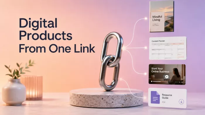
A single link can hold an entire creator business, but only when it is built as a buying path rather than a page full of buttons. The goal is not to send visitors towards everything you do. It is to help the right person recognise the right product, understand its value and complete the purchase without unnecessary hesitation.
This guide explains how to turn one creator link into a focused digital store, from choosing the first product to arranging the storefront, setting the price, handling delivery and improving sales after launch.
The One-Link Store Model
A creator store is the small commercial system that sits between content and payment. Someone sees a useful post, visits the profile, taps the main link and arrives at a page where the next step should feel obvious.
That journey contains several decisions. The visitor must decide whether the store is relevant, whether the product fits the problem, whether the price feels reasonable and whether the checkout looks trustworthy. A weak store leaves those questions unanswered. A strong one resolves them in sequence.
| Stage | What the Visitor Needs |
| Discovery | A reason to care about the problem or result |
| Store visit | Immediate confirmation that the page is relevant |
| Product evaluation | Clear outcomes, contents, proof and limitations |
| Checkout | A simple, credible payment process |
| Delivery | Fast access and usable instructions |
| Follow-up | Help using the product and a logical next offer |
Consider a freelance designer selling a social media template kit. The buyer is not paying for a folder of editable files. The buyer wants to publish faster, maintain a consistent visual style and stop rebuilding every post from scratch. The store must sell that improvement, not merely list the number of templates included.
Start With a Sellable Outcome
Many creators begin by asking what they can package. A better starting point is to identify a repeated problem that already appears in comments, client conversations, search queries, community discussions or personal messages.
A product becomes easier to sell when the outcome is narrow enough to picture. “Creator resources” is too broad. “A 30-day launch content system for solo course creators” gives the buyer a clearer use case.
A practical product idea can be shaped with four elements:
Specific audience + recurring problem + usable result + convenient format
A photographer might turn general editing advice into a preset collection for low-light indoor portraits. A fitness creator might package a four-week bodyweight plan for people training in small spaces. A career coach might create an interview workbook for candidates moving into management roles.
The format should match the job. Checklists provide speed, templates provide structure, short courses explain a process and bundles combine resources normally used together.
Before spending weeks building the product, test the problem. Publish content around it, invite people to join a waitlist, offer a small paid version or ask existing clients what they currently use. Ten detailed replies from people who regularly face the problem can be more valuable than hundreds of vague likes.
A promising first product usually meets these conditions:
● The problem appears repeatedly, rather than emerging from one isolated conversation.
● The result can be explained in one or two sentences without specialist language.
● The buyer can use the product soon after purchasing it instead of completing extensive setup.
● The product saves time, reduces uncertainty or replaces a task the buyer regularly dislikes.
● The creator can demonstrate part of the method publicly without giving away the complete solution.
The first version does not need to be large. A focused £12 resource that solves one clear problem may reveal more about demand than a £150 course built without buyer evidence.
Build a Product Ladder
A creator store becomes confusing when every product competes equally. Visitors see a mixture of ebooks, templates, workshops, coaching calls and unrelated downloads, but no clear starting point. A product ladder arranges offers according to the buyer’s level of trust and the depth of support required.
| Level | Main Purpose | Suitable Offers |
| Entry | Turn an interested follower into a first-time buyer | Checklists, presets, swipe files and mini-guides |
| Core | Solve the main problem with a fuller system | Template packs, workshops, courses and bundles |
| Premium | Add personalisation, feedback or direct access | Audits, consultations, coaching and custom work |
The entry product should create a quick win. The core offer should solve a broader part of the same problem. The premium offer should add access, interpretation or customisation rather than simply supplying more files.
For the designer, an entry product might be a £9 carousel planning sheet. The core offer could be a £39 brand-ready template library. The premium offer might be a £180 visual content audit with personalised recommendations. Each step serves the same buyer at a different stage.
Most early creator stores do not need more than three to six active offers. A smaller catalogue is easier to explain, maintain and improve. It also gives the creator clearer sales data about which problems buyers value most.
Design the Store Around Decisions
The first screen of the store carries more weight than the rest of the page. A visitor arriving from social content may give it only a few seconds before leaving. The page must quickly confirm who the store serves, what result is available and where to begin.
Start with a positioning line that describes the outcome rather than the creator’s identity.
Weak: Digital products for creators and small businesses.
Stronger: Practical content systems for solo creators who need to publish consistently without building every post from scratch.
Below that, feature one product as the recommended starting point. It should be the offer that suits the largest share of qualified visitors and is easiest to understand without additional explanation.
Each product card needs a product name, a one-sentence outcome, the format, the price and a clear action. “30 editable templates” describes quantity. “Plan and publish one month of branded posts without starting from a blank canvas” describes use.
Place proof near the decision. A testimonial buried near the footer may never be seen. Add a relevant buyer comment, preview image, sample result or usage example beside the product it supports. The proof should answer a specific doubt. A screenshot showing how a template is organised may be more persuasive than a general statement that the product is “amazing.”
Secondary links should remain secondary. A portfolio, newsletter, podcast and social profile may deserve a place, but they should not visually compete with the store’s main action. When every button has equal weight, the page becomes a directory rather than a sales path.
Write Product Pages That Remove Doubt
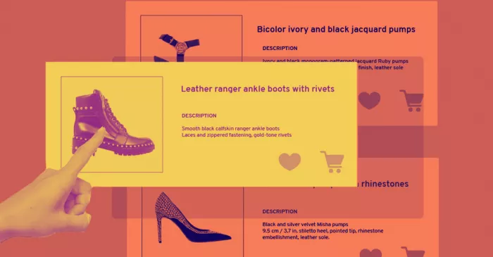
A product page should reduce uncertainty until the buyer feels confident enough to act. Begin with the problem in the buyer’s language, then explain the result without exaggeration. “Create polished client proposals in less time” is credible. “Double your income instantly” is not.
The page should make the following points clear:
● Who the product is designed for and the stage the buyer should already be at.
● What files, lessons, templates or access the buyer receives.
● How the product is used after download or enrolment.
● Which result it supports and what work the buyer must still complete.
● What the purchase does not include, especially support or customisation.
● How delivery works and where the buyer can get help.
Show the actual product whenever possible. A template preview, sample lesson, worksheet page, before-and-after example or short walkthrough lets buyers judge quality before paying.
A brief suitability note can also filter the wrong buyers:
This template kit is designed for creators who already know what they want to post but need a faster way to organise and design it. It does not include a complete brand strategy or custom design support.
Clear limitations do not weaken the sale. They prevent the product from being purchased by someone expecting a different service, which can reduce refund requests and support problems later.
Use direct calls to action such as “Get the template kit,” “Download the workbook” or “Start the workshop.” “Learn more” adds another decision without explaining the action.
Price for the Buying Situation
Digital products are often priced by size: number of pages, files or video hours. Those measures describe production, but they do not determine value.
A short checklist that prevents an expensive mistake can be worth more than a long ebook that repeats familiar advice.
Price depends on the seriousness of the problem, time saved, specificity of the solution, quality of execution and support included. Trust also matters. An established creator with visible proof can usually sell a higher-priced offer more easily than a new account with no track record.
For a first product, choose a price that fits the buying situation. An entry resource should feel easy to understand and try. A core product can cost more because it solves a larger part of the problem. A premium offer should reflect the creator’s time, expertise and limited availability.
Bundles work best when the items belong together. A launch planner, email templates and campaign review checklist support the same project. Three unrelated downloads with a discount do not create the same value.
Tiered pricing can work when the difference is meaningful. A basic version may include the files, an expanded tier may add examples and a higher tier may include feedback. The higher option should solve a real need rather than adding filler to make the middle tier appear more attractive.
Introductory pricing can help validate demand, but it needs a clear reason and end point. Constant discounts train buyers to wait. A defined launch price or useful early-buyer bonus protects the product’s perceived value more effectively.
Review pricing after real purchases. Consider conversion, refund reasons, support volume and the kind of buyer attracted. A low price that creates heavy support demands may be less sustainable than a higher price with better qualification.
Make Checkout Feel Safe
The buyer becomes more cautious as payment gets closer. Small inconsistencies can cause abandonment.
The price must remain consistent throughout the process. Any taxes, fees or recurring charges should be explained before the final step. The buyer should know which payment methods are available and what name will appear on the receipt.
The checkout must work comfortably on a phone because many creator-store purchases begin inside a social app. Forms should be short, buttons easy to tap and product details visible without excessive scrolling.
Trust comes from ordinary details: a secure checkout, seller identity, support contact and accessible refund terms. A buyer should not have to leave the checkout and search through a social profile to discover who is processing the payment or how to request assistance.
Complete a real test purchase before launch. Check the receipt, confirmation page, delivery email, file link, mobile layout and support address. Use a different email account and device where possible. Test failure points too. An expired link, mistyped email address or failed payment should lead to a clear recovery path.
Automate Delivery Carefully
Automated delivery should feel immediate, not careless. The first email should confirm the purchase, provide the access link and explain the next action. Avoid placing a long welcome note above the download button.
File names matter. “final_v7_new.pdf” looks unfinished. Use clear names matching the product. If the download contains several folders, add a short “Start Here” file explaining what each folder contains and which resource to open first.
For a course or membership, explain the login process, where to begin, how long access lasts and where support is handled. Do not assume buyers will remember the details from the sales page.
Delivery should also improve product use. A template pack can include a short setup video. A preset collection can include recommended starting adjustments. A workbook can include a completed example. These additions often create more value than another batch of files.
Follow-up messages should support the purchase before promoting the next one. A useful sequence might include a quick-start note, a common-mistakes email and a feedback request after the buyer has had time to use the product.
The next offer should connect naturally to the first. Someone who bought a carousel planning sheet may later need the full template library. Someone who bought the library may later benefit from a content audit.
Connect Content to Products
A creator store rarely succeeds through the store page alone. Content creates the context that makes the product relevant.
A designer selling social templates can publish a post about why visual inconsistency makes a small brand look less established. Another post might show how to turn one content idea into three layouts. A third could demonstrate part of the paid template system.
Some posts reveal the problem, while others show the method or demonstrate the product. Together, they reduce the explanation required on the store page.
Avoid promoting the same product with the same sales message repeatedly. Rotate the angle. Show a use case, explain a mistake, answer a buyer question, share a preview, compare two workflows or demonstrate the result.
Product mentions should remain close to the topic. A tutorial about planning a launch can point towards a launch planner. A post about editing short videos should not end with an unrelated personal branding guide simply because that is the newest product.
The profile bio should support the current priority. Use one clear statement connecting the content with the store. The main link can then lead directly to a featured product or a focused storefront where the relevant offer appears first.
Creators can also build small campaigns around each product using education, a behind-the-scenes example, a buyer result, a demonstration and a final reminder. This gives the audience several ways to understand the value without turning every post into an advertisement.
Measure the Store as a Funnel
Total sales matter, but they do not explain why the store is working or failing. Review the journey in stages.
| Signal | What It May Reveal |
| Profile views but few link clicks | The bio or content does not create enough interest |
| Link clicks but few product views | The storefront is unclear or poorly organised |
| Product views but few checkout starts | The offer, proof, price or product page is weak |
| Checkout starts but few purchases | Payment friction or trust concerns may exist |
| Sales with high support volume | Delivery or product instructions need improvement |
| First purchases but no repeat buyers | The product ladder or follow-up path is weak |
Do not change the whole store after a handful of visits. Look for repeated behaviour and repeated questions.
Review traffic sources weekly so it is clear which content brings qualified visitors. Track refund reasons and support messages because they reveal expectation gaps that numbers may hide.
Buyer language is especially useful. Repeated questions expose missing information, while phrases customers use to describe the result can improve the product copy.
Improve one stage at a time. If visitors reach the product page but do not begin checkout, changing the delivery email will not solve the problem. Rewrite the outcome, strengthen the preview or clarify who the product is for. If checkout starts are strong but purchases are weak, examine the payment process.
Audit the Store Before Launch
Before sending traffic to the page, review the store from the perspective of someone who has never seen the creator’s work. Check whether the first screen identifies the audience and result. Confirm that one product is clearly recommended. Read every description and remove wording that only lists file quantity without explaining use.
Open the store on a phone and complete a purchase. Confirm that the receipt, delivery email and download work. Ask someone unfamiliar with the product to explain what they think each offer includes.
Review the operational side as well. Make sure product files are final, support requests have a clear destination, refund terms are visible and customer email addresses are stored responsibly. If the product will receive updates, explain whether buyers receive them automatically.
A store is ready when the buying path is clear, the product matches the promise and the delivery experience works without manual rescue.
The Practical Takeaway
Selling digital products from one link is not a matter of placing several payment buttons beneath a profile photo. It requires a connected system in which content creates interest, the storefront guides the decision, the product page removes doubt and the delivery experience proves that the purchase was worthwhile.
The best starting point is one validated product with one specific outcome. Build a simple store around it, recommend a clear first step and test the entire purchase journey before promoting it widely. Additional products should be added only when they help the same buyer move forward.
A small creator store can outperform a crowded catalogue when every part of the page has a purpose. The link may be short, but the business behind it should be deliberate.


Comments