
You spend hours making content. You write the caption, pick the thumbnail, pay attention to the hook. Then you point everyone who's interested toward a single link that does almost nothing, a pile of blue text that someone taps, glances at, and leaves. All that earned attention, dead-ended.
A bio link should do the opposite. Done right, it quietly turns strangers into subscribers and followers into customers while you sleep. This guide walks through how to rebuild that one URL into a hub that actually works, not a prettier list, but a system.
The reframe: it's a funnel, not a menu
Here's the core idea the whole guide hangs on: a bio link isn't a menu of options, it's a funnel with a direction. A menu asks the visitor to decide what they want. A funnel already knows what you want them to do and gently moves them toward it.
This distinction sounds small but it changes every decision you'll make later. If you think of your link as storage, you add things to it endlessly. If you think of it as a funnel, you start asking a sharper question of everything on the page: does this move someone forward, or just sit there? Most links fail not because they're ugly, but because nobody ever asked that question.
A menu makes the visitor work. A funnel does the work for them.
What a "creator hub" actually is and what it isn't
People use the phrase "link in bio" and "creator hub" like they're the same thing. They're not. The difference is structure and intent.
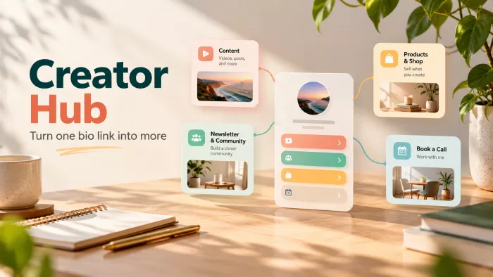
A link list is flat. Everything sits at the same level, competing for the same tap, with no sense of what matters most. A hub has hierarchy. It tells the visitor, within a second or two, who you are, what you mainly want them to do, and where everything else lives if they're curious. One is a drawer you throw things into. The other is a room someone can actually walk through.
| Metric | A link list | A creator hub |
| Structure | Flat everything equal | Layered one clear priority |
| Visitor's job | Figure out what to tap | Follow the obvious next step |
| Goal | Store links | Move people toward an action |
| Grows by | Adding more links | Sharpening what's already there |
The psychology of the tap
Before you build anything, it helps to understand how people actually behave the moment they land on your link. They are not studying it. They arrived mid-scroll, half-distracted, and they'll give your page a couple of seconds before deciding whether it's worth their attention. That's the window you're designing for.
Two forces work against you here, and both are worth naming:
● The paradox of choice. When you give someone fifteen options, you don't make them fifteen times more likely to act, you make them freeze. Every extra link dilutes the one you actually care about. More choices almost always mean fewer clicks on the thing that matters.
● The cost of thinking. Any moment where a visitor has to stop and work out "wait, which of these is for me?" is a moment they might just close the tab instead. Clarity isn't a design nicety here; it's the difference between a tap and a bounce.
This is why the best hubs feel almost too simple. They've removed the thinking. The visitor doesn't decide they follow.
Audit first: find where your attention leaks
You can't improve a funnel you haven't measured. So before you redesign anything, spend ten minutes diagnosing what's actually happening with the traffic you already send to your link. Your link-in-bio conversion rate gives you a useful baseline for spotting where attention turns into action and where it drops off.
Two things you're looking for. First, your real sources which platform and which type of content actually drive people to tap the link, versus where you just assume they come from. Second, the leaks the points where attention arrives and then evaporates without doing anything.
A quick self-audit, in plain terms:
● Where does the traffic come from? Check which platform sends the most link taps, and whether a specific video, post, or pinned comment is doing the heavy lifting. You'll often find 80% of your taps trace back to a surprisingly small slice of your content.
● Where does it stop? If people land and leave without clicking anything, your page isn't giving them an obvious next move. That's a leak, not a traffic problem and it's fixable in an afternoon.
● What's actually dead weight? Be honest about links that get essentially zero taps. They're not neutral; they're clutter that pushes your real priority further down the page.
Pick one primary goal the one-decision rule
This is the single most important decision in the whole process, and it's the one most people skip. Before you choose colors or arrange buttons, decide the one thing you most want a visitor to do. Not three things. One.
Grow your email list. Sell your course. Drive people to your YouTube channel. Get bookings. Whatever it is, that becomes your hero action, the thing that gets the best position, the boldest button, and first place on the page. Everything else on your hub is demoted to supporting cast.
It feels uncomfortable to prioritize this hard, because you want people to do all of it. But a hub that gently pushes one goal will beat a hub that limply offers five. You can always serve secondary interests lower down. What you can't do is have five top priorities. That's just another word for no priority.
If everything on your page is featured, nothing is.
The anatomy of a high-converting hub
Once you know your goal, the structure almost writes itself. A strong hub isn't a random stack, it's an ordered sequence, and the order matters as much as the parts. Here's the backbone, top to bottom, and the reason each piece earns its place.
| Block | What it does |
| Identity line | One sentence that says who you are and who you help. This is the "am I in the right place?" check it buys you the next few seconds. |
| Hero action | Your single primary goal as one unmissable button. Everything above exists to get the visitor here. |
| Supporting links | The genuinely useful secondary options your other platforms, latest work, shop. Present, but visibly lower priority. |
| Social proof | A number, a logo, a line of credibility that reassures a stranger you're worth their tap. |
| Footer | The low-stakes stuff contact, older links, legal. There for the people who scroll, invisible to those who don't. |
Notice what this order does. It answers the visitor's questions in the sequence they actually ask them: Who are you? What do you want me to do? What else have you got? Why should I trust you? Get the order wrong and even great content underperforms.
Content hierarchy: first, second, and never
Hierarchy is a skill, and it's mostly about restraint. The instinct is to add. The discipline is to cut and to rank.
Think in terms of what sits "above the fold" the part of the page someone sees before scrolling at all. Your identity line and hero action should live there, always. If a visitor has to scroll to find the main thing you want them to do, you've buried your own lead.
Then use visual weight deliberately. The most important thing shouldn't just come first it should look most important: bigger, bolder, more color, more space around it. When two things shout equally loud, the visitor hears neither.
And there's a "never" category worth taking seriously. Broken links, links to abandoned platforms, and anything you added once and forgot about these actively cost you. They make the page feel neglected, and they shove your real priorities down. Deleting a dead link is one of the highest-return things you can do in five minutes.
Design and branding: make it unmistakably yours
Design here isn't decoration, it's trust. A stranger lands on your hub straight from a video or a post, and in that half-second they're subconsciously asking whether this is really you and whether you're legit. Visual consistency answers that before they've read a word.
A few principles that do most of the work:
● Match your main profiles. Use the same profile photo, the same colors, and a similar tone to what people just saw on the platform they came from. The visual handoff should feel seamless, not like they've landed on a stranger's page.
● Design for the thumb, not the desktop. The overwhelming majority of people hit your bio link on a phone, one-handed, mid-scroll. Buttons need to be big enough to tap without aiming, and text needs to be readable without zooming. If it only looks good on a laptop, it's broken.
● Use images where they add meaning. A thumbnail of your actual product or latest video pulls more taps than a plain text link, because it shows rather than tells. But don't thumbnail everything. The point is to make your priority stand out, not to turn the page into a wall of pictures.
Turn the hub into a capture machine
Here's the shift that separates a creator who's building something from one who's just posting: your followers are rented, but your email list is owned.
Every follower you have lives on a platform you don't control. An algorithm change, a shadowban, a suspended account any of these can cut you off from an audience you spent years building, overnight. You're renting access to those people, and the landlord can change the terms whenever they like.
Your bio link is the one place you can convert that rented audience into one you actually own. That's what makes it strategically valuable far beyond "a place to put links." The move is simple to describe and quietly powerful: use your hero action to offer something worth an email address, a useful free resource, an early-access list, a short guide, a discount and route people into a list you control. Now, even if a platform disappears tomorrow, you still have a direct line to your people. That's ownership, and the hub is where you earn it.
Followers are rented. An email list is owned. The hub is where you trade one for the other.
Monetization, added in layers
Money on your hub should arrive the way floors get added to a building one layer at a time, on a solid structure, never all at once. Dump every revenue option onto the page simultaneously and you're back to a cluttered menu that converts nothing.
Instead, think of monetization as options you stack as you grow, each only added when it earns its place:
● Digital products and downloads. Your own course, template, preset, or guide the highest-margin thing you can sell, and often the most natural fit once you have an audience that trusts you.
● Affiliate links. Genuine recommendations for tools or gear you already use, earning a cut when people buy. Low effort to add, but only worth it when the recommendation is real your audience can smell a cash grab.
● Services and bookings. Coaching, consulting, a booking calendar the right first layer for creators whose audience values their time directly.
● Tips and support. A low-pressure way for people who like your work to give back, best treated as a footnote rather than a headline.
The rule that ties this back to everything above: each new layer should never crowd out your primary goal. If adding a shop button buries your email signup, the shop button goes lower or waits.
Read your hub like a dashboard
A hub isn't something you set up once and abandon. The whole point of the funnel framing is that you can measure it and improve it, something a static list of links can never give you.
You don't need to drown in metrics. A handful tell you almost everything:
● Click-through rate per link. Of everyone who lands on your page, what share taps your hero action? This is the single truest measure of whether your funnel is working.
● Top destination. Where does most of your traffic actually go? Sometimes it's not where you intended, which is a signal to either promote that link harder or rethink your priority.
● Drop-off. How many people arrive and leave without clicking anything at all? A high number here points straight back to clarity problems you can fix.
Give it a quick monthly review. Good link-in-bio analytics make it easier to see what is performing, cut what's dead, and test one change at a time. That rhythm alone will put you ahead of almost everyone, because almost no one does it.
The quiet mistakes that kill conversions
Most underperforming hubs aren't failing dramatically. They're leaking slowly through small, boring mistakes that nobody notices because everything still technically "works." Here are the usual culprits, each one a leak you can plug today rather than a flaw to feel bad about.
● Burying the main goal. The thing you most want people to do is sitting third or fourth down the page, below links nobody cares about. If your hero action isn't the first and loudest thing, you're sabotaging yourself.
● Too many links. Twelve options means no option. Every link you add makes the important ones harder to see.
● Dead and stale links. A broken URL or a link to a platform you quit six months ago signals neglect and wastes a tap.
● Ignoring mobile. A page that looks great on your laptop but is cramped and unreadable on a phone is broken for the audience that actually matters.
● Never updating it. Your priorities change; your hub should too. A link set up a year ago and never touched is almost never pointing at what matters to you now.
The verdict: a hub is a living asset
Here's the thing worth holding onto. Individual posts fade. Trends burn out in a week. Platforms rise and fall. But your bio link sits above all of that it's the one piece of your presence that every platform keeps pointing to, no matter what you post or where you post it.
That's why it deserves to be treated as infrastructure, not an afterthought. Build it as a funnel, not a menu. Give it one clear job. Use it to turn rented attention into an audience you own. Then check it, tune it, and let it keep working long after any single piece of content is forgotten.
The move today is small and specific: open your bio link, decide the one action you most want a visitor to take, and make that the first and boldest thing on the page. Everything else in this guide builds out from that one decision so make it, and you've already started.


Comments