
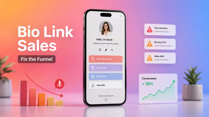
A reel does 300,000 views. You open your dashboard expecting a bump. Four sales, maybe six. The traffic showed up, it just didn’t buy.
If that’s familiar, the fix almost certainly isn’t more reach. It’s the page that sits between your content and your checkout: your bio link. Most creators treat it like a coat rack to hang links on. It’s not. It’s the last mile of your entire funnel, a checkout counter that a stranger walks up to for about fifteen seconds before deciding whether you’re worth their money. And right now, it’s leaking.
Every visitor who lands there moves through five quick stages before they buy: they click the link, land on the page, understand what you’re offering, decide whether they trust it, and then act. Miss any one stage and they’re gone usually without a trace, because a bounce never leaves a complaint. Each mistake below breaks a specific stage. Fixing them in the order they fail matters more than fixing all eight at once.
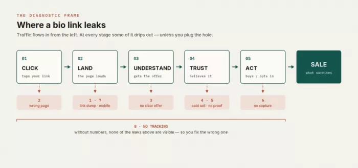
THE EIGHT LEAKS, AT A GLANCE
| # | The mistake | Stage it breaks |
| 1 | Your page is a link dump | Land |
| 2 | The page doesn’t match the thing that sent them | Click |
| 3 | No one can tell what you sell in three seconds | Understand |
| 4 | You send cold traffic straight to checkout | Trust |
| 5 | No proof where the decision happens | Trust |
| 6 | You rent your audience instead of owning it | Act |
| 7 | The page is broken on mobile | Land |
| 8 | You’re guessing because you track nothing | All of them |
1. Your bio link is a link dump
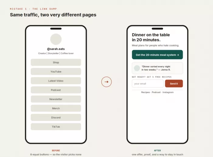
You know this page. Eight to twelve identical buttons stacked in a column: Shop, YouTube, Latest Video, Podcast, Newsletter, Merch, Discord, TikTok, Amazon Storefront. Every one the same size, the same weight, shouting at equal volume.
The instinct is that more options means more ways to convert. The opposite happens. When every choice looks equally important, none of them does, and the visitor has to do the work of figuring out which one matters. Faced with a wall of equal-weight buttons and no guidance, the cheapest decision the brain can make is to defer “I’ll come back to this later” which, on the internet, means never. Every link you add past the one that actually earns money quietly taxes the one that does.
If you want to take that idea further, the better move is to turn one bio link into a conversion funnel where every part of the page has a job, from directing the first click to capturing people who are not ready to buy yet.
The highest-converting bio pages I’ve torn apart had one thing to click. Everything else was demoted to a footnote or gone entirely.
FIX IT
● Pick one primary action per campaign and make it visually dominant larger, a solid color, above the fold, impossible to mistake for anything else. Everything else drops a level.
● Demote your “nice to have” links to socials, the back catalog to small text links or a collapsed section, not full-size buttons competing with the money.
● If you genuinely serve two audiences, say buyers and casual fans, give them two clear paths. Two is routing. Twelve is a maze.
Watch: the click-through rate on your primary link as a share of total page visits. If it’s low, the page is spreading attention too thin.
2. The page doesn’t match the thing that sent them there
Your video sold one specific idea, say, a Notion template that plans your whole week in twenty minutes. Someone taps your link, intrigued. It opens on a generic “Hi, welcome, here’s everything I do” hub. The template is in there somewhere, three buttons down. They don’t go looking. They leave.
People follow relevance the way an animal follows a scent. Your content laid down a specific trail “the thing that saves me three hours a week” and when the landing page doesn’t confirm that scent inside a second or two, the visitor concludes they’ve arrived somewhere wrong and backs out. This is the most invisible leak of the eight, because in your analytics the traffic looks perfect. They clicked. They just didn’t recognize where they landed.
This gets harder when different posts keep sending people to the same profile over time. Instead of replacing the destination every time something new goes live, it helps to build a more stable bio link system that keeps important paths available while changing only what genuinely needs to change.
FIX IT
● Point the destination at the promise. If the content sold one thing, the page should lead with that same thing ideally in the same words the video used.
● Use campaign-specific links wherever your tool allows it. A viral post can point somewhere different from your evergreen bio. They’re not the same visitor.
● Carry the language across. If the video said “the 20-minute meal system,” the button can’t say “Shop Now.” It says “Get the 20-minute meal system.” Matching words are matching scent.
3. No one can tell what you sell in three seconds
Above the fold: your name, your handle, a headshot, and a tagline like “Creator | Storyteller | Coffee lover.” All charming. None of it tells a stranger what they can get from you or whether it’s meant for someone like them.
A first-time visitor is running one silent query the entire time: what’s in this for me, and is it for me? When the top of your page answers “here’s who I am” instead of “here’s what you get,” you’ve spent your three most valuable seconds on the wrong subject. Your identity is what you care about. The outcome is what they care about. Those are not the same page.
FIX IT
● Lead with the outcome and the audience, not your title. A stranger should be able to finish “this is for me because ___” before they scroll a single pixel.
● Put the offer above the fold in plain words. “Hi, I’m Sarah” is a closer, not an opener “Meal plans that get dinner on the table in 20 minutes, for people who hate cooking” is what earns the scroll.
● Trade clever for clear. “Storyteller” tells nobody what to buy. Specific beats are witty every time money is involved.
4. You send cold traffic straight to a checkout
A stranger watches thirty seconds of your video, taps your link, and lands on a $149 buy button with nothing in between. Then you wonder why the conversion rate is a rounding error.
The problem isn’t the price. It’s the timing. Someone who’s known you for fifteen seconds is cold, and a checkout is an ask you make of warm people. Trust is built in steps, and here you skipped every one of them. Match the ask to how warm the visitor actually is:
| Temperature | Where they came from | The ask that fits |
| Cold | First time seeing you, one video | Free or low-risk: a lead magnet, a “start here,” a cheap tripwire |
| Warm | Followed a while, watched several posts | Your signature paid offer, with proof sitting right next to it |
| Hot | On your list, replies, already bought | Your highest-ticket offer, direct no bridge needed |
FIX IT
● Build a bridge for cold traffic, a free resource, a short waitlist, or a low-cost tripwire that starts the relationship instead of demanding the whole commitment up front.
● Don’t retire your high-ticket offer; just stop pointing strangers at it. Send cold traffic to the front door and warm traffic to the register.
● Let the price you show match the temperature of whoever is actually clicking, not the temperature you wish they had.
5. There’s no proof where the decision actually happens
Your testimonials exist on a separate sales page, or in a highlight reel, or nowhere at all. The bio link itself asks for money with no evidence attached to it. At the exact moment someone is deciding whether to trust you, you’ve handed them a button and nothing else.
Proof isn’t decoration; it’s risk reduction. When you describe your own offer, that’s expected of course you think it’s good. When someone else vouches for it, that’s information the buyer can’t get anywhere else, and it lands harder than another paragraph of you selling yourself. A single specific line from a real customer, placed beside the button, often moves more people than a redesign of the button.
On a bio link, one specific sentence from a real customer usually outsells three of your own.
FIX IT
● Put one or two pieces of proof exactly where the money moves beside the primary button, not two clicks away on another page.
● Choose specific over glowing. “Went from skipping breakfast to meal-prepping every Sunday in two weeks Jenna R.” beats “amazing, 10/10!!” because detail reads as true and superlatives read as marketing.
● Use the proof you already have. A screenshot of a DM, a real customer count, a recognizable logo, a modest before-and-after. Honest and small beats polished and vague.
6. You’re renting your audience instead of owning it
Every link on your page points outward to platforms you don’t control. There’s no email capture, no way to reach these people again except by posting and hoping the algorithm feels generous that day. You’re capturing attention and letting it evaporate.
A follower is a lease the platform can cancel at will. You’ve watched it happen: reach halves overnight, an account gets flagged, a format falls out of fashion, and the audience you thought you had simply stops seeing you. The people tapping your bio link today are the warmest traffic you will ever get. If the only place they exist is inside someone else’s app, you don’t actually have them.
The most profitable job of a bio link is often not to make a sale today it’s to turn a stranger into someone you can reach on purpose tomorrow.
FIX IT
● Add one capture step: an email or SMS opt-in tied to something worth trading for: a free guide, a discount code, a spot on a waitlist.
● Treat the list as the asset and the individual sale as the follow-up. A buyer you can email again is worth many times one who bought once and disappeared.
● Even when selling is the goal, capture the ones who didn’t buy. Most people won’t purchase on the first visit the opt-in is how you earn a second one.
7. The page is broken on the only device that matters
You built the page on your laptop. You checked it on your laptop. Almost none of your visitors will ever see it there. Bio-link traffic comes from apps people use on their phones, which means the desktop preview you’re admiring is the one view that doesn’t count.
Every mobile flaw is a silent leak you cannot see from a desktop: a page that loads slowly on cellular data, buttons too small or too crowded for a thumb, text that overflows its container, a header image so tall it shoves your call to action below the fold, a link that breaks inside the in-app browser. None of these show up as errors. They show up as bounces.
FIX IT
● Test on your actual phone, on cellular data, not just on office wifi. Load speed on a mediocre connection is part of your offer whether you like it or not.
● Make tap targets large and well spaced thumbs are imprecise instruments. The primary button should be both impossible to miss and easy to hit.
● Keep the important things above the fold on a small screen. A beautiful full-width header that pushes your CTA off-screen is beautifully costing you sales.
● Confirm your links actually open correctly from inside Instagram’s and TikTok’s in-app browsers, where a surprising amount silently misbehaves.
8. You’re guessing, because you track nothing
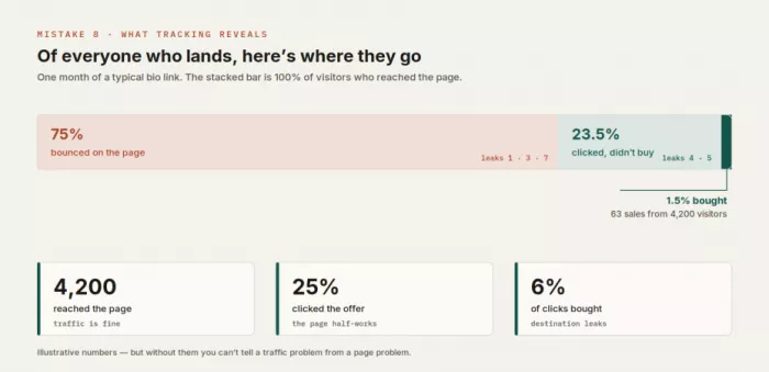
This is the master mistake, the one that keeps the other seven invisible. You know your follower count and roughly how many sales you made last month. You have no idea how many people actually reached your bio link, how many clicked through, or where in that fifteen-second walk they dropped off.
Without numbers you can’t tell a traffic problem from a conversion problem so you fix the wrong one. You chase more views when the real leak is on the page. You redesign the page when the real issue is that the traffic arriving was stone cold. Every fix in this article becomes a guess. A handful of numbers turns “I think” into “I know.”
FIX IT
● Turn on whatever analytics your bio-link tool already gives you most show visits and clicks at no cost. Learn your baseline before you touch anything.
● Use tagged links so you can see which specific post sent buyers, not just which sent clicks. Buyers and browsers are different traffic.
● Change one thing at a time. Redesign everything at once and you’ll improve your numbers without ever knowing which change did it which means you can’t repeat it.
What a bio link that sells actually looks like
Eight fixes can feel like a pile of parts. They’re not. Read top to bottom, a bio link that converts is a single argument, and every stage of the funnel has one job on the page:
1. A headline that names the outcome and the audience (Understand), in the same words your content used to get them here (Click).
2. One dominant call to action, matched to how warm the visitor is (Land, Trust) a low-risk step for cold traffic, the paid offer for warm.
3. A piece of real, specific proof sitting right beside that action (Trust).
4. An email or SMS capture for everyone who isn’t ready to buy yet (Act).
5. Everything else socials, back catalog, the story about you demoted below and kept quiet.
6. All of it fast and thumb-friendly on a phone (Land), with tracking switched on so you can see what’s working.
Run your own page against that list right now. Most people find three or four leaks on the first pass and the repairs are usually an afternoon, not a rebuild.
Reach gets you noticed. The last fifteen seconds get you paid.
A bio link rarely fails because the offer is bad. It fails in the plumbing, the extra button, the mismatched headline, the checkout shown to a stranger, the missing testimonial, the page nobody ever opened on a phone. None of it is dramatic, which is exactly why it survives. It costs you quietly, one bounced visitor at a time, and quiet losses are the ones that never get fixed.
You don’t need more traffic to solve this. You need the traffic you already have to stop draining out the sides. Start with the stage that’s failing first; a broken Click can’t be rescued by a flawless Act and repair it in order. Fix the leaks, and the same reels you’re already posting start closing the sales they were always capable of.


Comments