
Someone watched your video to the end, tapped your profile, and then tapped your link. That's three decisions in a row, all in your favor. Then they landed on your page, looked around for a few seconds, and left.
That last step is where most creators quietly lose the people they worked hardest to reach. This guide is about that moment: what visitors see when they arrive, what they came looking for, and what actually gets them to tap.
Why Your Bio Link Is the Hardest-Working Page You Own
Think about the path a visitor takes before they ever see your link page. They find your content, decide it's good enough to check out your profile, read your bio, and then decide to tap an external link. Each of those steps filters people out. By the time someone reaches your link page, they're no longer a casual scroller. They're the most interested person you'll meet all day.
That's what makes a weak link page so costly. You aren't losing random traffic. You're losing the warmest traffic you have, and you already paid for it with the hours that went into your content.
There's a second reason this page matters. Your followers on Instagram, TikTok, or YouTube live on someone else's platform, under someone else's rules. An algorithm change can cut your reach overnight. Your link page is the doorway to the things you actually own: your email list, your store, your booking calendar, your community. When it works well, it steadily moves people from rented attention to a relationship you control.
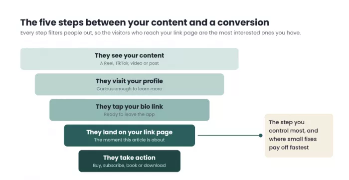
Key takeaway: The people who reach your link page have already said yes three times. Your page's only job is to make the fourth yes easy.
What “Conversion” Actually Means on a Link-in-Bio Page
Before you can improve a conversion rate, you need to know which one you're talking about. On a link-in-bio page, there are really three layers, and they tell you very different things.
• Page click-through rate is the share of visitors who tap any link at all. It tells you whether the page is doing its basic job of moving people forward, or whether they're landing and bouncing.
• Link-level click-through rate shows which specific links get tapped and how often. This is where you learn what your audience actually wants, which is often different from what you assumed they wanted.
• Downstream conversion is what happens after the tap: the purchase, the email signup, the booked call. This is the number that pays the bills, and it's the one most creators never connect back to their link page.
Here's the catch. A page can have a great click-through rate and still fail. Looking at bio link metrics in context matters because not every click carries the same value. If most of your clicks go to your Spotify profile but your real goal this month is selling a course, your page is busy, not converting. The metric that matters depends entirely on what you're trying to achieve.
| Creator type | What “converting” usually means | The number worth watching |
| Musician or artist | Streams, pre-saves, ticket and merch sales | Clicks to pre-save or ticket links, not just total page clicks |
| Coach or consultant | Booked discovery calls | Calls booked per 100 page visitors |
| Product seller or shop | Purchases | Revenue per visitor |
| Writer, educator, or newsletter creator | Email signups | Signup rate from the page |
| Influencer working with brands | Affiliate sales and brand inquiries | Affiliate clicks, commissions, and media kit views |
| Nonprofit or cause | Donations, volunteer signups, petition signatures | Completed actions, not visits |
Pick one row, or write your own, and keep it in mind as you go through the rest of this article. Every fix below works better when you know exactly which number you're trying to move.
1. Give Your Page One Job
Most link-in-bio pages grow the same way. You launch something and add a link. You start a podcast and add another. A brand deal comes in, and that gets a button too. Nothing ever gets removed, so two years later the page looks like a junk drawer: everything you've ever done, with equal weight and no clear direction.
The reason this happens is understandable. Creators worry that if they remove a link, someone who wanted it won't find it. But a page that treats ten things as equally important is really telling the visitor that nothing is important. People don't read link pages carefully. They scan, and if nothing stands out, they leave.
How to fix it
• Ask yourself one question: if a visitor could do only one thing on this page this month, what would matter most to you? That answer becomes your primary link.
• Put the primary link at the top and make it look different from everything else. Depending on your tool, that might mean a larger button, a featured block with an image, a contrasting color, or an embedded form.
• Keep two to four secondary links underneath, and treat them as supporting options rather than competitors to the main one.
• Move older or rarely used links into a grouped section, a collapsible folder, or a separate “more” page, so they're still available without crowding the main path.
Before: Eleven buttons of the same size, starting with “My Website” and ending with a podcast episode from 2023.
After: One featured block for this month's workshop, three supporting links below it, and everything else tucked into an archive section.
Pro move: Your page's one job doesn't have to stay the same all year. During a launch it might be sales. In a quiet month it might be growing your email list so the next launch has an audience. Change the job deliberately rather than letting old priorities linger.
2. Match the Page to the Post That Sent Them
Nobody taps a bio link out of general curiosity. They tap because a specific post made them want a specific thing: the recipe from the video, the jacket you were wearing, the free template you mentioned. They arrive with that one thing in mind, and they give your page a few seconds to show it to them.
Marketers call this “information scent.” When the page clearly continues the thread that started in the post, people keep going. When they have to hunt, most of them assume the thing isn't there, or that finding it isn't worth the effort, and they close the tab.
How to fix it
• Whenever you publish a post that asks people to go to your link, put that exact item at the top of the page, even if only for a few days.
• Use the language from the post in the button itself. If the video said “the 15-minute pasta,” the button should say “The 15-minute pasta recipe,” not “Recipes.”
• Check which older posts still bring in traffic. A video from six months ago that's still getting views deserves a permanent spot, perhaps in a “From my videos” section.
• If your audience on each platform wants different things, consider separate pages or separate links for each one. Your YouTube viewers and your TikTok viewers may arrive expecting completely different things.
This one change often does more than any design tweak, because it fixes the most common reason people leave: they couldn't find what they came for.
Pro move: Say the button's exact wording in your content. “Tap the link in my bio and hit Free Meal Plan” removes all guesswork. The visitor knows exactly what to look for before the page even loads.
3. Cut Your Links in Half (Then Cut Again)
Every link you add makes every other link a little less likely to be tapped. This isn't just a theory about decision fatigue. On a phone screen, it's physical: a page with twelve buttons pushes most of them below the first screen, and many visitors never scroll far enough to see them. The link you care most about can end up invisible simply because of where it sits.
A link nobody taps still costs you something. It takes up space, adds a decision, and pulls attention away from the links that matter.
How to fix it
Open your analytics and look at the last 30 to 90 days of clicks for every link. Then sort each link into one of four groups:
• Keep and feature: links that get strong clicks and connect to your main goal. These stay near the top.
• Keep but move down: links that get steady clicks but aren't your priority right now, like a podcast feed or a past free resource.
• Merge: links that do similar jobs. Three separate product links can often become one “Shop my favorites” link that leads to a single collection.
• Remove or archive: links that get almost no clicks and don't serve your current goal. Expired offers, old campaigns, and outdated projects belong here.
Pay special attention to links pointing to your other social profiles. The visitor just came from social media, so full-sized buttons for Instagram, TikTok, and X usually waste prime space. A small row of icons at the bottom does the same job without competing with your main offer.
Key takeaway: Aim for a page where the most important link is visible without scrolling on a small phone. If it isn't, you have too many links above it.
4. Write Link Labels Like Promises, Not Nouns
For most visitors, the text on your buttons is the only copy they'll read. They won't study your bio or scroll through a description. They'll glance at the buttons and decide in a second or two which, if any, is worth a tap.
That's why labels like “Shop,” “Blog,” “Course,” and “Freebie” underperform. They tell the visitor what category something belongs to, but not why they should care. A good label answers the question every visitor is silently asking: what do I get if I tap this?
How to fix it
• Lead with the outcome or the specific thing the person gets, rather than the format it comes in.
• Add one concrete detail, such as a number, a time frame, or a format, because specific labels feel more trustworthy than vague ones.
• Say “free” when something is free. It's one of the most useful words you can put on a button, and leaving it out makes people assume there's a cost.
• Keep labels short enough to fit on one or two lines on a phone. If the text wraps into three lines, it stops looking like a button and starts looking like a paragraph.
| Weak label | Stronger label | What changed |
| Shop | Shop the 3 products in my morning routine | Specific, and tied to content people already saw |
| Newsletter | Get one money tip every Friday (free) | States the benefit, the frequency, and the price |
| Coaching | Book a free 20-minute strategy call | Clear action, clear time commitment, no cost |
| My course | Learn to edit Reels in one weekend | Describes the result instead of the product |
| YouTube | Watch the full kitchen tour (12 min) | Tells people exactly what they'll see and how long it takes |
Pro move: For your top one or two links, add a thumbnail image if your tool allows it. A photo of the actual product or a still from the video often communicates faster than any label can.
5. Win the First Screen
Many of your visitors discovered you through a single post. They don't know your name, your story, or what you offer. When your page loads, they're asking two quick questions: am I in the right place, and is this for me? If the first screen doesn't answer both, the rest of your page barely matters.
The first screen is everything visible before the visitor scrolls. On most phones, that's your profile photo, your name, a line or two of text, and the first couple of buttons. That small area has to do a lot of work.
How to fix it
• Use the same profile photo you use on the social platform that sends you the most traffic. When the visitor sees a familiar face, they instantly know they've landed in the right place.
• Replace vague bio lines with one clear sentence about who you help and how. “Mom | Dreamer | Coffee lover” tells a stranger nothing useful. “I help new runners train for their first half marathon” tells them everything.
• Make sure your primary link appears on the first screen. Large banner images and long intro text often push it down without you noticing.
• Choose a background that stays out of the way. Busy patterns and low-contrast photos make buttons harder to read, especially outdoors in bright light.
Before: “Creator | Traveler | Living my best life ✨”
After: “Budget travel guides for Southeast Asia, from someone who's lived there for six years.”
Pro move: Preview your page on the smallest phone you can borrow. If your primary link is visible without scrolling there, it's visible almost everywhere.
6. Design for Thumbs, Not Desktops
Almost all of your link-in-bio traffic comes from phones, and most of it opens inside an app's built-in browser rather than Safari or Chrome. That detail is easy to forget when you build or edit your page on a laptop, but it changes a lot about how the page behaves.
In-app browsers are more limited than regular ones. Visitors often aren't logged into their accounts there, saved payment details may not appear, and some pages load slower or display differently. So a link that works perfectly when you test it on your computer can feel clumsy when a real visitor taps it from inside Instagram or TikTok.
How to fix it
• Make buttons easy to hit. Full-width buttons with comfortable spacing between them prevent accidental taps, which quietly send people to the wrong place and frustrate them.
• Check contrast and text size. Light gray text on a white button might look elegant on a large monitor, but it becomes hard to read on a phone in sunlight.
• Keep the page light. Autoplay background videos and oversized images look impressive but can slow the page on mobile data, and visitors don't wait long for a page that is still loading.
• Watch for login walls. If a link leads to a checkout or platform that requires signing in, expect drop-off. Prefer destinations that allow guest checkout or quick payment options wherever possible.
The simplest test is also the most revealing. Open your own profile in each app that sends you traffic, tap your bio link, and try to complete your main goal from start to finish. Buy the product, sign up for the list, book the call. You'll likely find at least one annoying step you didn't know existed.
Pro move: Run that test with Wi-Fi turned off. Many of your visitors are on mobile data, sometimes with a weak signal, and slow loading problems show up much more clearly that way.
7. Remove Every Step You Can
Every extra page between the tap and the goal gives people another chance to leave. A common setup looks like this: the bio link leads to a link page, which leads to a landing page, which leads to a checkout page, which leads to a payment page. Using a bio link checkout can remove part of that journey by keeping more of the buying process in one place.
Each step feels small on its own. Together, they add up. People get distracted, lose signal, get a notification, or simply lose interest. The shorter the path, the more of your visitors make it to the end.
How to fix it
• Count the taps from arriving on your page to completing your main goal. Write them down. Then look for any page that exists only to send people to another page, and remove it.
• If your link-in-bio tool supports it, collect emails, sell digital products, take bookings, or accept tips directly on the page, instead of sending visitors to another site to do it.
• Ask for less information. An email signup that asks only for an email address will almost always get more signups than one that asks for a name, phone number, and birthday.
• For affiliate and product links, send people directly to the specific product, not a store's homepage where they have to search again.
Key takeaway: Every page between the tap and the goal should earn its place. If a step doesn't help the visitor decide or act, it's just a place for them to leave.
8. Borrow Trust Before You Ask for Anything
A follower who has watched your content for a year already trusts you. A stranger who found you through one viral video doesn't. That second person is often the one landing on your page, and you're asking them to hand over an email address, book a call, or pay for something from someone they met five minutes ago.
Trust signals help close that gap. They show the visitor that other people have already taken this step and were glad they did.
How to fix it
• Add a short, specific testimonial near your paid offer. “Loved it!” does little. “I ran my first half marathon eight weeks after starting this plan” gives a new visitor something real to picture.
• Use real numbers when you have them. The number of students, customers, subscribers, or reviews gives quick reassurance. Only use numbers that are accurate, because an inflated figure can undo all the trust you've built.
• Show where you've been featured. Press mentions, podcast appearances, and brand partnerships signal that others have vetted you.
• Keep your face visible. People are more comfortable buying from a person than from a logo, especially in the creator economy, where the relationship is the product.
Placement matters as much as content. A testimonial at the very bottom of the page, far from your offer, does very little. Put proof right next to the moment you ask for something, so it's there when the visitor is deciding.
Pro move: Screenshots of real comments or messages (shared with permission) often feel more believable than polished, formal quotes. They look like what they are: a real person reacting honestly.
9. Create Honest Urgency and Keep the Page Fresh
Your regular followers visit your link page more than once. If it looks exactly the same every time, they stop really looking at it. Their eyes slide past buttons they've seen before, the same way people ignore banner ads on websites they visit often.
Freshness gives returning visitors a reason to pay attention again. Urgency, when it's real, gives everyone a reason to act now instead of “later,” which for most people means never.
How to fix it
• Use scheduled links for launches, drops, and events so they appear and disappear on time without you needing to remember.
• Add a countdown only when there's a real deadline, such as the end of an early-bird price, a limited batch, or an event date.
• Rotate seasonal content. A holiday gift guide, a back-to-school resource, or a summer collection makes the page feel current.
• Remove expired offers right away. A “limited-time sale” link that leads to a closed sale is more than a broken link. It's a broken promise, and visitors remember it.
A word of caution about fake urgency: timers that reset whenever someone reloads the page, or “only 2 left” labels that never change, might get a few extra clicks at first. Over time, your audience notices, and trust is much harder to rebuild than a click-through rate.
Pro move: Set a monthly reminder to review your page. Ten minutes once a month to remove stale links and add something new keeps the page working much harder than a big redesign once a year.
10. Measure, Test, Repeat
Everything above is a strong starting point, but your audience is not everyone's audience. The only way to know what works for your page is to measure it, change one thing, and measure again. Creators who do this consistently tend to improve steadily. Those who make changes based on instinct often end up changing things that were already working.
Start with a baseline
Before changing anything, write down your current numbers: total page visits, overall click-through rate, and clicks on your primary link. Without a baseline, you have no way of telling whether a change helped or hurt.
Track what happens after the click
Your link page's analytics can tell you who tapped, but not whether they bought or signed up. To close that gap, add UTM tags to the links that go to your own website or store. These are small tags added to the end of a URL that tell tools like Google Analytics exactly where a visitor came from, so you can see which link on your page led to real sales or signups.
Test one thing at a time
If you change the label, the order, the button color, and the header all at once, you won't know which change made the difference. A simple monthly rhythm keeps testing manageable:
• Week 1: Review last month's numbers and pick the one thing you think is holding the page back.
• Week 2: Make a single change, such as rewriting your top label, moving a link up, or adding a testimonial.
• Weeks 3 and 4: Leave the page alone and let enough visitors pass through to give you meaningful data.
• End of the month: Compare the new numbers with your baseline, keep the change if it helped, and choose your next test.
Keep outside events in mind when you read results. If a video went viral during your test, your traffic and behavior will look very different from a normal month. Note those spikes so you don't mistake a lucky week for a winning change.
Pro move: Compare each link's clicks with its position on the page. A link sitting fifth that gets nearly as many clicks as the one at the top is telling you people are actively searching for it. Move it up and see what happens.
Before and After: A Link-in-Bio Page Makeover
To see how these ideas work together, let's look at a fictional example. Maya is an online fitness coach with a growing Instagram following. Her main goal this quarter is to fill her 8-week strength program, but her link page doesn't reflect that at all.
Her original page has eleven links of the same size. At the top is “My Website,” followed by her Instagram, TikTok, and YouTube, a podcast episode from last year, a discount code for a supplement brand, a free workout PDF, an old challenge that already ended, her Amazon storefront, a contact form, and, in eleventh place, “Coaching.” Her bio line reads “Fitness | Faith | Family.”
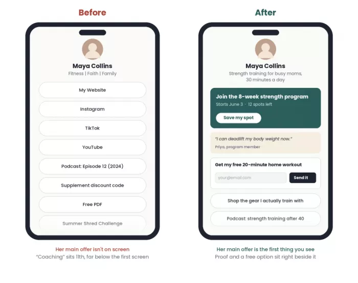
Here's what changed after applying the ten fixes:
| Page element | Before | After | Fix applied |
| Bio line | Fitness | Faith | Family | Strength training for busy moms, 30 minutes a day | Way 5 |
| Top link | My Website | Featured block: “Join the 8-week strength program (starts June 3)” | Ways 1, 4, 9 |
| Number of main links | 11 | 4, with the rest in an archive section | Way 3 |
| Social profiles | Three full-size buttons | Small icon row at the bottom | Way 3 |
| Free resource | “Free PDF” linking to a separate site | “Get my free 20-minute home workout” with email capture on the page | Ways 4, 7 |
| Social proof | None | A short client result next to the program link | Way 8 |
| Expired challenge | Still live | Removed | Way 9 |
| Tracking | Total clicks only | UTM tags on program and store links, monthly review | Way 10 |
Notice what didn't happen. Maya didn't need a new brand, a new design, or a paid tool upgrade. Most of the changes involved removing things, rewording things, and putting the right thing at the top. A new visitor now knows who she helps within a second, sees exactly what she wants them to do, and has a reason to trust her before being asked to commit.
Whenever she posts a Reel about a specific workout, she'll temporarily place that workout just below the program link (Way 2), so people arriving from that video find what they came for without searching.
The 15-Minute Link-in-Bio Audit
Open your link page on your phone, preferably from inside the app that sends you the most traffic, and go through these questions. Every “no” is a clear place to start improving.
☐ Can you name the one main job this page has right now?
☐ Is your most important link visible without scrolling on a small phone?
☐ Does your top link match what your most recent post asked people to go and find?
☐ Could a stranger understand who you are and who you help within three seconds?
☐ Does every button say what the visitor gets, not just what category the link belongs to?
☐ Have you removed or archived links that got almost no clicks in the last 90 days?
☐ Are your other social profiles shown as small icons rather than full buttons?
☐ Is there some form of proof, like a testimonial or a real number, next to your main offer?
☐ Have you tapped every link from inside Instagram or TikTok this month to check it still works?
☐ Can a visitor reach your main goal in three taps or fewer?
☐ Are all time-limited offers on the page still active?
☐ Do you know your current page click-through rate and your primary link's clicks?
You don't need to fix everything in one sitting. Pick the two or three “no” answers closest to your main goal and start there.
Final Verdict
A link-in-bio page is small, but it sits at the single most important moment in your content funnel: when interest either turns into action or disappears. Most pages struggle because they try to show everything, not because they're missing something.
The pages that convert well share a few habits. They have one clear job, they match what the visitor came looking for, they speak in outcomes, and they get checked and adjusted regularly. None of this takes a big budget or a designer. It takes about fifteen minutes and a willingness to remove things.
So open your page now, run the audit above, and make one change today. Then give it a few weeks and check the numbers. Small, steady improvements to this one page can make a real difference to everything your content is working toward.


Comments