
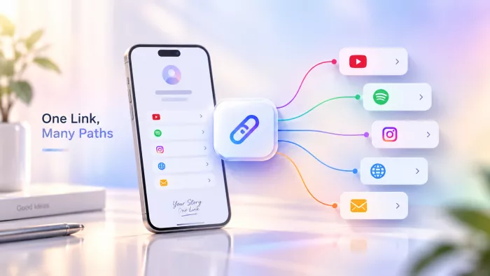
Open Instagram, look at a profile, and count the clickable links. One. That's the entire allowance, the famous “link in bio.” TikTok is the same, and so is most of the social web. Meanwhile the things we'd love people to see are scattered across half a dozen places, all of them competing for that lone slot.
Most of us solve this in about ten minutes and never think about it again. That's a shame, because the ten-minute fix is the boring half of the story. The interesting half, the one that decides whether the link earns us anything, is what happens after it goes live. So let's get the setup out of the way quickly, then spend real time on the part that matters.
First, what a “link in bio” really is
The phrase gets thrown around loosely, so let's pin it down. Strictly speaking, the link in bio is just that one clickable link the platform lets us put on our profile. On its own it can only go to a single place, that's how any URL works, and no tool changes it.
The trick everyone actually means is pointing that one bio link at a small hub page, a page whose entire job is to hold our other links as tappable buttons. Someone taps the link in our bio, lands on the hub, and chooses where to go next. One doorway that opens onto a room full of doors.
We'll hear this hub called a few names: a “link in bio page,” a “link hub,” a “landing page.” They're the same idea wearing different labels, and once that clicks, the rest of this is just detail.
Link hubs and link shorteners aren't the same thing
This trips a lot of people up, so let's clear it early. A link shortener, the kind that turns a long, messy address into something tidy still points to exactly one destination. It compresses a single link; it doesn't combine several.
A link hub does the opposite job: it's one address that fans out to many. If we've ever been told to “use a shortener to put all our links together,” that's a mix-up worth catching now shorteners shorten, hubs branch. We want the branching kind.
Why our bio only allows one link
It's worth knowing why the restriction exists, because it quietly shapes the smart way to handle it. Instagram and TikTok earn their money from attention that stays inside the app. Every tap that sends someone off to another website is a small leak, so those exits get rationed down to a single, half-hidden link in the bio.
In other words, we're not up against a missing feature. We're working around a deliberate business decision, and the platform has no reason to make it generous. That's worth keeping in mind, because it's the same reason further down we'll make the case against building everything on someone else's rented land.
Our realistic options, laid out plainly
Strip away the noise and there are four ways to do this. Everything we'll read anywhere else is a version of one of them.
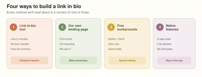
| Route | What it's really for | Cost | Control |
| A link-in-bio tool | Getting something live today with no fuss | Free to low | Low–medium |
| Our own page | Owning it outright, no branding but ours | Low–medium | High |
| Free workarounds | Spending literally nothing | Free | Medium |
| Native app features | Staying in-app, skipping third parties | Free | Low |
None of these is objectively best. Let's walk through each way we'd explain it to a friend, rather than as a spec sheet.
The fast route: a link-in-bio tool
This is what most of us reach for, and it's genuinely the quickest path from nothing to done. A link-in-bio tool exists to do this one job: it hands us a ready-made hub page and a short URL to paste into the bio.
The flow is about as simple as it sounds. We claim a username (which becomes the link, like tool.com/ourname), add our links one at a time, label each one in plain language, drag them into the order we want, publish, and swap the new URL into the bio. Ten minutes, no code, no headaches.
The part worth doing carefully isn't the setup, it's choosing the tool. Rather than counting features, let's ask four questions: can we brand the page or are we stuck wearing their logo, does it show us which links get clicked, will it still be free once we grow, and can we take the setup with us if we leave. Those four answers tell us far more than any template gallery.
The route that's actually ours: our own page
If we're building something we care about, it's worth considering skipping the dedicated tool and making a simple one-page site ourselves. It sounds more technical than a lightweight builder, a page on a site we already run, or something on our own domain all work fine.
We add the same buttons we would anywhere else. The difference is what we're standing on. This page is ours: our design, our rules, our branding, and a link no company can restyle, rate-limit, or switch off on a whim.
The trade is an honest effort. We'll spend longer setting it up and we own the upkeep. What we get back is total design freedom and the part that matters years from now is an asset we hold rather than borrow. For anyone treating this as a real business, that trade usually tips toward doing it ourselves.
The no-cost paths
Plenty of us want this to cost exactly zero, and it can. A few routes are free with no asterisk:
● A public Notion page. Already in Notion? We can build a clean page of links and share it publicly. It's free, fast to edit, and more presentable than we'd expect. The only real downside is an ugly URL unless we tidy it up.
● A free page builder such as Carrd. Its free tier gets us a neat one-pager with a handful of links and no payment, and it looks a good deal more polished than a bare document.
● The free tier of a link-in-bio tool. Most have one that's plenty to start; we'll simply bump into caps on branding, link counts, or analytics as we scale.
● Whatever the app itself offers. Platforms occasionally lend a hand Instagram's Story link stickers, for instance, and its slowly loosening bio rules. It's worth checking what ours currently allows before reaching for a third party.
Each of these has a ceiling. Free plans cap features, native tools limit how many links we get and where they show, and a plain Notion page won't win design prizes. Let's learn where each wall is before leaning on it, so we're not migrating everything in a panic three months from now.
Actually putting the link in our bio
Once the hub is built, there's one last step people forget to mention: dropping that single URL into the bio itself. It's quick, but it lives in a slightly different spot on each platform, and the rules shift often enough that it's worth a fresh look each time.
● Instagram. Edit profile, then find the website or links field, and paste the hub URL there. Instagram has loosened up and now lets us add more than one link, but a single tidy hub still beats a cluttered list and we can also drop the link into a Story link sticker for extra reach.
● TikTok. Edit profile and add the URL to the website field. Historically this slot unlocks once an account qualifies, so if we don't see it yet, that's usually why rather than a bug.
● YouTube, X, and the rest. Nearly every profile has an about or bio link field somewhere in its settings. The pattern is always the same: find the one link slot, paste our hub, save.
Whichever platform we're on, the move is identical in spirit to replace whatever single link is sitting there now with the one hub link that leads to everything. That's the entire point of the exercise finally paying off.
The honest answer isn't a single winner; it's whichever matches the one thing we care about most. Read down this list and stop at the row that sounds familiar.
| If this is us | Start here |
| Just want it live in five minutes | A link-in-bio tool's free tier |
| Running a business that needs branding and data | A paid link-in-bio plan, or our own page |
| Refusing to spend a cent | A public Notion page or Carrd's free plan |
| Building for the long haul and want to own it | Our own page on our own domain |
Notice the tool is never really the decision. Speed, money, branding, ownership we pick our priority and the method falls out of it almost by itself.
Holding our links in one place is the easy part. Getting someone to tap the right one is the entire skill and it's the step nearly every guide skips.
The step that actually decides whether it works
Here's where the ten-minute crowd and the people who get results part ways. A hub that simply contains our links is doing a quarter of its job. A hub that guides people to the right one is doing all of it.
The classic mistake is treating the page like a filing cabinet for every link we've ever made, stacked top to bottom, in no particular order. Land on that and nobody feels spoiled for choice; they feel tired, and tired people close tabs. A short, deliberate list beats an exhaustive one every single time.
Do this ● Put the link we most want tapped right at the top, where most taps land. ● Keep it to a handful of genuine priorities, not a life's archive. ● Label links the way a person talks “Book a free call,” “Read this week's post.” ● Decide what a single visit is for, and make that one action the obvious star. ● Reshuffle it around whatever we're pushing right now. | Not this ● Dumping ten near-identical buttons in the order we happened to add them. ● Leaving a link to last month's launch sitting there, dead. ● Naming things “Link 1,” “Click here,” or pasting the raw URL. ● Giving five things equal weight so none of them stands out. ● Setting it up once and never touching it again. |
None of this is complicated. It's just the difference between a page that holds links and a page that moves people and almost nobody bothers, which is exactly why it works.
How many links is the right number?
There's no magic figure, but the honest rule is: fewer than we think. Every link we add divides attention among the rest, so a page of ten quietly weakens all ten. Three to five focused links usually outperforms a long stack.
A simple test settles most cases. Could a stranger glance at the page for two seconds and tell us what we most want them to do? If yes, the count is fine. If not, we've got too many, and the fix is to cut, group, or rotate not to add another button hoping one sticks.
Little things that make a link look trustworthy
The look of the link matters more than most of us assume, and it all reduces to trust. A link is a tiny promise about where a tap will land, and a scruffy one makes people hesitate at exactly the wrong moment.
A custom domain is the single biggest lift. A link reading ourname.com feels like us; a generic sometool.com/ourname94 feels like a stranger handed it over. That same trust advantage is why a clear branded vanity URL often feels safer to click than an opaque shortened address. Subtle, but it genuinely nudges whether someone trusts the tap enough to take it.
Past the domain, dropping a third party's branding and matching the page to our own colours says, quietly, that we take ourselves seriously. This isn't decoration for its own sake; a clean, recognisable link earns more clicks than a messy one, and clicks were the whole point.
The same door, offline too
Here's a use most people miss. That single hub link doesn't only belong in a social bio nearly every tool, and any page we build ourselves, can turn it into a QR code. Same doorway, now scannable.
That means the work we put into the hub travels beyond the app. A code on our packaging, a business card, a market stall, or the last slide of a talk all lead to the same well-organised set of links. Build the hub once; point everything at it, on screen and on paper.
Let the clicks tell us what to fix
A link hub isn't a monument; it's a thing we improve, and we can only improve what we can see. That's why analytics aren't optional; a tool that won't show us per-link clicks is hiding the one number we actually need.
Three simple things are worth watching: how many people click at all, which links they pick, and which ones nobody touches. Looking beyond raw clicks with link-in-bio analytics also makes it easier to see whether visitors are choosing the destinations we actually want them to reach.
That last figure is the useful one. A link stuck at zero is telling us it's in the wrong spot, poorly named, or something our audience simply doesn't want all fixable, once we know.
Then we close the loop. Push the winners up, rewrite or bin the dead weight, and try a different label on the same destination to see if it pulls better. A handful of changes guided by real taps will out-perform any amount of guessing about what people “probably” like.
A maintenance habit worth keeping
Left alone, a link hub rots. Promotions expire, links break, and last season's priority stays glued to the top long after it stopped mattering. None of that announces itself; we just quietly lose clicks.
A five-minute check every couple of weeks fixes it: is the top link still the thing we're actually pushing, does every link still work, and is anything sitting there expired? Tiny habit, and it's the difference between a page people trust and one they learn to ignore.
The part most people don't want to hear
Before the send-off, one uncomfortable truth. Nearly all of us build our one link on rented ground. The page, the short URL, the whole arrangement lives on a service we don't own and if that service hikes its price, rewrites its terms, or folds, our link goes down with it. Every bio, caption, and business card pointing at it breaks in the same instant.
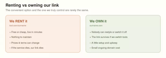
That's the real argument for a custom domain and, ideally, a page that's ours: it's the one version of this nobody can quietly take away. Convenience is worth plenty, and there's no shame in the easy route. Let's just make the trade knowingly, instead of discovering the catch the hard way.
If we were setting one up today
We'd start on a free link-in-bio tier to get something live the same afternoon, because a link that exists beats a perfect one still stuck in our heads. We'd add three links, not ten, with the most important on top and labels that read like a human wrote them.
Then, once it was clearly earning its keep, we'd move it onto our own domain so the link was ours for good and we'd glance at the click numbers every few weeks and quietly tidy up. That's the whole game: fit the links in fast, then spend our attention making the one doorway the most useful thing on the profile.
Because the goal was never really to cram many links into one. It was to turn that single, stubborn link in our bio into the best-used door we've got.


Comments