
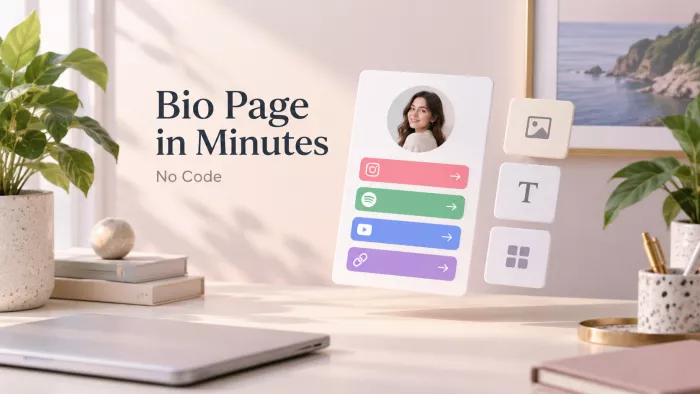
You can drag some links into a template and have a bio page live before your coffee cools. That part is genuinely easy, and anyone promising to teach you how is padding an afternoon of clicking into a 2,000-word post.
Here’s the thing they leave out: most people build a page that functions and never realize it doesn’t convert. It loads, the links work, and it quietly underperforms because nobody told them what a good one looks like. So we’re going to build yours fast but fast in a way that ends with a page that earns the tap, not just one that exists.
The 90 seconds of thinking that make the 10 minutes possible
The people who spend forty frustrated minutes on a bio page are almost always the ones who opened the tool first and started thinking second. The build is quick precisely because you make three decisions before you sign up for anything.
DECIDE THESE BEFORE YOU TOUCH A TOOL • What is the one action this page exists to drive? Not five actions one. Selling a product, growing a list, getting streams, booking calls. Every other link is a supporting act to this. If you can’t name the headline goal, the page has no spine and it’ll show. • What are your links, ranked by that goal not by habit? Most people list links in the order they think of them, which is basically random. Order them by how much each one serves the goal above. Write the list on paper first; ranking is easier away from the interface. • Where is your traffic actually coming from? A page fed by TikTok wants something different up top than one fed by a LinkedIn profile or a podcast description. The visitor’s starting point shapes what should greet them. |
Ninety seconds on those three, honestly, and the rest is assembly. Skip them and you’ll be the person rearranging buttons at minute thirty-five wondering why it feels off.
Pick a tool fast, without the twelve-option roundup
You do not need to compare every link-in-bio tool on the market to start. That’s a different article and it kills your momentum. For a first page, one of three defaults will fit almost everyone pick on the basis of what your goal is, not which has the most features.
A fast pick, based on what your page is for.
| Choose this if | Go with | Why |
| You just need to route people | The big, popular default tool | Fastest setup, most templates, nothing to learn. Perfect when the page is a signpost, not a store. |
| You’re selling or collecting emails | A creator-commerce tool | Native checkout and email capture built in, so you’re not stitching three services together later. |
| You already live in one ecosystem | Whatever your platform offers natively | If your host or shop already has a bio-page feature, using it saves an integration and keeps data in one place. |
Don’t agonize here. The tool is the least consequential decision you’ll make today the link order matters ten times more and every one of these lets you export or switch later. Pick, and move.
The build, minute by minute
Here’s the whole thing, time-boxed so “ten minutes” is a real claim and not a headline number. The times genuinely add up to ten. What follows the table is the why under each block, because that’s where the page is won or lost.
The full build, and where your minutes should actually go.
| Time | Step | The real point of it |
| 0–2 min | Sign up & claim your URL | Get in the door; get the handle right the first time |
| 2–5 min | Add & order your links | The highest-leverage step in the whole build |
| 5–7 min | Make it look like you | Three things that matter; five that don’t |
| 7–9 min | The details 90% skip | A hero action, icons, mobile preview |
| 9–10 min | Publish & go live | Get the link into the bio it was built for |
Minutes 0–2 : Sign up and claim your URL
Sign up with whatever’s fastest, then spend your attention on one thing: the URL handle. Match it to the name people already know you by, and keep it consistent with your other socials. A page at your clean name reads as trustworthy; one with random numbers tacked on the end reads as a burner account.
The common mistake is grabbing whatever’s free and moving on, then wanting to change it after you’ve printed it on things. Get it right now. If your exact name is taken, add a natural word (your niche, your city) rather than digits “yourname.studio” beats “yourname8842” every time.
Minutes 2–5 : Add your links, then fight over the order
This is the part worth slowing down for, even inside a speed run. Adding links is trivial; ordering them is the entire game. People read a bio page top to bottom and lose energy as they go, so the top slot is your most valuable real estate and the bottom is where links go to be ignored.
Put the link that serves your one goal at the very top above the fold, first thing a thumb reaches. Everything else ranks below it in descending order of usefulness to that goal. Resist the urge to lead with your latest YouTube video just because it’s the newest thing; lead with the thing you actually want to happen. That hierarchy is also what separates an ordinary bio page from a link-in-bio landing page that converts, where one action is deliberately given priority over the rest.
And cut ruthlessly. Every extra link dilutes the ones that matter and hands the visitor a small decision they didn’t ask for. A page with four sharp links beats one with eleven, because eleven choices is the same as no choice, people freeze and tap nothing.
Minutes 5–7 : Make it look like you (without the rabbit hole)
Design is where beginners burn most of their ten minutes, and it’s the least important part. You need it to look intentional, not perfect. Three things do 90% of the work:
• A recognizable profile image ideally the same one as your socials, so the person who followed you on Instagram instantly knows they’re in the right place. Familiarity is the fastest trust signal you have.
• One accent color that’s actually yours pick a single color that matches your brand or your vibe and let it carry the page. One deliberate color beats six clashing ones.
• Readable contrast dark text on light or light on dark, tested with a squint. If you can’t read a button in half a second, neither can someone scrolling at a bus stop.
What you can safely ignore on a first build: fancy fonts, animated backgrounds, gradient experiments, and theme-hopping. None of it changes whether someone taps your top link. Set the three things above and physically move on the timer is the point.
Minutes 7–9 : The details almost everyone skips
This is the two minutes that separates a page that works from one that just sits there. Three small moves, big payoff:
• Give your top link a reason to be tapped. A weak page labels its first button “My Links” or “Shop.” A strong one says what the person gets: “Get 20% off my preset pack” or “Free 5-day email course.” The label is a tiny pitch, not a filing category.
• Add a thumbnail or icon to each link. A wall of identical grey buttons is exhausting to scan. Small images or icons give the eye something to land on and make the important link visually louder than the rest.
• Preview it on an actual phone. Your page will be seen on a phone roughly always, so check it on one before you call it done. Buttons that looked balanced on a laptop can crowd or clip on a narrow screen.
WEAK TOP LINK My Links · Shop · Latest Video Generic labels that name a category and give no reason to tap. | STRONG TOP LINK Get 20% off my new preset pack Names the payoff. The visitor knows exactly what happens and why it’s worth it. |
Minutes 9–10 : Publish and put it where it belongs
Hit publish, copy the link, and this is the step people somehow forget actually paste it into the bio field of the platform it was built for. A finished page that never makes it into your Instagram or TikTok bio is a page nobody will ever see.
While you’re there, drop the link anywhere else it earns its keep: your YouTube channel description, your email signature, your podcast show notes. The page took ten minutes; putting it in five places takes thirty more seconds and multiplies who lands on it.
Before you close the tab: the 5-point audit
Run this the moment you think you’re done. It takes twenty seconds and catches the mistakes that quietly cost you clicks. If any answer is “no,” fix it before you move on.
THE FINISHED-PAGE CHECKLIST • Does the top link match your one goal? If your goal is sales and the first button is your Spotify, the page is arguing with itself. • Would a total stranger understand it in three seconds? Show it to someone who doesn’t know your work. If they hesitate, your labels are too clever or too vague. • Does it load fast and look right on mobile? Slow or broken on a phone means most of your traffic bounces before the page even appears. • Is there a clear reason to tap the main link? The label should promise a payoff, not name a category. • Did you remove everything that isn’t pulling its weight? If a link doesn’t serve the goal, it’s competing with the ones that do. Cut it. |
The mistakes that quietly kill a bio page
None of these break the page. That’s exactly why they’re dangerous everything looks fine while the clicks leak out the bottom.
• Too many links. More options feels generous; it actually paralyzes. Every link you add makes the whole page harder to act on. Fewer, sharper links win.
• Burying the important link. The thing you most want people to do should never be at position seven. If it matters, it goes near the top, full stop.
• A wall of identical buttons. When every link looks the same, nothing stands out, and the visitor’s eye slides right off. Use icons, spacing, or a highlight to give the key link visual weight.
• Dead and outdated links. The “new” drop from four months ago, the event that already happened. Nothing signals “abandoned” faster than a stale top link. Treat freshness as maintenance.
• No hierarchy at all. A flat list of equal-weight links tells the visitor nothing about what matters. A good page has an obvious first choice; a bad one makes you decide.
What to do after it’s live (the part tutorials never mention)
Here’s the shift that turns this from a chore into an asset: a bio page isn’t a thing you finish, it’s a small hypothesis you test. You guessed at the best order today. Your visitors are about to tell you whether you guessed right.
Come back after a week and look at the click data. Looking beyond raw clicks with link-in-bio analytics makes it easier to see which destinations are actually producing useful actions. The link getting the most taps might not be the one you put first and if so, that’s not a failure, it’s a free lesson. Reorder to match reality. Retire links nobody touches. Swap the top action when you have something new worth leading with.
Do that two or three times and you’ll have something most people never bother to build: a page tuned by evidence instead of assumption. It’s the difference between a bio link that exists and one that works for you while you sleep.
| One honest caveat: if you’re standing up a full storefront multiple products, checkout, tax settings ten minutes gets the page live but not the commerce fully dialed in. Build the page fast today, then give the selling side its own dedicated session. Don’t let “under 10 minutes” pressure you into a half-configured shop. |
The ten-minute promise is real, but it was never the hard part. Anyone can assemble a bio page quickly; almost nobody builds one on purpose. The difference isn’t speed or design or which tool you picked, it's the ninety seconds of ranking, the one honest goal, and the willingness to cut what doesn’t serve it.
That little page is quietly the most-clicked piece of real estate you own on the internet, the single link standing between everything you post and everything you want people to do next. Ten minutes is plenty to build it. Just make them ten intentional ones.


Comments